The iOS 7 Review
by Brian Klug & Saumitra Bhagwat on September 19, 2013 1:25 AM EST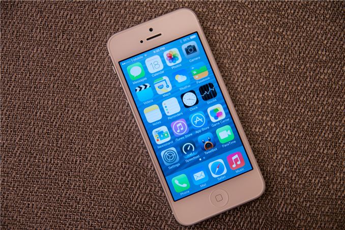
There’s no doubt about it, this iOS update is one of the largest in Apple’s history. In the wake of the iPhone 5 launch, there was a considerable amount of criticism that iOS’ visual design was beginning to get stale. The core of the interface hadn’t really changed in either visual appearance or function. With iOS 7, those pundits get their wishes granted, as almost every part of the OS gets some kind of change.
The new UI is a dramatic reimagining of the core of Apple’s mobile operating system for iPhones, iPod Touches, and iPads. The most obvious superficial change is a completely new visual appearance with a new emphasis on minimalism and simplicity. At the same time, iOS 7 is always in motion, with transitions and other effects almost everywhere you look in the OS. It’s a change that’s bound to be jarring and solicit mixed reactions initially like all redesigns are, but our thoughts have solidified since running the earliest betas up until the latest GM.
New UI
Apple’s designers were no doubt faced with a huge challenge with iOS 7. The platform has to remain familiar enough to be immediately usable and recognizable to iOS 6 and prior users, while at the same time accomplishing the goals of both modernization and cleaning up the cruft that has accumulated in some places over the past 6 major versions.
iOS 7 (Left), iOS 6 (Right) on iPhone 5
The other reality is that smartphone users no longer need a UI that emulates real-world analogues to real objects for them to be able to discover and learn the interface. Things like controls (switches, sliders, and buttons) that emulated actual buttons no longer have to appear that way to be immediately obvious. Textures and other surfaces no longer need to mimic the real world either. Instead these can now give way to something that’s minimalist and new. The educational phase is over, and for the most part smartphones are now largely mainstream rather than an enthusiast novelty or niche market. iOS 7 is the result of all that change.
There are some obvious changes that stick out immediately, like app icons that are now a slightly larger size, a status bar area that’s now smaller and more customizable for developers, mandatory retina quality assets, new folder appearance, borderless buttons everywhere, different fonts (Helvetica Neue) and dynamic size, and a host of other first party changes.
Color Scheme
There’s really no way to avoid it, but iOS 7 moves to a completely different color palette than other releases. If there’s one thing that sticks out at me, it’s that the iPhone 5c really is the canonical correct device for iOS 7, as those devices essentially define the emphasis on color that’s visible throughout the whole OS. Each application gets a tint color that carries through it – ideally this color is used in the application icon in a very obvious way, then throughout the application to indicate interactivity.
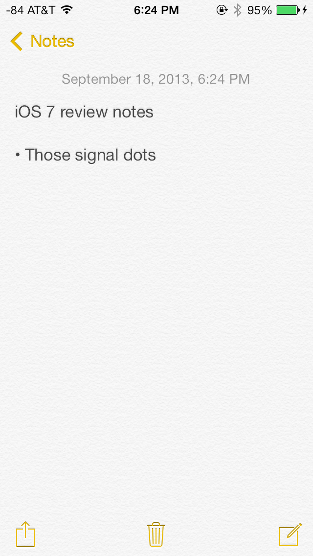
Yellow in the notes app icon, yellow interactive elements inside
Calculator has orange function buttons on the icon, inside these buttons are still orange. Notes has a yellow strip like a notepad, inside the icon tint is yellow. Calendar has the date written in red, inside almost all the elements are red. Camera has a tiny yellow dot for the camera flash or LED AF assist, inside all the text and interactive elements are yellow. Without the shiny rounded buttons or sunken indicators everywhere, this tint color is really the only good way to know whether a certain element is actionable, and it’s a big theme in iOS 7.
Transparency
Heading into iOS 7 there was a lot of discussion about how computer interfaces were largely going “flat.” To many, that meant completely devoid of any sense of depth or z-height, to others that meant elimination of the kind of rounded, 3D buttons that previously cued users on what elements were actionable or not. While I’ll leave the discussion about what “flat” really means to human computer interface scientists, the reality is that iOS 7 isn’t really flat, and one of the most obvious places you can see that is with its use of translucency and parallax.
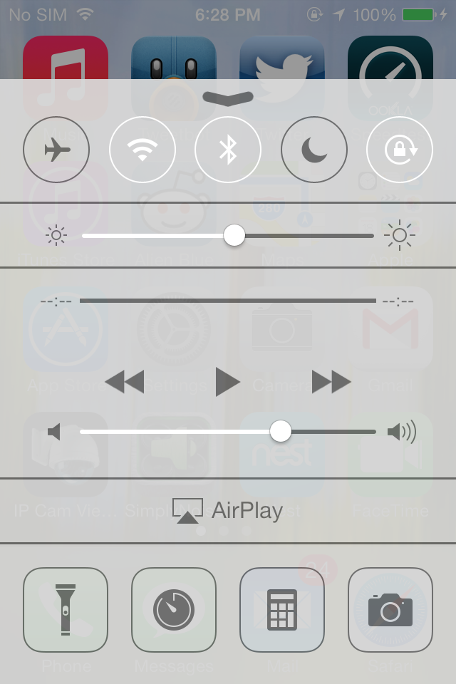
Transparency is everywhere in iOS 7
Translucency is a big deal in iOS 7 for two reasons. First, it’s part of the “constant motion” theme of the design, for example while scrolling a page in safari or a dialog in messages you’ll see content move behind frosted glass elements. Second it gives hierarchy cues without being obvious about it or wasting space on drop shadows. There’s a certain depth that comes with the transparent effect that makes things understandable, especially for things like the notification center and control center shades. This allows certain views to be separate in an obvious kind of way. Alerts used to be one of the last bastions of Apple’s prior love of big rounded faux–3D elements, and now are translucent. Apps also now are supposed to draw the entire view all the time, even when the keyboard is up, as it now is transparent as well.
I was a huge fan of transparency in Windows with aero glass, iOS 7 pulls off translucency and this frosted glass appearance very well, with just the right amount of opacity. There’s certainly a part of it that’s eye candy, but it does make a lot of sense in this “flat” world.
iPhone 4, iPhone 4S, respectively
The transparencies are great, but definitely computationally intensive on the GPU and obviously adds to an overdraw tax. As a result not every device that iOS 7 supports gets transparency and a blur effect, some devices just get transparency. On the iPhone side, the iPhone 4 lacks the cool blur effect in a number of places (notification center and control center are the most obvious), and iPad 3 does as well.
Fonts
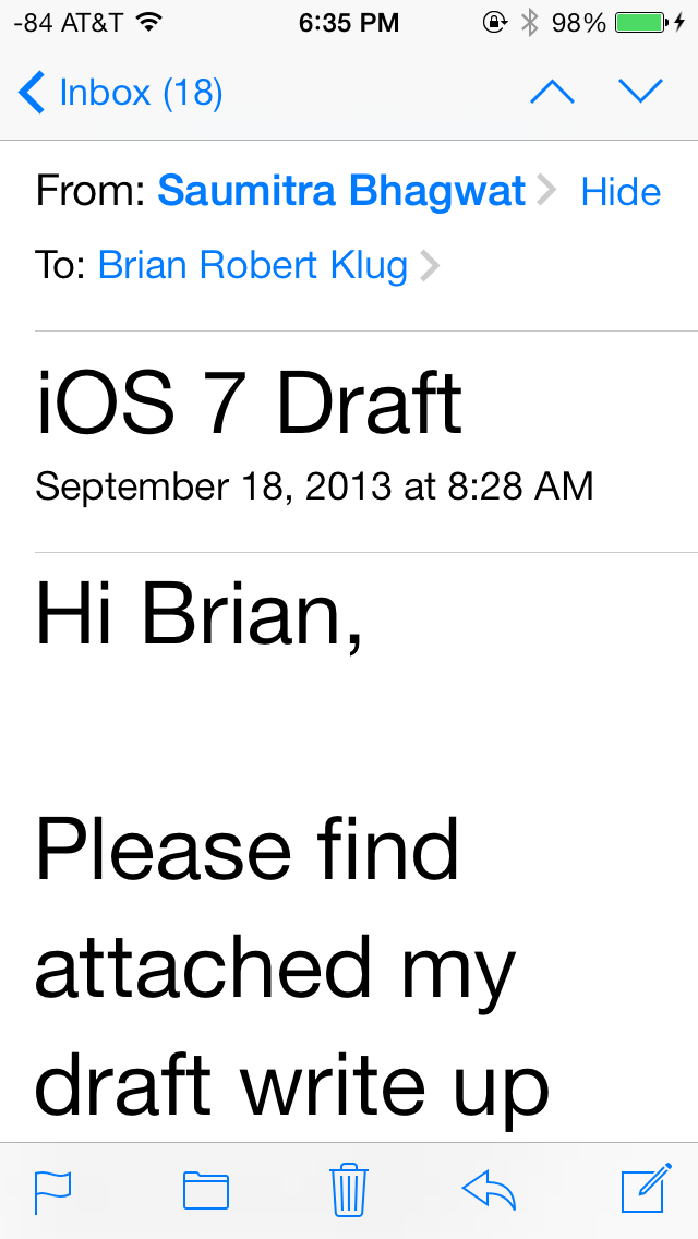
iOS 7 moves to Helvetica Neue for the system font, with frequent use of the ultra light and light weights of that particular font. Apple is so proud of its change in fonts, it changed the “iPhone” font on the back of the iPhone 5s and 5c to match. It’s a not so subtle change, and iOS 7 also now places more emphasis on being typographically-centered. Much the same way that color is a theme that runs through iOS 7 applications, typography with a color tint applied is now supposed to define most of the user interface elements on their own.
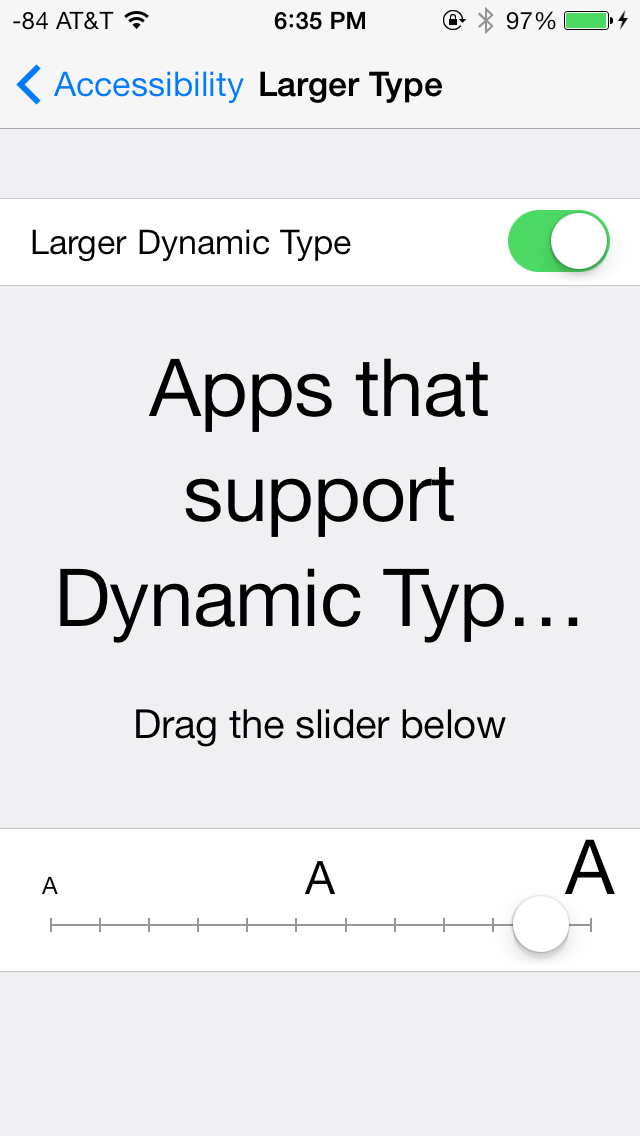
A new feature is dynamic type (through the new Text Kit set of UIKit classes), which essentially is an accessibility feature that enables users to change the font size bias system wide and in applications that use the UIFont method to get a font size. This automatically adjusts weight, character spacing (kerning) and line height, and seems like an awesome change for users who need larger font sizes for elements to be readable.

From early beta to release, font weights did change around
One of my initial big concerns was the legibility of a number of iOS 7 UI elements based on what was shown at WWDC, such as the lock screen. Initially I saw stuff like light weight fonts on a light lock screen background and low contrast between font color and what was around it, stuff that any designer would never stop screaming about. To Apple’s credit, a lot (but not all) of these pain points have been addressed now that iOS 7 is ready for wide release, but a few could still pose readability issues outside of 20-somethings with good eyesight. Apple fixed a number of these elements by just moving to bigger weights, but I suspect there will inevitably be some additional adjustment and tweaking.
The good news is that dynamic type makes it really easy to just change everything system wide or enable the bolder weight fonts through accessibility options, which moves font weights up one notch.
Transitions
iOS 7 brings motion to a whole new level, with a bunch of motion effects and gamification through both Sprite Kit and UiKit Dynamics. The short story is that these new frameworks allow developers to build applications with interactions that mimic real world physics, for example reacting to gravity or mass and user-input that triggers acceleration.
The new UI in iOS 7 uses this framework throughout for things like spring loaded animations when opening apps or going into multitasking, dismissing tabs in safari, and so on.
App tiles fly in, dismissed apps fly off the top
iOS 7 is very animation heavy, almost everywhere you go there’s either a subtle bounce-back (like on the passcode entry screen) or some transition. Applications float in when you go back to the home screen, notification center bounces accordingly depending on how fast you flick it down from the top of the screen, and applications zoom into or out of their icons when launched or closed respectively. It’s all a lot to look at, and iOS has always been home to design that wasn’t afraid to demonstrate how much stuff it could throw at OpenGL ES in the pursuit of making things look pretty without having FPS drops.
The only issue is that after a while some animations start being a lot to sit through each time, especially the multitasking interface animations and app fly-in. Some of these issues have been offset by making the touch targets active while the notifications are playing, but I find that it’s still not enough – going back to the home screen the app targets work, as does multitasking, but you still have to physically sit through the animation, then the action happens. It’s disconcerting flicking apps up to dismiss them and having the UI stutter and play the slide animation after the action happens.
One of my big use case is switching between messaging and the web quickly, and it just feels tedious waiting for things to happen while an animation plays. At some level animations clearly are masking loading times, and just like in OS X these will be removed slowly to make the platform feel faster, I just wish there was an option in the UI to speed things up.
App Interfaces
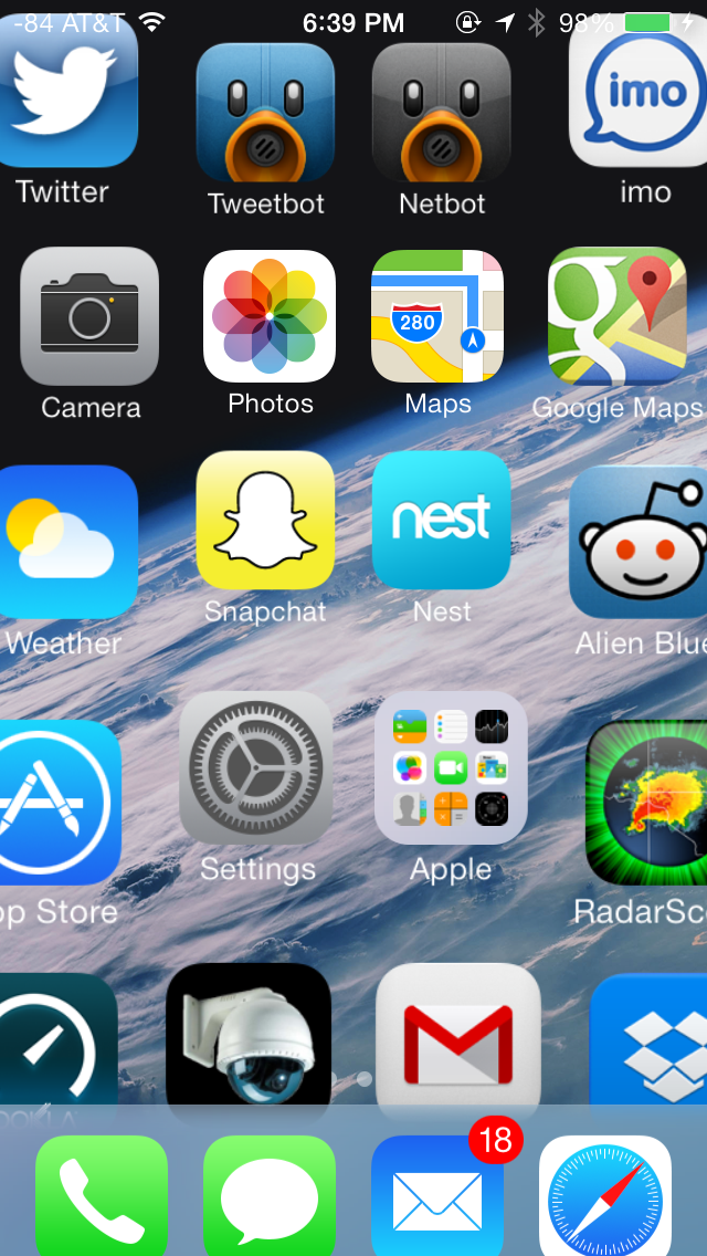
iOS 7 presents a fresh take on the system-wide UI, and has completely done away with the textured, gray app interface in use since iOS 1. UI elements in iOS 7 predominantly feature bold, basic colors mostly on a plain white background. Other background elements, such as those used for Spotlight, Control Center and Notification Center are varying shades of frosted gray, designed to adapt to the underlying wallpaper and user content. Iconography has also been simplified; a bit too excessively in some cases, but is applied uniformly across the OS. The in-app icons align with color scheme applied to the app (i.e yellow for Notes, red for Calendar and Music and blue for apps such as App Store, Phone and Messaging). A uniform set of icons provides for an extremely cohesive UI throughout the OS.
The UI for selecting the date, setting alarms and selecting items from drop down menus in Safari is quite bland and could have looked better with borders or other supporting UI elements. In some cases, especially on the iPad, this leads to excessive white space.
Apple has also introduced a new swipe gesture to efficiently navigate apps with hierarchical interfaces. Swiping right from the left edge of the screen takes users back to the previous screen, essentially acting as a back button. The gesture is especially useful in Safari and Messaging, allowing much faster navigation. Given the small display size of the even the flagship iPhones however, edge gestures are easy to activate inadvertently.
Swipe to delete has also been reversed in iOS 7. Rather than a left to right swipe to bring up a delete button, it’s now a right to left swipe.
The new system font, coupled with predominantly white colored backgrounds, use of transparent layers and a bouquet of bold colors applied throughout, have given iOS fresh and vibrant look, one which it desperately needed for some time now. The use of transparencies gives a sense of place within the OS, but also offers nearly infinite ways to keep the OS looking new, just by changing the wallpaper.
Lock Screen
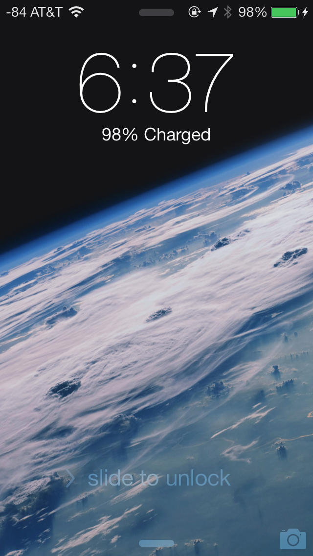
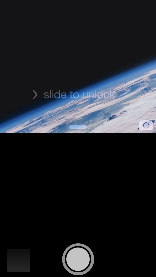
At a high level, the lock screen on iOS 7 is immediately familiar looking. There’s still the time and date displayed in large characters up top, and slide to unlock at the bottom. The shortcuts that worked before in iOS 6 also still work here, you can launch the camera by pressing and holding on the camera icon at bottom right and dragging up, for example.
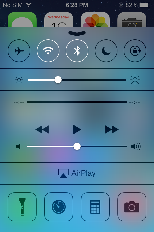
What’s new is the addition of two new small rules which launch control center and notification center from the top and bottom. These quick access shades overlay themselves on the lock screen.
Notifications that have come in while the device was locked still fill in underneath the time and date, and are actionable by sliding to the right just like they were before. Only the top notification is displayed at 100 percent opacity, the others are slightly greyed out but still visible, so you focus immediately on what’s newest. When a notification has popped in there’s also a transparency which appears behind it, making it easier to read the latest notification on top of your lock screen wallpaper.
The top status bar is also enlarged relative to its appearance throughout the rest of iOS 7. Icons and font size are increased here ostensibly so they’re more glanceable. There’s no longer a huge battery icon visible when the iDevice is plugged in and charging either, so this larger status bar obviously takes the place of it.
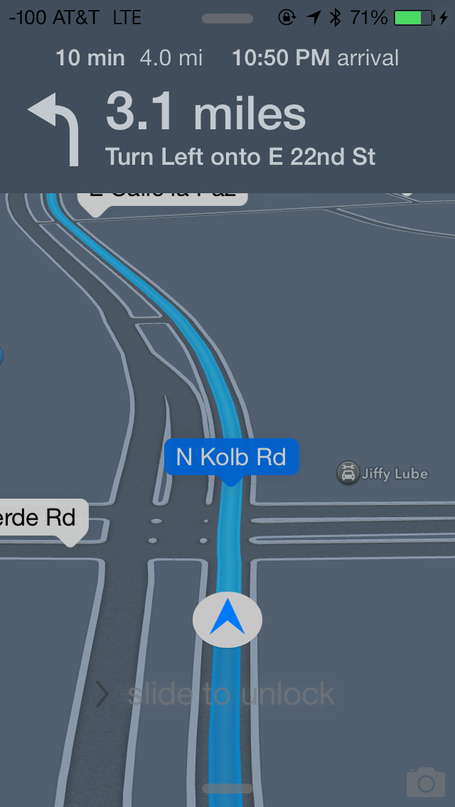
Turn by turn directions are still presented behind the lock screen while in use, now there’s less clutter in the way. Slide to unlock and the other shade and camera toggles remain, but are subtle in comparison.
The lock screen really is a microcosm of the changes that are made to iOS 7. Functionally not a lot is changed, so the existing workflows still work, there’s just tweaks to the visual appearance.


144 Comments
View All Comments
uhuznaa - Thursday, September 19, 2013 - link
One point Steve Jobs argued about with the old Apple and that lead to him being fired was that he didn't want the Mac to have more RAM. His way of thinking was that programmers should look for ways to make their apps solve problems by thinking through the problem deep enough to come up with simple solutions that didn't need lots of code or memory. All this "we have actually no idea what the people want to do, so just let's throw raw hardware power at it and give them everything" never was his vision.And everybody who ever designed an app or any software solution to something knows that really diving to the bottom what you want to solve is the crucial part. If you do this right you may end up with incredibly simple solutions that go a very long way. The Wiki idea is a good example here.
Jumangi - Thursday, September 19, 2013 - link
2013 and its still just screens of static icons...boring Apple.kyuu - Thursday, September 19, 2013 - link
Personally, I think the iOS 7 aesthetic is pretty ugly. I like Metro, but you can't simply Metro-ize the old grid-of-chiclets and expect it to look good. The propensity for bright, pastel colors doesn't help either.And then that translucency effect is downright bad, especially if you have a dark background. The simple transparency you get with the iPhone 4 is much, much better and should be the default. There is a (rather obfuscated) setting to turn the translucency off labeled "Increase Contrast".
Also, the contrived text in the notifications pane (it says "It is now X degress. The high today was Y degrees" or some such instead of just showing the current temperature and today's high/low) is a huge space waster and offers nothing over simply showing the numbers.
While the move away from skeumorphism to more modern design was necessary, Apple did it in a pretty poor way, IMO. If I had any inkling to move back to iOS before, Apple pretty much killed it with iOS 7.
mfenn - Thursday, September 19, 2013 - link
Capital letters. Use them please.HardwareDufus - Thursday, September 19, 2013 - link
I'm surprised by the use of bright pastel like colors. I don't like it. I can't stand Kelly Green, Magenta, Cyan and Baby Blue used so extensively. It's like the pulled a 'ME TOO' and adopted Windows8 Crayola color palette.That said, I use Phone8 and I can only stand 2 of the color scheme's available. So perhaps I am well in the minority.
The Von Matrices - Thursday, September 19, 2013 - link
After reading through the article, I'm surprised that the new operating system brings no new software features that make me think "wow, I wish my Android phone did that." From an overall view it seems that more than ever that the only real difference between IOS 7 and Android is their colors, font, and icon graphics. It seems that smartphone operating systems are converging on one UI design, just like desktop operating systems have done in the past few years.Sandiamom1 - Thursday, September 19, 2013 - link
I have always considered myself part of that Loyal Apple fan base. I have owned Apple computers, iPods, iPads, iPhones...I have given them as gifts, etc. I have raved about my phone so much, many of my friends have gotten the iPhone. Yes, I am that middle aged woman, not terribly tech savvy & enjoyed the immediate tech support of Apple & ease of use. Since upgrading to the iPhone 5 in June 2013, I have experienced nothing but frustration! This iPhone 5 is basically a very UNSMART, expensive piece of junk! I tried going to the Apple store for tech support, but they won't talk to me for 4 days! Guess that fast tech support service is a relic of the past. Went to AT&T, but they say it's a hardware problem so I'm at the mercy of a slow to respond Apple service system. Since upgrading to the 5 (had the 4s), some contacts get no texts from me, others it may be delayed by hours or days & vice versa; it frequently won't pick up the wi-fi & won't switch to my data plan so I just can't access the internet at all; it drops calls; Find My iPhone app will not work on this; touch screen & scrolling are frequently unresponsive; other things I can't remember now. A couple family members just got the android Galaxy 4S. I am seriously thinking of dropping all Apple products. Told my friends. They're interested in hearing my thoughts on the 4s if I switch. Apple store didn't seem concerned about losing a longtime, dedicated customer, which makes me think it's time to go.kwrzesien - Friday, September 20, 2013 - link
You got a lemon, get Apple to swap it out. Don't restore your 4S profile to it, start from scratch, re-download the apps you still need/want from the App Store, let the contacts sync with iCloud and/or Gmail and/or Facebook, etc. Every few weeks kill all the running apps from the task manager (double-click the home button, hold an app until the "x's" appear) and then reboot. The friends that aren't getting your texts probably have iPhones on Verizon, switch to sending to them as SMS - there is much more delay between AT&T and Verizon then there is internally, I think Apple has different server clusters for each and the interconnect can either get bogged down or jammed. I think the iMessage servers for Verizon in general seem to be slow.The iPhone 5 hardware is very good, but the key is that you did an UPGRADE. I think the software just gets screwy with this and I recommend doing a fresh install. If that doesn't fix your issues then get it replaced.
dcost11 - Friday, September 20, 2013 - link
The apps move when you tilt your device on the ipad, has anyone else noticed this? its like they are on a layer above the wallpaper and as you move the device you see more or less of the wall paper. It doesn't seem to work on my iphone 4Gorgenapper - Friday, September 20, 2013 - link
Updated my iPad 3 to iOS 7 last night.1) Apple fans complain so much about the occasional lag on Android devices, well now they can have some of it too. But of course, Apple lag is in fact a built-in value-added feature. I'm just using the iPad wrong.
2) I think I can hire a chimpanzee to design and draw better icons than most of the ones that have been updated. I mean, sure, the iOS 6 sunflower icon for photos has been around for roughly a million years or more and was due for replacement, but they couldn't draw up one or two abstract representations of photos and instead gave us this Wheel-O-Colors that makes no sense whatsoever? Some of the other icons are so hilariously minimalistic and juvenile in execution that it cheapens the entire experience of using the iPad.
3) No calculator for the iPad? Really? Seriously? Most of the free ones out there are full of ads.
4) Movies on my iPad no longer have titles, I'm supposed to know which movie it is by looking at the thumbnail. Let's see... I have... "A Movie shot in Black", "The Terrifying Darkness", "Noire", "Black Screen of Death II", "Random Face Caught in Motion" and "Unidentified Body Part". Another value added feature from Apple, thanks!