Google Chrome: Performance and First Impressions
by Anand Lal Shimpi on September 3, 2008 12:00 AM EST- Posted in
- Software
Google made a...browser?
Based on WebKit, the same foundation for Apple’s Safari web browser - yesterday Google introduced Chrome, it’s own browser:
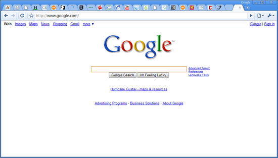
It’s been a while since we’ve had a brand new, completely unexpected Google launch and what better way to change that than by launching a damn web browser?
![]()
It's getting crowded in the browser market
Despite how often Google is viewed as competing with Microsoft, these days it’s acting very Apple-like. Android has the potential to bring to the masses much of what Apple did with the iPhone, and Apple’s MobileMe (albeit mismanaged and poorly launched) is one step away from being a costly Google Apps competitor. The browser step for Google is an interesting one, yet of all of the browser companies Google is the most natural fit - it’s almost surprising that Google hadn’t released a browser by now.
What follows are my thoughts on Chrome - be sure to chime in with your own in the comments.
Sometimes It Takes a Revolution
Google revamped a few basic things with Chrome, some of them with very deep implications.
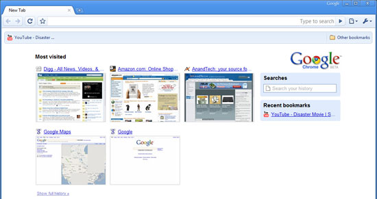
Your home page is now a tiled list of your most visited websites. In the old days it used to be one site or one search engine, but now with sites like YouTube, Facebook, AnandTech (see how I snuck that one in there?), MySpace, Digg, etc... it’s tough to have just one single home page. Google’s change here makes sense and it is also quite altruistic. Google could’ve just as easily used its own browser platform to help promote its own websites and services.
If you’ve only got IE7 installed on your machine Chrome will even default to Microsoft’s Live Search as the default search engine, asking you if you’d like to change it. The assumption is that your computer is setup the way you want it to be and Google isn’t going to force its services on you - competition is best done based on merit, not by manipulating the market.
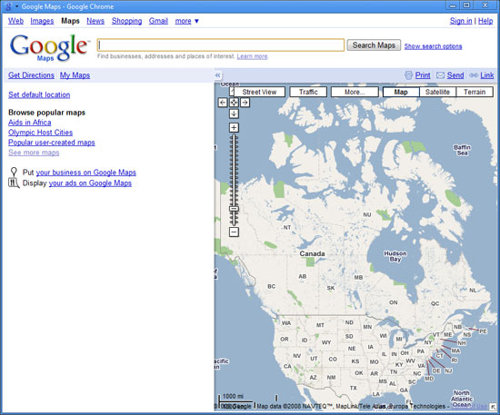
You can add direct links to web applications on your desktop, which will fire up Chrome in more of a thick-client view like this
The most visible change is that the tabs are now the topmost part of the browser window, in fact there’s no menu bar at all. Accessing typical menu items is done via two very simple buttons at the right of the OmniBar (what Google’s developers call the URL bar). There’s not even a menu item for opening a file/web page, although CTRL + O will bring up an open dialog box.
Removing the menu bar does something very interesting for Google Chrome: it makes it look very OS agnostic. It doesn’t quite fit in with Vista’s look and feel, nor does it look very Apple at all. In Google’s world, the OS doesn’t matter, so long as it has access to the Internet (see: Google docs, YouTube, Gmail, etc...). Given this view of the world, why should Chrome have an archaic remnant of conventional OSes? The missing menu bar is a very important statement.
There’s no search box in Chrome (not even a Google Search box), all searching/navigating is done through the OmniBar. Much like Spotlight under OS X, you get full text search through any webpage in your history. Remember reading something about panda bears a couple of days ago but can’t remember what site it was on? Just type in panda bears into the OmniBar and you’ll get a list of relevant results from your history.

Sites like Amazon can be searched from within the OmniBar as well, assuming you’ve performed a search on the site before. Just start typing Amazon into the OmniBar and hit tab to type in your search query. It’ll take you straight to the search results on Amazon.com. Pretty cool.
Incognito mode
Private browsing is taken the next level by Chrome with its incognito mode. You can choose to open an individual window/tab in incognito mode, where no data is logged and nothing is added to your history. You even get a cool guy wearing a trench coat in the upper left hand corner of your incognito window to drive the feature home.
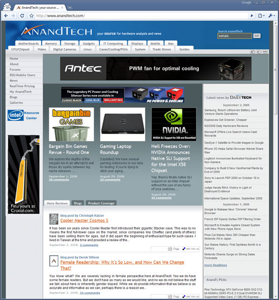
Downloads & History
Downloads are handled quite elegantly in Chrome, when something starts downloading it appears as an icon at the bottom of your browser window. There’s no external download manager window. I’m not sure if this is the most efficient approach, especially when managing tons of downloads, but I suspect that it works well for most users.

Downloads appear at the bottom of your browser
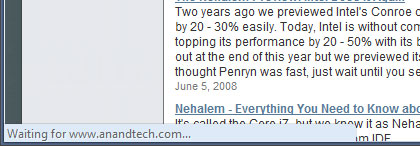
The status bar only appears when appropriate, otherwise it disappears - even when visible it only takes up as much space as it needs.
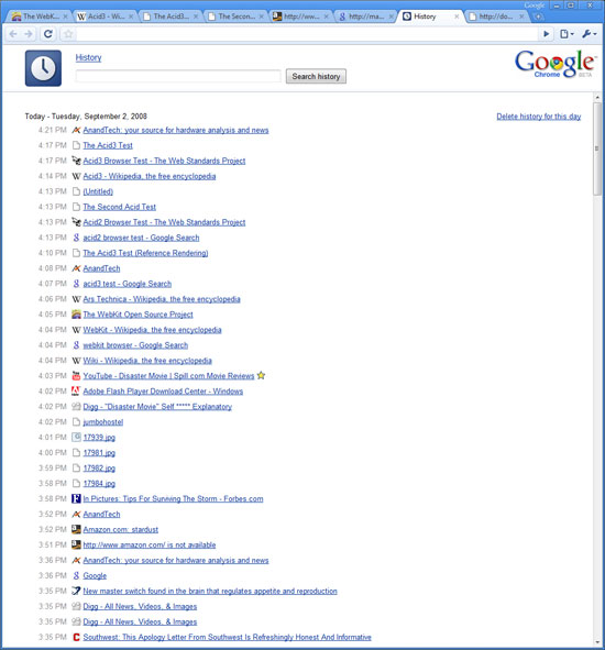
History is organized like a simple web page, it just makes sense:


105 Comments
View All Comments
Jynx980 - Wednesday, September 3, 2008 - link
I have been using Wintasks by Uniblue/liutilities to check out processes. It works pretty well and sure beats googling up unknown processes and ones I have forgotten about. I think it is now part of "SpeedUpMyPC 2009" (http://www.liutilities.com/products/speedupmypc/)">http://www.liutilities.com/products/speedupmypc/) I can't seem to get the links button to work.There's also The Elder Geek guide (http://www.theeldergeek.com/services_guide.htm)">http://www.theeldergeek.com/services_guide.htm).
I guess the Black Viper site is back. I have no idea what happened to him but he's back anyways. He also used to have different profiles. Maybe this page will help (http://www.blackviper.com/WinXP/xpprofiles.htm)">http://www.blackviper.com/WinXP/xpprofiles.htm)
The trouble with profiles is that no matter how many are made, someone is going to have problems. In short, if the person doesn't understand what their doing, they should learn more about it first or avoid it altogether. That's just an IT pipe dream though.
Several other sites have services covered so I don't see what more Anadtech could bring to the table. Maybe an introduction article, benchmarks on profiles and after shutting down some common unneeded processes, that would work.
And to stay on topic, Chrome is great/and or sucks.
Alyx - Friday, September 5, 2008 - link
A while back I saw a article on turning all the un-needed stuff off that the black viper site recommends. The machines with stuff turned off had nearly identical resource usage and actually performed worse. Since then I've never bothered with all the optimizations. The amount of time you save is way offset by the headache and time spent setting everything up.nortexoid - Wednesday, September 3, 2008 - link
So far Chrome's been pretty buggy for me. It locks up with flash animations (especially when coming out of fullscreen mode) mostly.It has some nice features. In fact one of them, it's autohiding status bar, led me to that very extension for FF3! Yes, I'm still in love with FF3.
dryloch - Wednesday, September 3, 2008 - link
There were several pages in the speed test that I have never been to. I went to those pages and they loaded faster then your tests are showing. I have been very impressed with the speed of this browser. So far I say good job Google.npp - Wednesday, September 3, 2008 - link
It's a nice thing, no doubt, and I'm sure it will make its way through the competition very fast (by the way, as I'm writing this, a nasty bug prevents the lines from being displayed properly...:) It looks good and feels fast, but I simply can't swallow the absence of all the features that make Opera my browser of choice. It may be that they went too far in their minimalistic approach; inability to import settings from any other browser than IE for example, is downright stupid. Other users also pointed out pretty obvious and common features that Chrome is missing right now.But then again, it may be that I'm just too paranoid; maybe the majority of users will never miss a feature in Chrome, and I guess google is aiming exactly at them. However, the users who like to customize everything exactly their way and need more control on what's going on are still better off with something like Opera, I guess.
strikeback03 - Wednesday, September 3, 2008 - link
Funny, it was the things I couldn't set Opera to do that caused me to not bother reinstalling in my most recent OS upgrade.idomagic - Thursday, September 4, 2008 - link
Please do give an example.strikeback03 - Thursday, September 4, 2008 - link
Been about a year and a half, but one I remember is that I could not find where to make Opera not automatically shift to a new tab when opening. When I read news I usually scroll down the headlines and open any I want to read in new tabs, then open the tabs one by one and read. With Opera, each new tab opened and went there, then I immediately had to click back to the main tab to open whatever else I wanted, etc.Plus, as mentioned, lack of Adblock is a deal-breaker.
cousin333 - Friday, September 5, 2008 - link
You didn't look hard enough... Did you tried to open links by clicking with scrollwheel? ;)There is an AdBlock in Opera, called Content block... You can access it by using the pages' context menu.
Tegeril - Wednesday, September 3, 2008 - link
You can import from Firefox.