Google Chrome: Performance and First Impressions
by Anand Lal Shimpi on September 3, 2008 12:00 AM EST- Posted in
- Software
Google made a...browser?
Based on WebKit, the same foundation for Apple’s Safari web browser - yesterday Google introduced Chrome, it’s own browser:
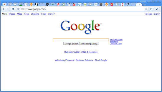
It’s been a while since we’ve had a brand new, completely unexpected Google launch and what better way to change that than by launching a damn web browser?
![]()
It's getting crowded in the browser market
Despite how often Google is viewed as competing with Microsoft, these days it’s acting very Apple-like. Android has the potential to bring to the masses much of what Apple did with the iPhone, and Apple’s MobileMe (albeit mismanaged and poorly launched) is one step away from being a costly Google Apps competitor. The browser step for Google is an interesting one, yet of all of the browser companies Google is the most natural fit - it’s almost surprising that Google hadn’t released a browser by now.
What follows are my thoughts on Chrome - be sure to chime in with your own in the comments.
Sometimes It Takes a Revolution
Google revamped a few basic things with Chrome, some of them with very deep implications.
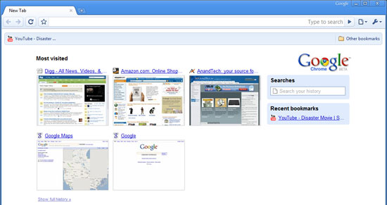
Your home page is now a tiled list of your most visited websites. In the old days it used to be one site or one search engine, but now with sites like YouTube, Facebook, AnandTech (see how I snuck that one in there?), MySpace, Digg, etc... it’s tough to have just one single home page. Google’s change here makes sense and it is also quite altruistic. Google could’ve just as easily used its own browser platform to help promote its own websites and services.
If you’ve only got IE7 installed on your machine Chrome will even default to Microsoft’s Live Search as the default search engine, asking you if you’d like to change it. The assumption is that your computer is setup the way you want it to be and Google isn’t going to force its services on you - competition is best done based on merit, not by manipulating the market.
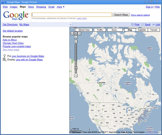
You can add direct links to web applications on your desktop, which will fire up Chrome in more of a thick-client view like this
The most visible change is that the tabs are now the topmost part of the browser window, in fact there’s no menu bar at all. Accessing typical menu items is done via two very simple buttons at the right of the OmniBar (what Google’s developers call the URL bar). There’s not even a menu item for opening a file/web page, although CTRL + O will bring up an open dialog box.
Removing the menu bar does something very interesting for Google Chrome: it makes it look very OS agnostic. It doesn’t quite fit in with Vista’s look and feel, nor does it look very Apple at all. In Google’s world, the OS doesn’t matter, so long as it has access to the Internet (see: Google docs, YouTube, Gmail, etc...). Given this view of the world, why should Chrome have an archaic remnant of conventional OSes? The missing menu bar is a very important statement.
There’s no search box in Chrome (not even a Google Search box), all searching/navigating is done through the OmniBar. Much like Spotlight under OS X, you get full text search through any webpage in your history. Remember reading something about panda bears a couple of days ago but can’t remember what site it was on? Just type in panda bears into the OmniBar and you’ll get a list of relevant results from your history.

Sites like Amazon can be searched from within the OmniBar as well, assuming you’ve performed a search on the site before. Just start typing Amazon into the OmniBar and hit tab to type in your search query. It’ll take you straight to the search results on Amazon.com. Pretty cool.
Incognito mode
Private browsing is taken the next level by Chrome with its incognito mode. You can choose to open an individual window/tab in incognito mode, where no data is logged and nothing is added to your history. You even get a cool guy wearing a trench coat in the upper left hand corner of your incognito window to drive the feature home.
Downloads & History
Downloads are handled quite elegantly in Chrome, when something starts downloading it appears as an icon at the bottom of your browser window. There’s no external download manager window. I’m not sure if this is the most efficient approach, especially when managing tons of downloads, but I suspect that it works well for most users.

Downloads appear at the bottom of your browser
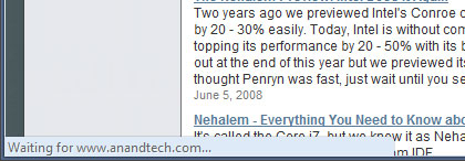
The status bar only appears when appropriate, otherwise it disappears - even when visible it only takes up as much space as it needs.
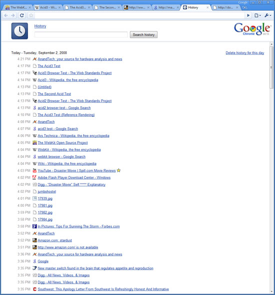
History is organized like a simple web page, it just makes sense:


105 Comments
View All Comments
GarionGoh - Wednesday, September 3, 2008 - link
Not sure if it is me, but after using FF3 since its release, I can atest to its speed in loading/rednering web page, almost always faster than IE7. While in the review, we are seeing that IE7 takes the crown for most of the test sites. Anyone any comments?zebrax2 - Wednesday, September 3, 2008 - link
they probably tested it without any add-onsSylvanas - Wednesday, September 3, 2008 - link
I am loving Chrome, very fast and best of all it's simple to use, nice UI.ubiloo - Wednesday, September 3, 2008 - link
I see the author of the article is looking for new features, etc.I think that Aurora (in Mozilla Concept series) is really displaying some... Check here:
http://labs.mozilla.com/2008/08/introducing-the-co...">http://labs.mozilla.com/2008/08/introdu...concept-...
imaheadcase - Wednesday, September 3, 2008 - link
Since no other web browser does except IE. Maybe it does?I love viewing this site with 4 inches width on each side wasted in FF3. Such a classy design anandtech.../sarcasm
strikeback03 - Wednesday, September 3, 2008 - link
IE7 and FF2 both display in the center with a lot of grey space to the sides on my 24" monitor. The table that spills out the end in FF though was all present in IE.Of course, all the ads are also present in IE, which is why I never use it.
theslug - Wednesday, September 3, 2008 - link
Anandtech seems to display fine for me with Firefox 3.imaheadcase - Thursday, September 4, 2008 - link
Try looking at AT on a 24 inch monitor. The site does not scale accordingly. The forums do, just not main site.strikeback03 - Thursday, September 4, 2008 - link
Define "scale correctly". It is centered, probably 1024 pixels wide, and I would imagine that is exactly what they programmed it to do.haplo602 - Wednesday, September 3, 2008 - link
what about ad blocks ? popup blocker ? session management ? page manuipulation (zoom etc.) ???