Microsoft BUILD: Windows 8, A Pre-Beta Preview
by Brian Klug & Ryan Smith on September 13, 2011 12:05 PM EST- Posted in
- BUILD
- Windows
- Microsoft
- Windows 8
- Trade Shows
Mobile Experience Side
Coming from the smartphone side of things, I really see many shades of WP7 inside Windows 8. That’s actually dramatically understating the state of things - the core of what we’ve been shown of Windows 8 that’s new literally is either adopted from or directly analogous to much of WP7.
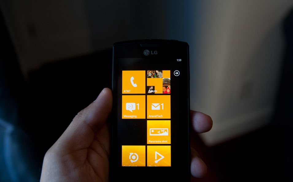
It doesn’t come as a surprise to me at all that the desktop Windows experience is moving in this direction, (and it seems as though the Xbox 360 interface will follow shortly). The positive result is that Windows 8’s touch experience feels much closer to the ground-up approach Android Honeycomb or iOS have taken than the than the “Tablet-Edition” versions of Windows XP and the tablet integration in Vista and 7. I used a UMPC and remember Origami and how that application lived as its own standalone mode of operation as an application within windows. What Windows 8 is the inverse - Windows now lives inside a Metro-themed Start screen that looks like WP7 for the desktop. Or at least it does in this demo we’ve been shown currently.
The tablet experience is now absolutely on par with modern mobile OSes - sure there are a few more things that need to be included, but the foundation is there for Windows to suddenly become more than an OS that also can do touch-based interaction.
IE 10
Microsoft has been actively promoting IE 10 since MIX 11, with two platform previews so far, and IE 10 is an integral part of Windows 8 both as a browser and as a runtime for HTML based Metro applications. We won’t go into exacting detail about what’s new and interesting inside IE10, beyond mentioning that it improves upon IE 9’s GPU acceleration and improves web compliance support including CSS3. What’s relevant in Windows 8 is that IE 10 gets two views - one belonging to the Metro-heavy start menu experience, which we’ll call the mobile view, and the other belonging to the traditional desktop windows view.
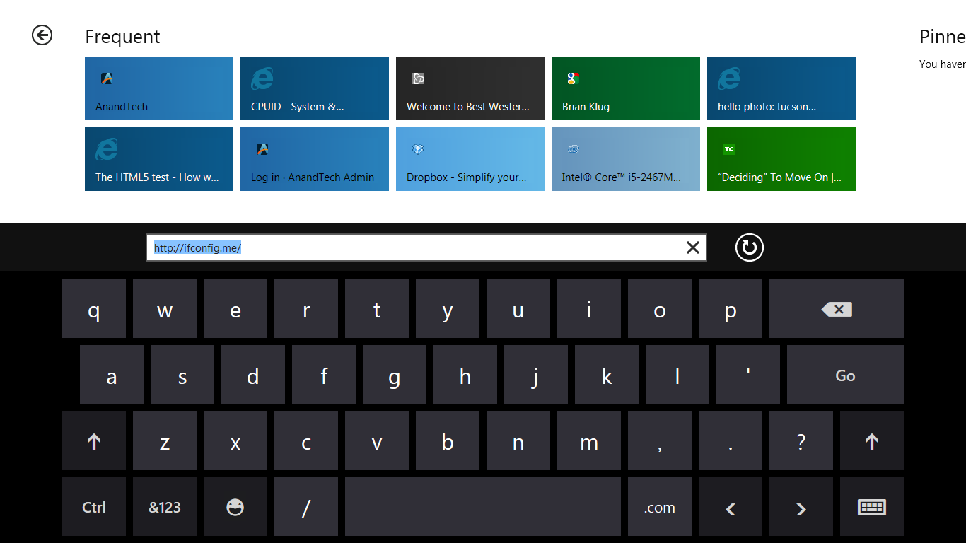
This dichotomy exists between the two IE10 experiences, which is in itself a bit curious. The mobile view is almost exactly what IE looks like inside Windows Phone 7.5 - at the bottom is the URL bar and controls, and with a slide down gesture, at the top are tabs. Meanwhile the IE10 desktop experience uses the older IE 9 UI. At this point, it doesn’t appear that windows opened in one are transportable to the other.

The mobile view is almost exactly like WP7.5’s however, the URL bar disappears when scrolling, and the browser supports a completely fluid multitouch experience that feels speedy.
Cloud
Windows 8 offers considerable integration with Windows Live and SkyDrive. Local user accounts can be directly tied to a Live account on trusted PCs, and then be used for live roaming. Live roaming enables each connected device to access the same set of accounts for photos, email, calendar, and contacts and speed up initial setup. For example, photos captured on a WP7.5 device’s camera roll can be immediately visible on a Windows 8 PC authenticated against the same Live account. This is very close to how camera roll will integrate into Apple’s iCloud and synchronize across iOS and OS X Lion.
One thing is clear, and it’s that Microsoft plans to heavily integrate and leverage its Live services into Windows 8 and provide an ecosystem-wide way to migrate accounts settings, photos, and data between mobile, tablet, and desktop.
Samsung’s Reference Tablet
We’ve been loaned Samsung tablets running the Windows 8 Evaluation copy used for this article, and thought it bears going over since the device will no doubt become a reference platform for Windows 8 development. This hardware is also being given away to developers in attendance at BUILD as well.
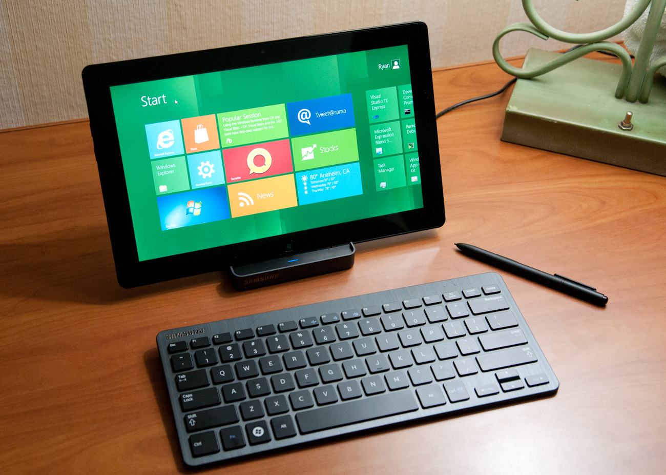
The Samsung tablet is none other than the 700T model announced at IFA very recently, and it packs a relatively impressive spec list.
| Samsung 700T Windows 8 Development Notebook/Slate - Specifications | |
| Processor |
Intel Core i5-2467M (2x1.6GHz + HT, 32nm, 3MB L3, 2.3GHz Turbo, 17W) |
| Chipset | Intel 6 series |
| Memory | 4 GB DDR3 1333MHz RAM (1 SODIMM) |
| Graphics | Intel HD 3000 |
| Display | 11.6" Super PLS (1366x768) |
| Hard Drive | 64 GB Samsung SSD |
| Networking | 802.11n WiFi + Gigabit Ethernet + GSM/WCDMA HSPA+ |
| Sensors | NFC, Magenetometer, Accelerometer, GPS, ALS, Front, Rear Camera |
| Dimensions | 12.9 mm thick, 909 grams |
The 700T includes GSM/WCDMA cellular connectivity courtesy of an Option GTM661W combination cellular modem and WiFi card. The GTM661W uses a Qualcomm MDM6200 baseband, which also provides GPS. There are also sensors such as ambient light, an accelerometer, and the two cameras onboard.
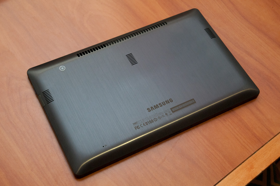
In addition, the 700T includes an active digitizer and capacitive touch display, making it suited for all three interaction modes that Windows 8 will support. The device comes with a dock that doubles as a charging stand, and also replicates full size HDMI, GigE, and a USB 2.0 port on the back. The slate has one USB 2.0 port, a headphone jack, microSD card slot, SIM slot, and a rotation lock button.
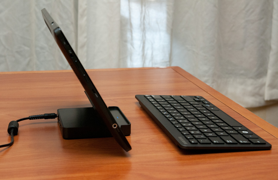
Samsung calls the 700T a slate, we've elected to call it a tablet, and the device feels decent if not a bit heavy in the hands. The 700T is also the first 16:9 tablet we've seen, with Android adopting 16:10 and iOS going with 4:3, which makes portrait a bit extreme.


235 Comments
View All Comments
Booster - Tuesday, September 13, 2011 - link
Exaclty. MS needs to get rid of Julie Larson-Green, the infamous inventor of the wretched ribbon and I suspect this abomination.BioTurboNick - Tuesday, September 13, 2011 - link
The ribbon is great. I'm sorry that you love trudging through menus to find the things you want.frozentundra123456 - Tuesday, September 13, 2011 - link
I agree with Booster. I absolutely hate the ribbon in Microsoft Office. It may add a lot of things that menus didnt have, but most of them are worthless. It requires considerably more steps to do simple tasks.The ribbon may be OK for someone who uses Office all day, every day, for business tasks. But I use it in a scientific setting, and just want to use the basic commands as quickly and easily as possible. For this kind of use, I really, really hate the ribbon.
ph0tek - Wednesday, September 14, 2011 - link
How did you manage to post that on DOS?Anyway... I bet the vast majority of people making the kind of comments as yourself are pretty old. Either that or just stupid. The Ribbon is better. Not debatable. New users of Office all agree it's better and do far better using it, thats a fact.
On Win 8 you can even customise the ribbon, or make a quick access bar with your own most used ribbon buttons. Instant access. You can get more quicker or efficient than that.
cjs150 - Wednesday, September 14, 2011 - link
No the ribbon is not better. I am a power user of word, our documents often run to 100 pages, with tables of contents, multiple level headings and paragraphs, track changes, charts and tables. When we get board we throw in columns as well.Let me take a simple example that happens all the time. Your document has track changes on it but is formatted incorrectly (for example you need to use keep with next). Right clicking the mouse will not bring up paragrpah settings because according to MS the context is tracking changes, so you go up to the ribbon, which is of course stuck in review mode because that was the last time you used it to switch track changes on, now scroll back to the home section of the ribbon, Where are the paragraph settings? - Not obviously there, you have to click on the little arrow in the bottom right of the paragraph tile on the ribbon and finally you have got what you needed.
And they call that an improvement?
The ribbon is fine for people who write a letter once every few days, but a complete waste of effort for business
BioTurboNick - Thursday, September 15, 2011 - link
That sounds like an imperfect implementation, not a problem with the interface style per se.quanta - Tuesday, September 13, 2011 - link
Since the introduction of Windows XP themes, the usable screen spaces have been on the decline.First of all, the default XP themes wasted more spaces by creating bigger margins/paddings between interactive screen elements just to fit pretty effects instead of making more efficient use of the same UI margins found in Classic theme while dressing up the visual.
Then came Windows Vista's Aero, which wastes even more space by switching to Segoe UI, where in its default configuration, has a bigger font sizes than the already inflated XP theme. Worse still, Segoe UI is one of the later ClearType-optimized fonts that looks blurry even after tuning, and ClearType itself isn't even designed for alternate subpixel layouts like non-aperture grille CRTs and Sharp Quattron (ClearType is only defined for 3-subpixel array, not 4-subpixel), making the default Vista UI look even worse on old and new monitors. Shrinking Segoe UI may have saved some screen estate, but the ClearType-tuned fonts are optimized for larger point sizes than the venerable Tahoma or even Microsoft Sans Serif, so it trades one compromise with another. The screen margin wastage is even worse than the XP themes. With all these new-fangled update, one would expect it the Aero UI will be more customizable, but it is not. You may be able to adjust the theme colours of Aero, but if you want to switch the colour of single elements such as (in)active menu bar or title, or switch the Aero font, YOU CAN'T! Well, at least not without hacking the system libraries[1], or going through the pain of editing the features with tools not supplied with the operating system, or use the Windows Classic theme. Windows 7 may have the mean of using the UI to build custom theme[2], but there is still zero method for conserving screen estates using Aero theme unless manually editing .theme files[3].
In this next Windows iteration, the incorporation of ribbon just add more clutter to the desktop. While the ribbon is needed for touchscreen uses, the way it is organized is far from most efficient. Does the ribbon really need text description over a button group for the buttons that already have descriptions on them? Desktop aside, the Metro fails to reuse the ribbon on the desktop UI, which would have provide a more consistent experience when switching between Metro and desktop, and even with the already bloated Windows 7-based UI, the ribbon layout still uses screen space more efficiently than Metro.
[1] http://www.howtogeek.com/howto/windows-vista/how-t...
[2] http://windows.microsoft.com/en-US/windows7/create...
[3] http://msdn.microsoft.com/en-us/library/bb773190%2...
Impulses - Tuesday, September 13, 2011 - link
Anyone else concerned that Win 8's multiple display support will be pretty hobbled? I'm already iffy on the whole Metro style, switching back to Metro to open unpinned apps when working on the traditional desktop seems horribly inefficient... But I don't see how that's gonna scale across multiple displays, I guess ideally you could leave the start panel with it's live tiles on a second screen, but MS has a history of ignoring multiple display users...We still rely on 3rd party tools to extend the taskbar or fine tune wallpapers across three displays... It's a shame too because after multiple cores and SSDs, multiple displays has been the biggest productivity boost I've gained thru hardware in the last 10 years.
BioTurboNick - Tuesday, September 13, 2011 - link
http://www.winsupersite.com/article/windows8/windo...Multiple monitor support is improved. Though this is just the desktop, not Metro.
CSMR - Tuesday, September 13, 2011 - link
That was fast. Thanks for the info Anand!