Original Link: https://www.anandtech.com/show/3982/windows-phone-7-review
The Windows Phone 7 Review
by Anand Lal Shimpi & Brian Klug on October 20, 2010 7:00 PM EST- Posted in
- Windows Phone 7
- Microsoft
- Smartphones
- Mobile
Introduction
This isn’t going to be a story about Microsoft’s return to dominance. Nor is it going to be the story of Microsoft’s failure to compete in the smartphone space. These mobile wars have only just begun and despite the advantage enjoyed by Apple and Google, there is no end in sight. In another twelve months we will see fierce competition from HP, Microsoft and Nokia. There’s a lot at stake, and no company is willing to give up the opportunity to own the next-PC market without a hell of a fight. Today is the beginning of Microsoft’s fight.
In the old days, when Microsoft tried to deliver a prettier UI it would just add lots of blue and make everything huge. That’s how we got XP. We never really lost the blue or hugeness, they were just made more refined through the years.
Windows Phone 7 is a significant departure from anything Microsoft has ever done in the past, from a UI standpoint that is. In my opinion it’s more beautiful than anything else on the market today - including Apple’s iOS. That’s a big statement for anyone to make about Microsoft, a company that has tried so very hard to prevent Apple’s increasing market share but always seemed to be at least one step behind in the user experience department. The Windows Phone 7 user experience is a big enough step forward to not only build a lot of faith in Microsoft’s mobile strategy, but also to give hope that future versions of the Xbox and desktop Windows OSes may be just as impressive.
The underlying architecture is well engineered, high performing and extremely efficient - a testament to the fact that Microsoft continues to employ some of the world’s most talented software engineers. Microsoft’s engineering talent is often masked by the bureaucracy of a company with nearly a hundred thousand employees and multiple billion dollar businesses, but it exists.
From a technical standpoint, Microsoft has never lagged Apple. In many cases, features Apple offered in its Macs were first enjoyed by Windows users. Where Microsoft fell short was in delivering these features in the cleanest way possible. The focus was on functionality, not the best way to use it. I continue to believe that anything you can do on a Mac you can do on a PC, it’s just the manner in which you do it that separates the two. Apple’s growing marketshare is testament to the notion that a significant portion of the population doesn't want to do it Microsoft’s way.
With Windows, Microsoft had to worry about legacy. It had to worry about maintaining a very large existing user base. With Windows Phone, Microsoft began with a clean slate. And it doesn’t disappoint.
Not the King, but a Start
I’ll say it now. Flipping through pages upon pages of square app icons just isn’t the most efficient way to do it. Folders help reduce the clutter, but they don’t fundamentally address the problem.
Microsoft had a similar problem back in Windows 3.x. You had a desktop, groups of application icons and the application icons themselves. Microsoft addressed the growing problem of managing tons of application icons by introducing the Start Menu. You had a way of getting access to frequently used applications without a lot of searching, and you could get to everything else without any clicking.
Apple never really tried the Start Menu approach but it achieved similar functionality in its desktop OSes. OS X gives you access to frequently used applications via the dock and for everything else you can either use Finder to navigate to them or Spotlight to search for them. Apple attempted to bring these features to iOS, but unfortunately not all of them translated well.
Using the system-wide search to launch applications doesn’t work as well on the iPhone simply because typing takes a lot longer on a smartphone than on a desktop/notebook. The dock is nice but it’s not nearly as wide on the iPhone. I’ve got 21 icons in my dock on my MacBook Pro, but you’re limited to 4 on the iPhone.
When you unlock your iPhone or Android phone you’re dropped into what’s effectively your smartphone desktop. In iOS, that’s just a collection of app icons with a 4-icon dock at the bottom. Android gives you more of a modern desktop with icons and optional widgets. Windows Phone 7 effectively drops you into the first layer of a start menu - that’s your desktop.
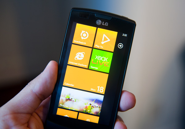
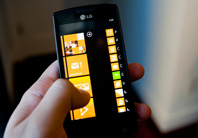
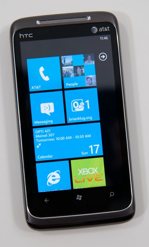
Microsoft calls it the Start screen. It’s a two page screen. The first page has a collection of square and rectangular tiles. These can be links to applications, web pages or even Bing Maps directions. The tiles can also link to Hubs, which are collections of applications and data under a common genre (e.g. the Xbox Live Hub is where you’ll find all of your games).
By default, the first four tiles are the same on all Windows Phones: Phone, People, Messaging and Email.
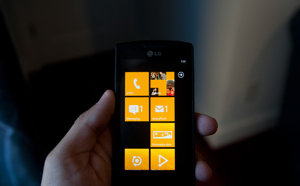
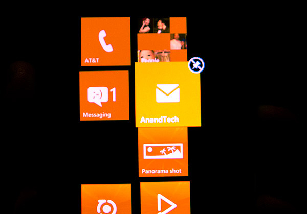
The next four are open for carrier customization. Carriers/OEMs can choose to populate as many of the next four as they’d like. While Microsoft won’t enforce a clean install on every Windows Phone, it does ensure that anything your carrier/OEM installs on top of the OS can be uninstalled. My Samsung Focus for example came with a bunch of AT&T apps. Not only can they be unpinned from the start menu, they can also be completely uninstalled. Carriers get the option to differentiate, but users get the option to say no, it’s a win-win situation. If you do a factory reset of your phone however, it will restore the phone to its original state - which will include reinstalling carrier/OEM installed apps.
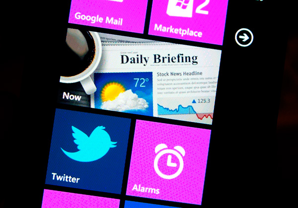
An example of an OEM installed app
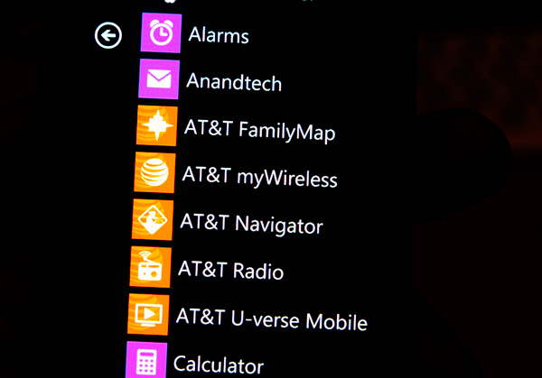
...and the list of AT&T installed apps on the Samsung Focus
The start screen is completely customizable. You can change the order of the tiles and remove any or all of them if you’d like. I found Microsoft’s start screen to be more useful than the default home screen on both Android or iOS. There’s less clutter and more of what you use most frequently is front and center. It’s like the left hand side of your Start Menu in Windows, except instead of automatically populating based on frequency of use it’s static. I suppose at some point we might see a more dynamic Start screen in Windows Phone. The only complaint I really have is that the camera tile isn’t there by default, but a quick pin later and all is well with the world.
The Windows Phone UI is built primarily to be used in portrait mode. While many apps will rotate to landscape, the intended use is in portrait. To deal with the obvious width limitations of a portrait phone, Microsoft made it very clear that nearly every app is wider than a single screen. While Android and iOS treat each screen as a discrete page, Windows Phone gives you a little preview of the next page to help convey the wider-than-visible UI. As far as how it works, the experience couldn’t be more natural. Virtually all apps implement this wide UI, including the start screen.
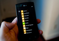
The start screen is the most traditional of multi-page UIs in Windows Phone. There’s a little animated arrow in the top right telling you that there’s more to be found at the next screen. Tap the arrow or flip the page and you’ll get to the second page of the Start screen: a list of all of your apps on the phone. There’s nothing more to it, just a simple list of everything on the phone. The GPU accelerated UI makes scrolling through the list super fast and smooth. And to be honest, a list of apps in alphabetical order is a lot simpler to navigate through than pages of app icons. I suppose eventually Microsoft may have to introduce another organization element to the app list (nested folders anybody?), but for now it works well.
Embarrassingly Smooth
Microsoft developed the Windows Phone 7 UI under the codename Metro. It’s supposed to represent the sort of simple chic design you’d find popular in a big city. If Windows Phone 7 is Metro, Windows Mobile 6 was probably suburban. A more accurate codename for the UI would have to be Liquid - there’s just no other way to describe the interface other than fluid.
There are two dominant UI elements spread throughout Windows Phone: the tile and tappable text.
Tappable text is exactly what it sounds like and the OS is littered with examples. Even conventional tabs are nothing more than oversized text in Microsoft’s Segoe UI light font.
The tabs are incredibly useful in Windows Phone, I’d say just as useful as the first time we got tabs in desktop OSes. In the email app for example there’s a tab for viewing only unread messages. To get to that tab, just swipe to the left. Microsoft calls this "pivoting." You even get a preview of the tab before you swipe to it thanks to Microsoft’s wider-than-a-single-screen interface.
Windows Phone tabs are used extensively in other applications. The Music app uses tabs to switch between what’s currently playing and all of your sources of music. The Videos app uses them to sort between different types of videos (e.g. personal vs. movies or TV shows). Apple and Google use tabs in their smartphone OSes but they’re more traditional. Your finger tends to hover around content, and swiping an entire screen to get to the next tab is just quicker than repositioning your finger at the top or bottom of the screen to tap a button. Switching between tabs in Windows Phone just feels more fluid than in the Apple and Google offerings.
The second basic UI element in Windows Phone 7 is the tile. At least on the Start screen, a tile is nothing more than a giant, optionally animated icon. Tiles can either be square or what Microsoft likes to call a double wide, effectively two tiles placed next to each other.
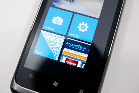
The default tile is composed of a simple white symbol (e.g. a phone, a camera or an IE logo) and a single line of text.
There’s a fine line between a text heavy UI and navigating through a book. Microsoft stays on the right side of that line by making extensive use of color and animation. Most screens are static when you’re looking at them, but start interacting with the screen and the OS subtly updates various parts of the screen to keep everything lively.
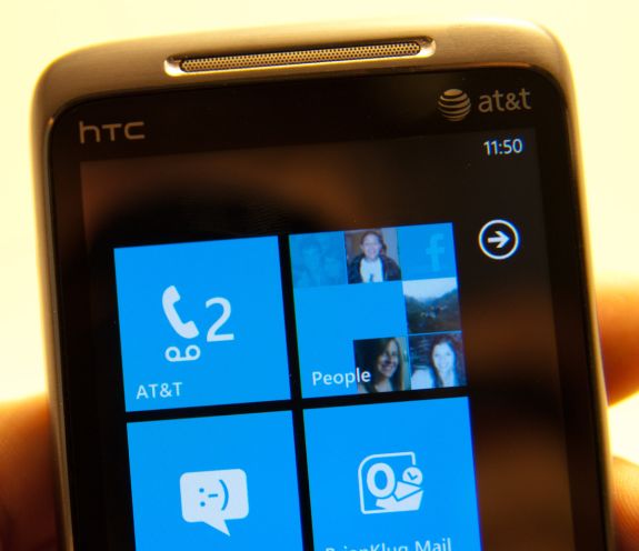
Assuming you’ve synced your contacts and/or provided a Facebook account, the People tile will display mini profile pictures of your friends. The OS automatically cycles through your friends and you don’t have to do anything to customize it, it just keeps things fresh.
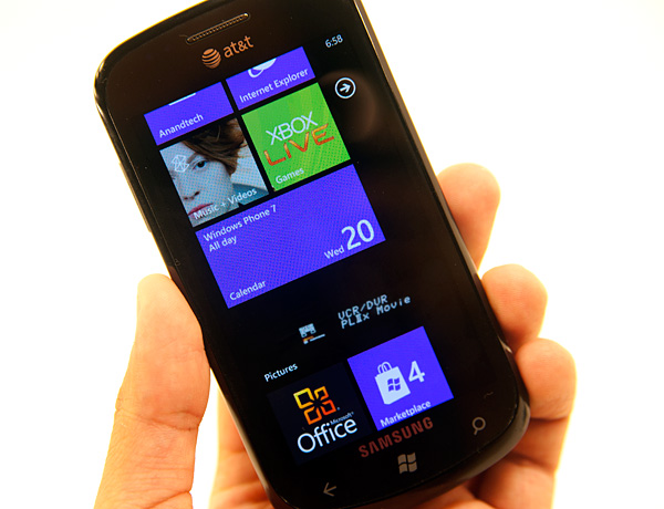
The same is true for the Pictures doublewide. Your actual photos will cycle in here. The Music + Videos tile will display a photo of whatever artist you just listened to.
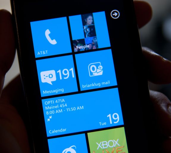
The UI is also functional. The Calendar doublewide gives you a listing of your appointments for the current day. Tiles for email, phone and the marketplace spawn counters to tell you how many new items (e.g. emails, missed calls/voicemails) lay within.
Animations are spread heavily throughout the OS and virtually all of them are GPU accelerated.
Windows Phone 7 runs two threads in parallel related to the UI: the render thread and the UI thread. The former preps the current frame for rendering and the latter predominantly handles user input. Most manipulation of objects, animation and transitions is handled by the GPU. In fact, Microsoft seems to have recognized the performance deficit on current ARMv7 processors and shifted most of the performance burden to the GPU.
The entire OS only supports a single GPU at this point: Qualcomm’s Adreno 200. Eventually we’ll see support for the 205 and other GPUs, but today, that’s all Microsoft supports. It’s an important limitation because it ensures that all Windows Phone 7 devices, regardless of vendor, have a fully GPU accelerated UI. While Qualcomm’s Adreno 200 GPU isn’t exactly fast, it’s fast enough to run all of the OS UI animations at a constant 60 fps.
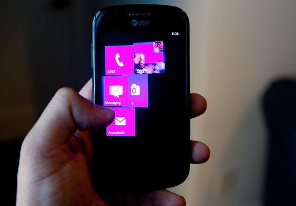
Start screen flying out, mid animation
The GPU is put to constant use in animating everything from moving around within an app to launching the app itself. Apps don’t just appear, they fold in. Tap anything pinned to your Start screen and the tiles will quickly fly, piece by piece. The app/hub you tapped on will fly in with similar pomp and circumstance. Even within an app, switching between tabs is an extremely smooth affair. The Start screen animation occasionally feels like it takes too long, but for the most part it’s a non issue.
The high frame rate animations and the absence of any dropped frames makes Windows Phone feel very fast (at times even faster than iOS). It also makes any occasional choppiness or slowdown from downloaded apps very frustrating.
For the most part the UI never slows down, but once you start downloading apps from the Marketplace all bets are off. Many of the 3rd party apps and even Microsoft’s own Xbox Live Extras app drop frames like there’s no tomorrow. That’s the biggest concern I have for the initial wave of apps: they won’t be tuned for performance as much as the apps you get with the phone. The core OS is so fast you assume the rest of the WP7 world will be the same. Ultimately as performance agnostic as Microsoft has tried to make Windows Phone, you will eventually run into UI slowdowns - just not with the Microsoft apps that come with the phone.
Progress bars echo the UI’s minimalist design. You get five animated dots that fly by the top of the screen when you’re waiting for network response (e.g. loading pages in the Marketplace).

All of the progress bars animate smoothly and seemingly linearly, which helps make the phone feel fast even when it’s taking a long time to do something. This is made most evident while loading web pages in IE mobile.

The overall UI is very well thought out. It’s clean, attractive and performant. It’s easily the best UI Microsoft has ever created and one that I hope inspires revolutionary designs within the company’s other business units.
Minimalist, Even Down to the Status Bar
When Apple introduced the iPhone, Steve Jobs made the point that a virtual keyboard was preferable to a fixed keyboard because you shouldn’t always be stuck with the same keyboard layout. Some applications would require a slightly different layout and other applications wouldn’t need it entirely. A physical keyboard requires you to pay the space penalty regardless of what you’re doing with the phone.
Microsoft takes that same argument even further with Windows Phone 7. The status bar present on all smartphones indicates things like signal strength, WiFi reception, Bluetooth status, remaining battery life and the current time. On a Windows Phone, the status bar remains hidden most of the time. The only element that’s nearly always present is the current time. The rest stay hidden unless you tap the top of the screen to reveal them for a short period of time.
Microsoft views these items as only useful for short period of time. All that’s necessary is a quick glance to check on their state, they don’t need to be a permanent part of the OS.
When you first wake your phone up you’ll see the full status bar, but the moment you unlock it the bar disappears leaving only the clock (of course the disappearing animation is very well done).
Elements of the status bar will appear on their own if something significant has happened. For example if you walk into range of known WiFi you’ll see the WiFi icon appear as the phone connects.
This is one of those features that you’ll either love or hate. Microsoft tried to do what it thought was best across the OS and you’re not always going to agree with its decisions. In this case, there were a few times when I wished the status bar was permanent. If my phone was loading a webpage slowly and I wanted to know if poor reception was to blame, or to just find out how much battery life I had left. Both of these problems go away if we eventually get faster/better network coverage and phones with significantly longer battery life, but today they are concerns. Despite the obvious limitations, the auto hiding status bar paves the way for what is ultimately the cleanest smartphone UI on the planet today. All that’s visible on the screen is what you’re ultimately trying to do with the phone. If it’s email, that’s all you see, if it’s a web page that’s pretty much it.
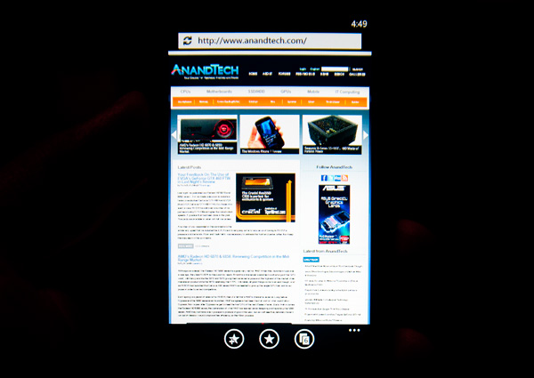
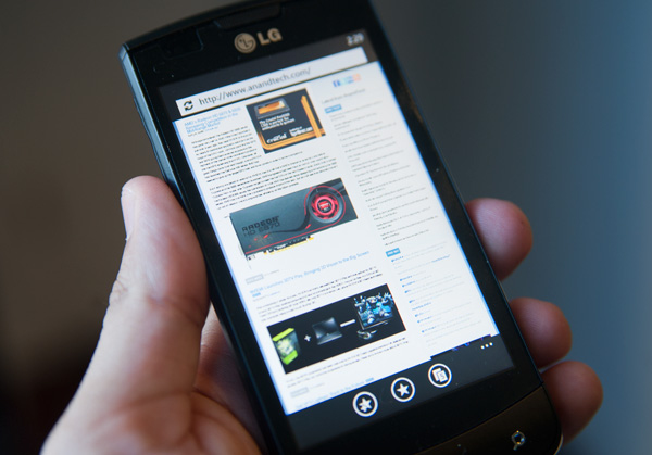
Even the URL bar in IE is thinner than what you’d find on Android or iOS. It’s almost uncomfortably thin. But Microsoft believes it’s worthwhile to always display it (rather than hide it as you scroll down) and there’s no need to make it bigger than it needs to be. Tap on the URL bar and you’ll get a slightly bigger version for text input (but still not too big).
The App Bar
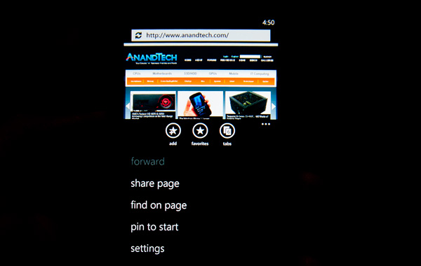
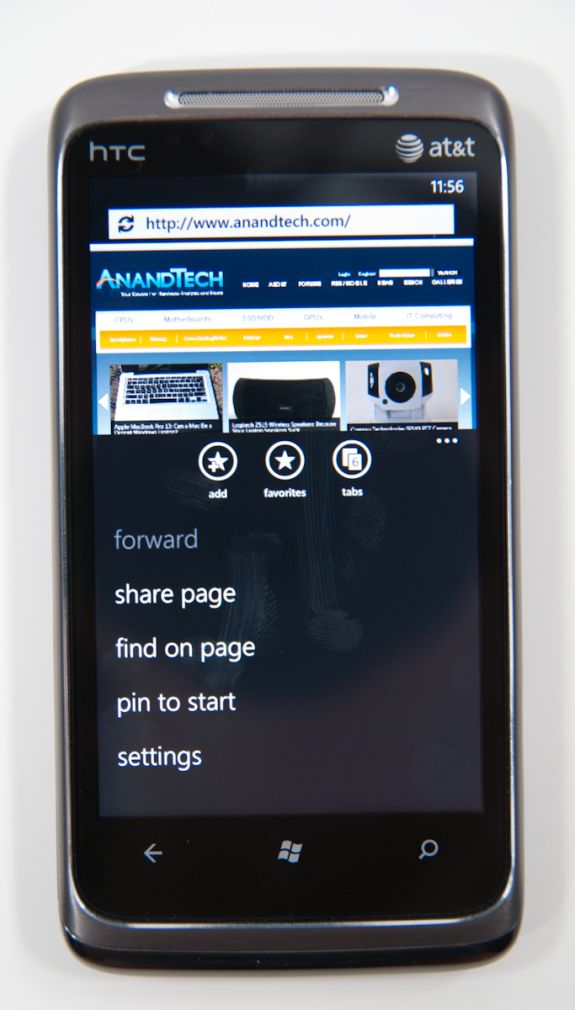
Some applications need more functionality than can reasonably be provided by Windows Phone 7’s very minimal interface. For those applications Microsoft uses the app bar. The app bar is a group of buttons (up to 4) at the bottom of the screen. The app bar in IE mobile has three buttons: add (to favorites), favorites and tabs.
All app bars have an ellipses in the far right corner. Tapping the ellipses will not only reveal more options, but it will also reveal the text labels for the buttons on the app bar to help new users learn the ropes. To keep the app bar as simple as possible no buttons on any app bar are labeled, you’re supposed to eventually just know what they mean.
I found myself tapping the ellipses to figure out what certain buttons did but the longer I used the phone the less I needed the labels. The space savings worked, good job Microsoft.
Themes
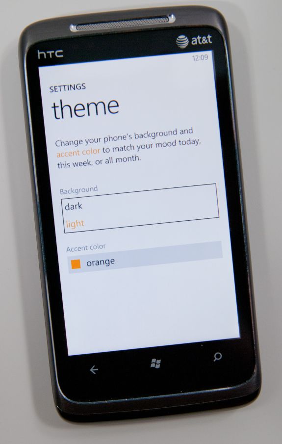
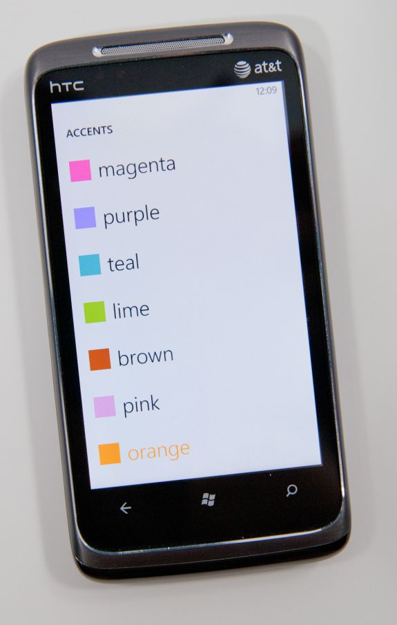
Despite Microsoft’s strict UI policies within Windows Phone, you can tweak two parameters to customize your phone: the background color and the theme color. You can choose white or black for the background color, although I’d recommend against white if you have an AMOLED or Super AMOLED phone as it can significantly reduce battery life.
The theme color controls things like the color of your tiles, color of links and even the color of progress bars in IE. The color options are all either bold or vibrant or a little of both, and they dramatically change the look of the device.
I’d say Microsoft got the personalization down just right. You can change the photos on your lock screen but everywhere else the background is either black, white or a picture automatically selected based on the content you’re viewing.
The theme colors are consistent once applied and refreshing to switch between. It’s like getting a case for the inside of your phone.
The UI customizations preserve a standard experience across all Windows Phone devices. Microsoft definitely learned from Windows Mobile.
Notifications
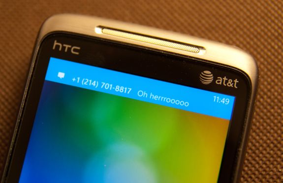
Notifications are still a sore spot for iOS users. Thankfully, Microsoft did a good job with notifications in Windows Phone. In general WP7 uses a small slice of the top of the screen real estate to deliver both the kind of information about phones that users need (signal, battery, and status), and also deliver ‘toast’ notifications.
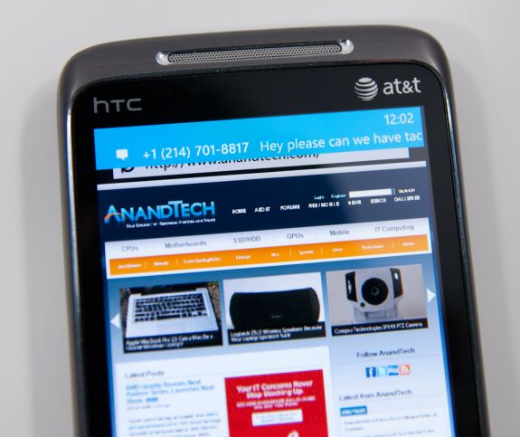
I’ve shown some of that before already. Incoming messages show up and have the contact’s name or number (depending on whether you have a contact card for them), and a snippet of the message. You can tap on that and dive into the messaging application, or swipe the message off to the side and ignore it:
It’s sort of a hybrid combination of WebOS’ notification system. The only small concern I have is that after a toast fades away, there’s no way to see it again. If you’re browsing and want to finish reading a paragraph before responding, you’ll probably miss the message toast. Then you’re forced to hop out of IE, hop into messaging, and get back. You end up missing out on the otherwise excellent IE -> messaging -> back to IE workflow enabled by the back button. It’s a tremendously minor gripe, but it’s important to differentiate that WebOS keeps those notifications at the bottom until they’re dismissed, WP7 dismisses them for you after a few seconds.
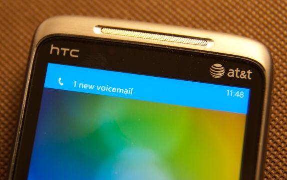
Voicemails also result in a notification the same way, popping up a simple new voicemail toast when something is incoming:
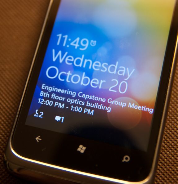
On WP7, there really are about 4 different ways to get notified about messages, missed calls, and voicemails. With toasts directly like I’ve already shown, with tiles on the start page that change and show a simple counter, and at the bottom of the lock screen:
Push notifications from applications will also show up as toasts, and there’s an in-application notification system as well. I’ve yet to encounter either of these two, but they’ll definitely be leveraged at one point or another.
I’d say in general that WP7 has struck a balance with its notification system that puts it some place inbetween the competition. iOS either freezes whatever you’re doing and pops up a big bubble right in the middle of your screen, or you can turn that off and get nothing at all. Android sticks everything in the notifications bar at the top and expects users to check that by dragging down. The result is that one gives you a ton of information at the cost of being annoying, the other keeps it all hidden away. Again, it’s obvious that WP7 takes nods from WebOS.
As we already mentioned, the top of the screen isn’t just used for toasts however. WP7 still needs to deliver basic information critical to the operation of the phone. Information like signal strength, network status, vibration status, and battery level. WP7 will drop down status indicators as appropriate, but only when it’s relevant. In a call, signal bars will drop down, but nothing else. When you’re hopping on or jumping off of WiFi, the wireless indicator will animate appropriately. It’s an interesting way of keeping the interface clean. I still prefer seeing all this information all the time, but I understand what the WP7 team was going for here.
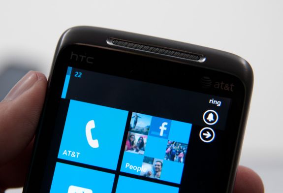
Tap volume, and you’ll bring up another toast-like notification where you can toggle vibrate/ring and change the current volume level:
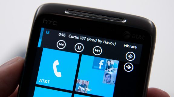
When playing music, there’s a similar kind of notification toast, except now you can skip tracks and pause:
There’s also a black on white version of all these if you change your theme settings:
Though the toasts remain the solid accent color set in themes.
OEM/Carrier Customization: One Part Apple, One Part Google
For the past couple of years we’ve had two options at the forefront of the smartphone race. If you want the ability to choose your own device, customize your OS and run virtually anything you want to: Android has you covered. If you want more of an appliance experience and don’t mind giving up freedom in hardware choice or OS customization, there’s always the iPhone. Apple will never sell iOS on non-Apple hardware, and until Android 3.0 Google won’t enforce a consistent UI across all partners. Microsoft falls smack in the middle. If you weren’t totally happy with either option, Windows Phone may be what you’ve been looking for.
The OS and user experience are pretty much off limits for carriers and OEMs to customize. Microsoft will not allow any custom skinning or replacement of default apps. While Android lets you switch out the virtual keyboard software, Microsoft takes a more Apple-like approach and instead delivers what it believes is the only keyboard software you will need. Microsoft wants all Windows Phones to look and feel the same from a UI standpoint, so custom UIs are out. Don’t expect to see HTC’s Sense or Samsung’s TouchWiz permeate Microsoft’s latest OS.
Even hardware specs are pretty well dictated by Microsoft. All first generation Windows Phone 7 devices must use a Qualcomm Snapdragon SoC with Adreno 200 GPU, they must feature at least a 5MP camera and an 800 x 480 screen. A physical keyboard may be optional but all must implement Microsoft’s virtual keyboard via a capacitive multitouch screen.
There are three buttons that must be present along the bottom of the face of any Windows Phone: Back, Start and Search. The buttons must be present in that order, avoiding the confusion of reordered buttons we sometimes see on Android devices. The type of button is up to the OEM to decide: either capacitive touch or physical buttons can be used.
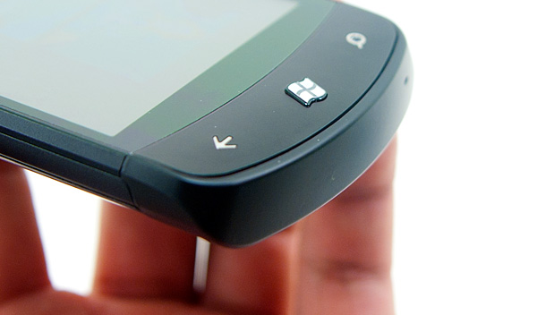
At the top left of any Windows Phone there must be a volume rocker. The top right has to have a power/lock button. The lower right has to have a physical camera button capable of waking the phone up from sleep and putting it directly into the camera app. Microsoft views the smartphone as the replacement for the point and shoot camera and thus Windows Phone needs to be able to function just as quickly as a P&S. Finally, all Windows Phones must have a 3.5” stereo audio out jack and support for headsets with three button integration. These are headsets similar to what Apple ships with the iPhone with button(s) on the cable itself.
Microsoft wants OEMs to compete based on hardware design. Windows Phones can take any shape and size, but they must meet these basic requirements. It’s Microsoft’s way of saying: feel free to differentiate, but don’t ruin what we’ve built.
With this approach Microsoft hopes to avoid the mistakes Google has made with Android, where there’s an inconsistent user experience going from HTC to Samsung to Motorola Android phones. It’s almost as if Microsoft is taking Apple’s approach and simply letting everyone build iPhones.
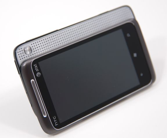
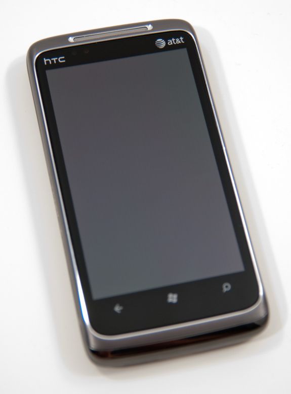
The OEMs are understandably nervous of what Microsoft is proposing. From what I’ve heard, Google is putting a lot of pressure on its partners to remain pro-Google. That combined with Microsoft’s unproven track record in this new smartphone world resulted in many OEMs shipping very conservative designs for their first Windows Phones. Many of these designs are recycled from previous phones. The Samsung Focus is a lot like the Samsung Captivate, and the HTC HD7 is very similar to the HD2. If Windows Phone gets enough traction, then (and only then) will we see riskier designs from Microsoft’s partners. If you’re wondering why there aren’t any truly sexy WP7 phones out at launch it’s just a matter of OEMs wanting to see if Microsoft really has a chance before committing to a more impressive design.
There’s also no carrier exclusivity here (although I suspect the Apple/AT&T deal is close to being over at this point). Microsoft is launching first in the US with AT&T, however T-Mobile and Sprint phones are forthcoming. Verizon is curiously absent, but if you paid attention to my Google pressure line above it’s not too surprising.
Facebook Integration
Windows Phone does the best job of Facebook integration I’ve seen of any smartphone platform.
Palm’s webOS was the first to seamlessly integrate Facebook into a modern day smartphone. Supply it with your Facebook credentials and you saw the entirety of your oversized friends list appear in your phone contacts. Email addresses, IM accounts, phone numbers and more were all automatically populated in your address book. If any of your Facebook friends changed their information, the information updated on its own on your phone. It was the wave of the future.
Spiritually, Microsoft picks up where Palm left off. You can do the same sort of blanket integration that you could with the Pre. Supply your Facebook login information and Microsoft syncs all of your contacts through the cloud. Unlike webOS however, Microsoft gives you an option to not sync all of your Facebook friends. You can choose to only sync those Facebook contacts who are already in your address book (from Google, Hotmail, Exchange or Yahoo).
Microsoft integrates Facebook in more places than just your address book however. Meet the People Hub.
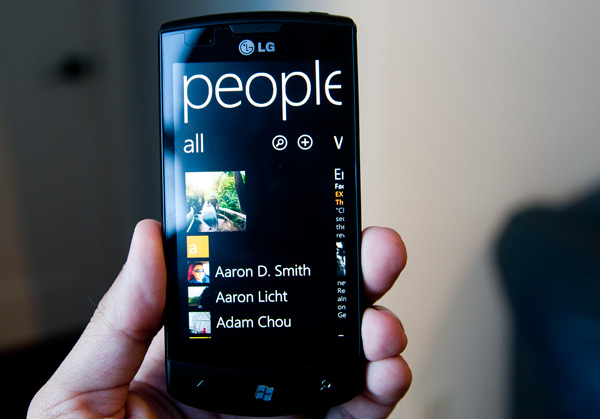
People Hub
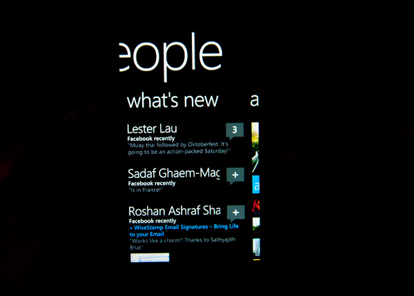
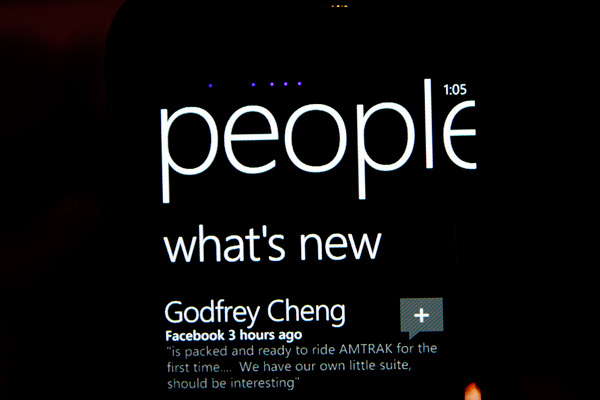
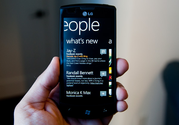
For all intents and purposes the People hub is the Facebook app for Windows Phone 7. If you’ve supplied your Facebook login, the default “what’s new” tab will serve as your news feed. It’s not the reduced load Top News feed you get from Facebook, but literally the most recent news from all of your Facebook friends and pages. You get 25 posts by default (non customizable) and there’s a get older posts button at the bottom of the page if you want to see more.
It’s not a total Facebook app replacement as you don’t get non-content updates. Items like who your friends have added to their friends list are absent from the feed. There is also no integration of friend request management. The Facebook integration is mostly for passive consumption with a couple of exceptions. You can view and add comments to posts as well as like posts, however you can’t see who has liked a post (just the number of likes for any given post).
Tapping on anyones name in the what’s new feed brings you to their contact page. You can view their “what’s new” feed and comment on their posts. You can also view their profile which will pull in data from both Facebook and your contacts (e.g. through Google or Live). Microsoft clearly (and cleanly) indicates what sources it is using to pull the profile information from under the contact’s name.
If you really like talking to/keeping tabs on/being creepy to a person, you can pin their profile to your Start screen for easy access.
From the profile tab you can write on their Facebook wall, send an email, make a phone call, send them a text message or even bring up their address on Bing maps.
All of these functions are super fast and seamlessly integrated into the experience. Quickly writing on someone’s wall without having to fire up a separate Facebook app couldn’t be faster. There’s literally a Write on wall screen that quickly appears when you select the option to. Sending an email or text message from the profile screen is a bit slower since you’re technically switching to another app, but it’s near instantaneous.
Here’s where the functionality of the back button really one-ups iOS multitasking. Let’s say I’m viewing a friend’s profile and I want to get directions to his house. I can click on his address on the profile page which will immediately fire up the Maps app. I can use Maps to quickly see where he lives (or eventually get directions) but now when I want to go back to his profile to send him a text message, there’s no double tapping or app selection - I just hit the back button and I’m back at his profile. Had I tried to get directions while at the Maps screen I would’ve tapped the back button twice (once to get out of directions and into the normal map and once again to go back to the profile) but it’s still a snappier process than manually switching between apps in iOS. The advantage is really limited to these types of scenarios however.
There’s still the need for a standalone Facebook app for more of the FB-specific features (gift giving, messaging, apps, chat, etc...), but the People hub gives you access to the most commonly used tasks. Update: A standalone Facebook app is now available for WP7.
While you can exclude Facebook friends who aren’t already in your address book from appearing in your address book, doing so will not keep those friends from appearing in your what’s new feed. The good news is that the what’s new feed will respect your Facebook news feed options. If you’ve removed someone’s updates from appearing in your Facebook news feed, their updates won’t appear in the what’s new tab on Windows Phone 7.
Today Facebook is front and center with Windows Phone, but it would be just as easy for Microsoft to extend the interface to support other social networks or status aggregators. Twitter obviously comes to mind and while Microsoft isn’t officially announcing anything yet, that’s clearly a target that we can expect to see pulled in at some point.
Aside from the news feed, there are two more tabs to the People hub: recent and all. The recent tab is actually a two-page tab that displays up to 8 tiles of people you’ve either recently communicated with or whose profiles you’ve viewed/stalked. The tiles are animated so you’ll see them alternate between a photo, photo + name, or just name.
This tab is effectively your favorites as there is no such functionality in the Phone app. You don’t get one touch dialing or emailing unfortunately, you’ll need one tap to select the contact and one more to choose your communication method.
The all tab is exactly what it sounds like - a list of all of your contacts. The topmost contact? A big link to your own profile of course, which you can use to provide status updates on your Facebook wall.
The search button will let you search through the all people tab. Results are narrowed down/highlighted as you type.
Tapping on any of the highlighted headers brings you to this screen, which you can use to jump to any other header in the list. I feel like the Android/iOS scrolling widget makes more sense but the Microsoft approach does work.
Facebook Photo Integration
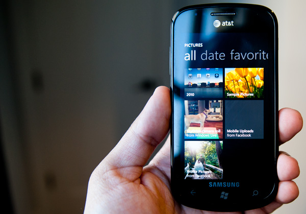
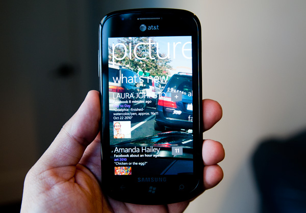
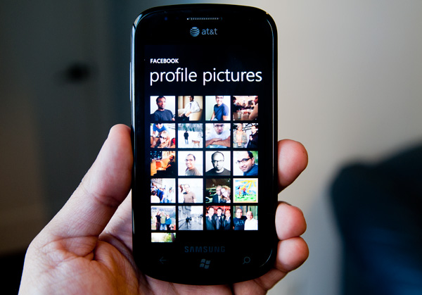
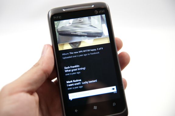
What I was more impressed by was the Facebook integration in the Pictures hub. Your profile pictures and mobile uploads are both listed as albums when looking through all of your photos by date. Browsing photos you’ve synced, photos you’ve stored in the cloud and photos you’ve uploaded to Facebook is not only possible, but done sensibly. On top of all of that, there’s also a what’s new tab in the Pictures hub that just gives you a feed of all of the photos your Facebook friends have posted recently. It’s a great way to photo stalk if that’s what you ultimately end up doing on Facebook anyway.
While Palm used Facebook as a way to integrate contacts, other companies have since tried to pull status updates and photos from the service to populate your phone. Microsoft now joins the list of those who have tried, and while the integration isn’t perfect, it’s quite possibly the best attempt yet.
Windows Phone Cloud Integration
One of the redeeming features of the failed KIN was its cloud integration. The entirety of your phone, everything from your contacts to your photos were synced with the cloud. If you ever needed to access a photo you took with your phone all you needed was your Live login and you’re good to go. While the KIN was short lived, its cloud integration features live on in Windows Phone, with some enhancements of course.
The hub for all of your Windows Phone cloud interaction is a website Microsoft put together: windowsphone.live.com. You authenticate using your Live login and once in there’s a lot you can do, all for free.
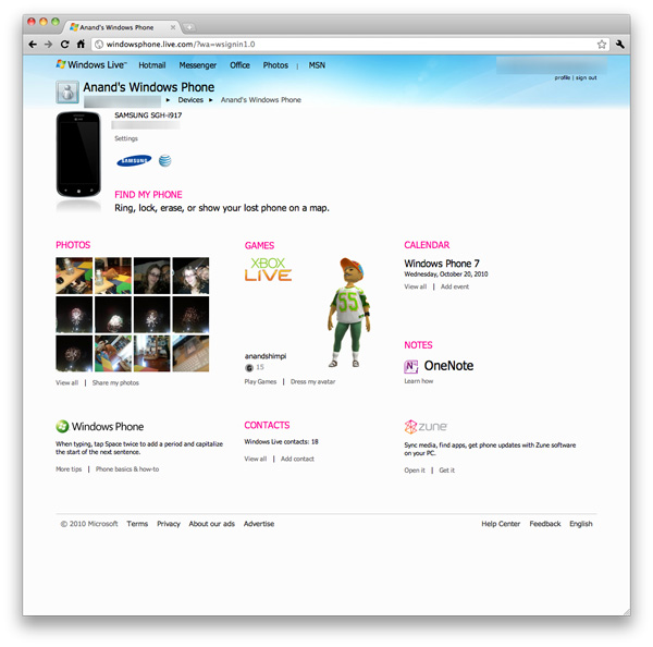
At the top left of your home page is a photo of your phone and your phone number. If you click on the Find My Phone link you’re taken to a page you can use to find your phone on a Bing map, make your phone ring, remotely lock or erase your phone entirely.
The mapping feature works pretty well. Within 30 seconds you’ll get a fairly accurate location of your phone on a map. The site also stores the position of your phone the last time you requested its location. For this feature to work you need to enable it on the phone itself. If you want more instantaneous results you can trade off battery life for location speed, presumably by just leaving the GPS radio on all the time.
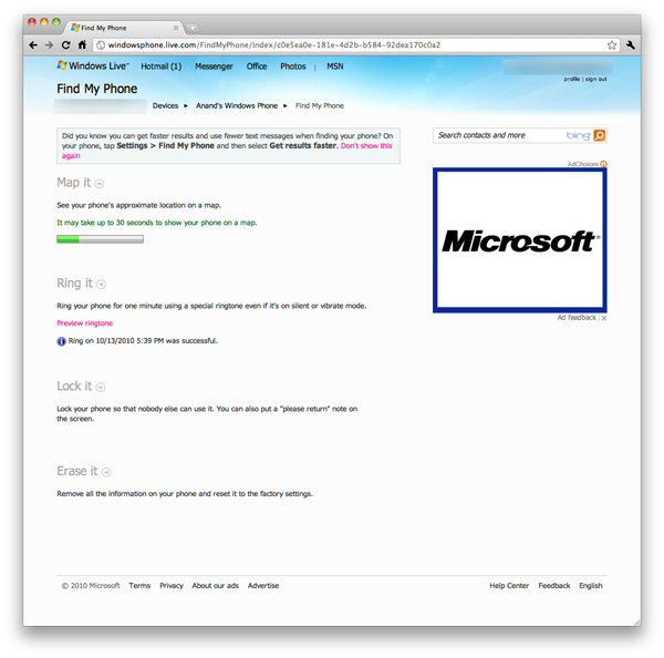
Remotely ringing your phone works as advertised. If you have your ringer off or volume turned all the way down the remote ring will still go through, although the actual ring will be quieter if your volume is turned down to 0.
Remote locking works well. You supply a four digit password and optional message to display on the phone. Microsoft won’t let you supply a simple password like 1111 or 1234, you need to be a little more creative than that.
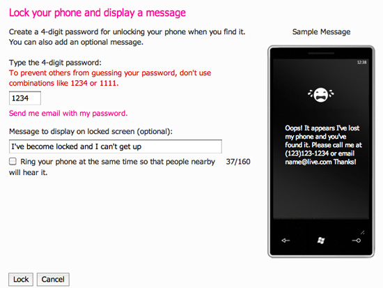
Finally there’s the erase function. The best part of this entire suite of tools is they are all free and they come supported on all Windows Phones.
If you’re not trying to do things remotely to your phone there’s still one very important piece of functionality windowsphone.live.com offers: automatic backup of your photos.
By default any photos you take on your Windows Phone aren’t mirrored in the cloud. However if you’re feeling trusty, you can opt to do just that. There are three levels of sharing options for your photos in the cloud: share with no one, share with friends or share with everyone.
A friend is defined as someone whose information you have in Windows Live either through your address book or Live Messenger. You can also manually add names to your friends list for the purpose of sharing photos.
Microsoft allows Facebook style sharing of photos with not only your friends, but their friends as well. You can even let your friends add their own photos, edit details and delete photos if you’d like.
Photos are uploaded in the background from your phone and they are treated as normal bandwidth usage. That means if you’re on the cellular network and you have a limited data plan, these auto-uploaded bytes count against your monthly limit. AT&T indicated that Windows Phones wouldn’t have any special treatment on the network, so you’ll pay the same rates for data that iPhone users pay.
Uploaded photos reside on your Windows Live SkyDrive account, which is automatically setup for you when you sign up for Windows Live. A single SkyDrive supports up to 25GB of storage for free, presumably you won’t be able to sync photos to the cloud beyond that amount. I say presumably because it’s nearly impossible to test. Windows Phone 7 doesn’t upload full resolution/quality images to your SkyDrive, instead you get a reduced resolution, higher compression version.
All Windows Phones have to sport at least a 5MP sensor, however photos synced to the cloud are stored at 0.3MP - 713 x 539 is what the Samsung Focus’ photos ended up as. File size was always under 90KB. Photos of complex scenes weighed in at around 80KB, while scenes with a lot of easily compressible data (repeated colors, solid backgrounds) were down below 60KB. The resulting image quality is ok but nothing to write home about.
The entire Windows Live web interface desperately needs an overhaul. It’s the one part of the Windows Phone experience that just doesn’t mesh. The functionality is nice but I would like to see higher resolution photos stored online, 0.3MP just isn’t enough. Perhaps when we get more generous data plans from the carriers we’ll see that sort of upgrade on the phone.
Rebuilding a Brand: IE mobile
If there was anything to take away from Windows Mobile, it’s that building a platform with a slow, glitchy browser doesn’t sell. Likewise, if there’s one thing Apple deserves credit for, it’s bringing truly smooth desktop-like browsing to the handheld with Safari. Google and BlackBerry alike can speak to just how important mobile browsers are to platform success, and to woo users from any smartphone platform, WP7 needed to have a fast mobile browser.
When I first heard at MIX10 that WP7’s browser would be built around IE 7 with components from IE 8, I wasn’t sure what to think. That’s right, WP7 is running a mobile port of IE 7’s Trident layout engine - but it isn’t bad. Actually, far from it - it’s quite usable.
First up, Internet Explorer is given its own tile on the home screen. Note that there’s no “mobile” here or insinuation that this is the “pocket” version like it was formerly known by on WinMo, it’s straight up IE. On the first launch, you’re brought to an AT&T captive portal, but ironically enough there’s technically no home page on WP7, future launches bring you to a blank start page.
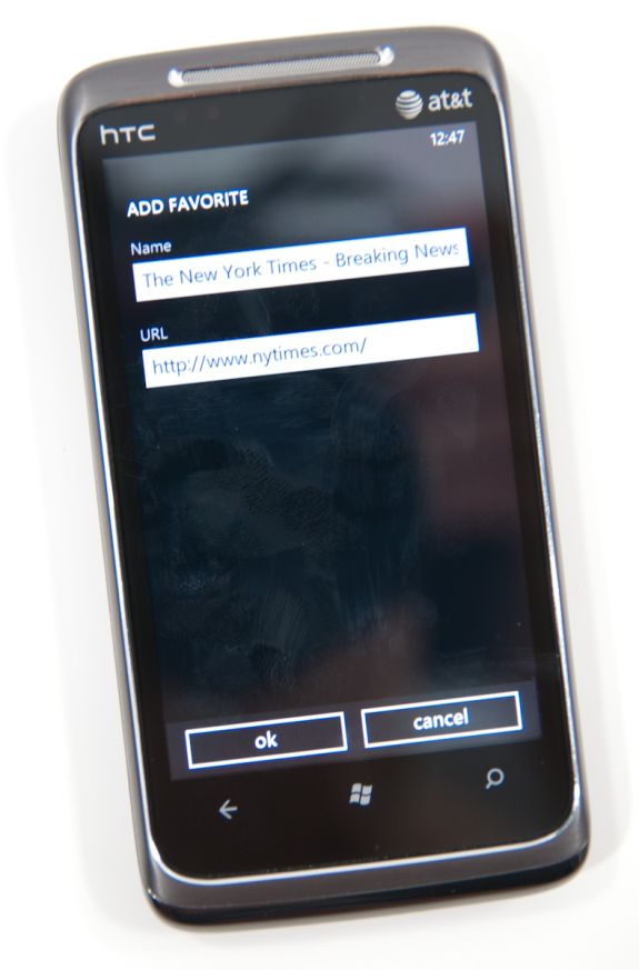
At the bottom are three buttons - add to favorites, favorites, and tabs. Tap the settings ellipsis and you’ll expose more settings - forward ,share page, find on page, pin to start, and settings.
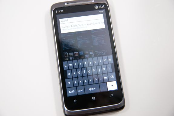
There’s a URL bar up top, but other than that the interface is very minimalist, true to Metro UI standards. Tap on the URL bar and start typing, and all the usual magic bar aides work - addresses from your history are suggested, Bing suggestions below them, and entries from favorites. Hit go, and a narrow progress strip appears just above the URL as the page loads.
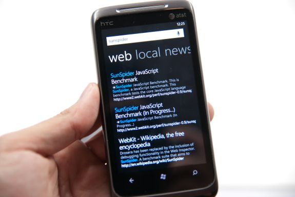
You can enter search terms in the URL bar, but are instantly transported to WP7’s Bing search application for the actual search and results. Clicking on the results brings you back to the browser. It’s a bit jarring to get yanked out of the browser and then transplanted back (and there’s no way to change your search preferences to Google, either), but it does work. More on WP7’s ubiquitous Bing search later.
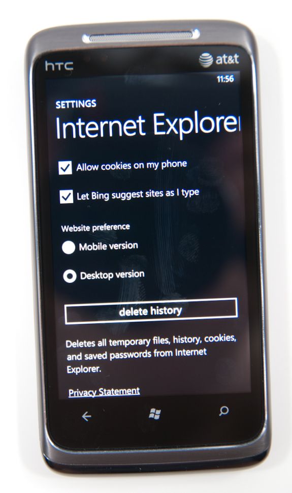
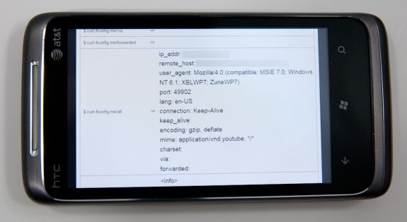
The settings pane for WP7 IE is a bit minimalistic, but gets the job done. There’s a button for clearing all the local data on the phone, but no granularity if you want to just clear history but leave cache intact, or some combination. It’s all or nothing. What’s very useful however is inclusion of a user agent switcher - Mobile version or Desktop version. For sites that support mobile user agent detection and shoot differently formatted content based on that, this is useful.
WP7 calls presents its browser user agent as “Mozilla/4.0 (compatible; MSIE 7.0; Windows NT 6.1; XBLWP7; ZuneWP7)” in desktop mode, and “Mozilla/4.0 (compatible; MSIE 7.0; Windows Phone OS 7.0; Trident/3.1; IEMobile/7.0; HTC; T8788)” in mobile mode. While there aren’t many sites right now that identify the phone in mobile view and send appropriately formatted content, that’ll change as detection includes those new WP7 entries. What’s interesting is the inclusion of XBLWP7 and ZuneWP7 in the desktop view - could a browser for Xbox be somewhere on the distant horizon?
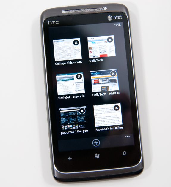
Moving on is the tabbed view. IE will let you open a maximum of 6 tabs - the current number of open tabs is displayed atop the logo itself. Though Microsoft calls them “tabs,” they really work in principle a lot more like (and bear more resemblance) to windows. There’s no tabs to be found anywhere. There’s a very smooth 3D animation switching between tabs and opening/closing them. What’s interesting however is that you can open pages in all six tabs in quick succession, and the pages themselves will keep loading and update the tile thumbnail once the page is done:
In practice, switching between tabs is very fast, as is closing many windows. It happens all with a very 3D feel and a steady framerate. It’s hard to argue that WP7’s tab switching interface isn’t as good or better than the competition’s. Pages also continue loading if you close the browser and go do something else.
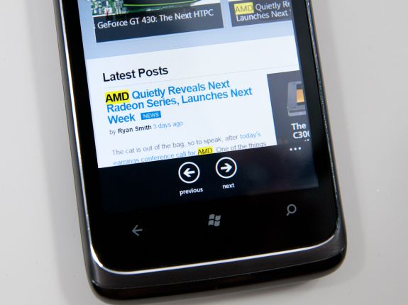
The inclusion of find in IE is a nice addition, something Android has that iOS still lacks in mobile safari. Enter a search term, and you’ll get highlighted matches throughout the browser and next/previous buttons at the bottom that cycle through instances. You don’t get the number of matches like Android provides, but find on page is at least there.
Similarly, you can pin any page to the start screen. Tap that, and a screenshot of the page shows up on the start screen in a tile of its own:
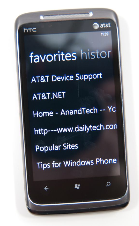
It’d be nice to see the tile reflect a current version of the page rather than the appearance it had when the tile was created - similar to how desktop browsers cache thumbnails of frequently visited pages - but this works. The favorites list is a bit spartan, consisting of a simple list of entries. Long press and you can edit or delete entries, but not change their order. Swipe left or right, and you’re at history.
One of the most common copy and paste workflows I find myself using on other platforms is simply sharing URLs. While there’s no copy paste support on WP7 yet, “share page” from the expanded menu does let you dump the current page’s title and URL into an email or SMS. You’re still somewhat out of luck if you want to share something on Twitter or another application, but copy and paste is coming soon.
There’s landscape support in IE, but you lose all of the UI elements and the browser window fills the entire screen. On one hand, you get the most possible browsing area this way, but sacrifice the URL bar, status bar, and all of the other controls. The downside to this layout is that every time you want to enter a different URL, you’ll have to rotate to portrait, enter it, and then swap back. Same if you want to change tabs or use a favorite. That can get a bit frustrating if you’re used to viewing pages in landscape, but not totally killer. There’s an impressively fluid rotation transition between portrait and landscape, however.
So how is the browser in actual use? Extremely usable and speed up dramatically since last I saw it, but there are definitely a few rough spots. It’s completely usable as it stands.
First off, panning and translating around pages is incredibly fast. It’s iOS level fast if not faster. That includes moving around pages, pinch to zoom, double tap to zoom, and inertial scrolling way down a page. IE does an impressive job keeping up with even extremely fast scrolling up or down a page. No doubt this is due partially to GPU accelerated UI. Android has some serious work to do here, as translating around on pages and multitouch zoom frequently feel choppy.
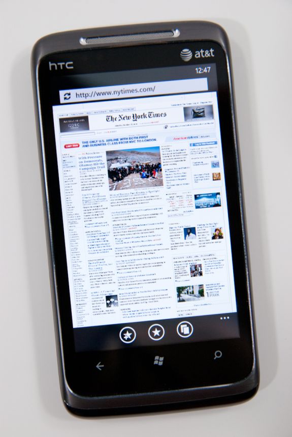
I spent an entire week with WP7’s browser visiting every site I could think of, and have yet to run into a site that doesn’t render properly. Apple showed off the New York Times homepage in some of its earliest iPhone ads, and Microsoft briefly showed off WP7 rendering the NYT homepage at MIX10. Here it is again:
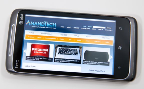
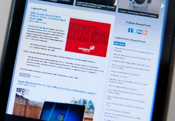
What’s a bit strange is how small fonts are rendered when one is zoomed completely out. Check out the AnandTech homepage, for example:
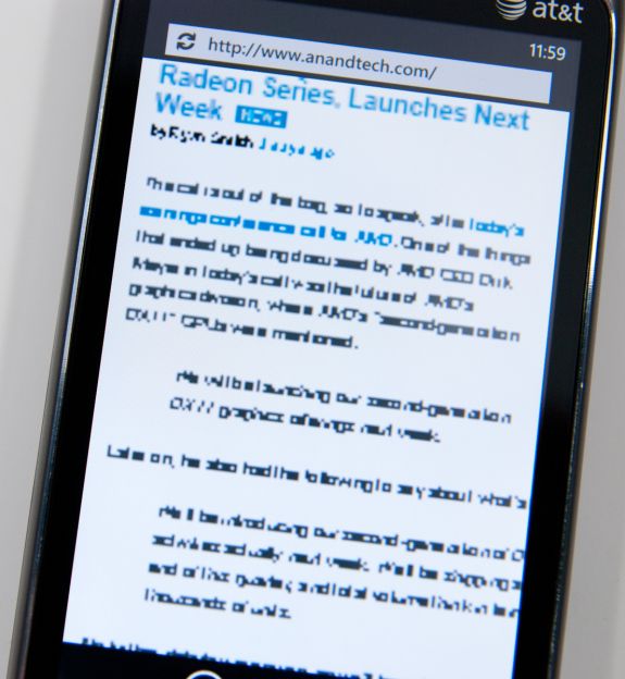
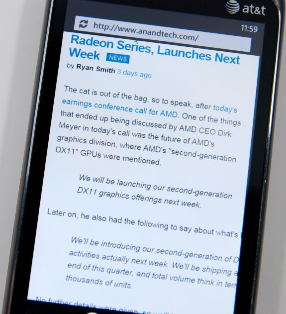
Up close, small text appears aliased and blocky, like a bitmap. The problem isn’t that text isn’t readable zoomed all the way out (it can’t be), it’s that it lacks the antialiasing larger text gets. If you quickly zoom in, that texture is enlarged and there’s a second long pause (or more sometimes) before text is re-rendered smoothly.
It’s clear that what WP7’s mobile browser is doing is rendering a large texture with the webpage, and then using a translate transform and clip (two inexpensive GPU accelerated operations) to pan the window around so smoothly. The downside is that if you zoom in a lot, you’ll blow that texture up and see the above while the browser re-renders at the new zoom level. What’s strange is that after a certain size, text is nicely anti-aliased - look at the after photograph above and it’s obvious that WP7 is doing subpixel font smoothing just like it should be.
It’s a minor nitpick, but still there. It isn’t quite the level of cheating that Opera mobile does with small text when zoomed out fully (it renders what look like grey boxes after a certain level), but some more font smoothing would be awesome.
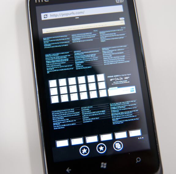
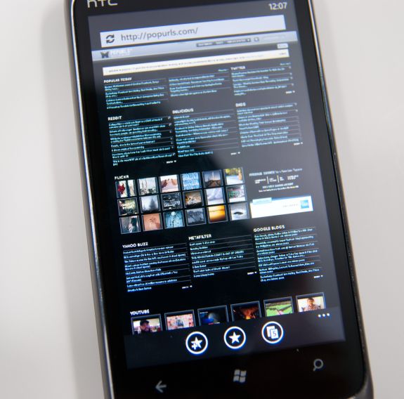
There’s also an occasional texture flash when switching between tabs. Change the tab and you’ll go from placeholder image icons to the actual photos after a very brief pause. It’s subtle, but noticeable. Take popurls for example:
It isn’t quite as bad as how iOS will completely dump a page and completely load then render it again (effectively double loading pages occasionally - which is admittely nice way to increase apparent browser market share), but it is there. This quick texture load happens more often when you’ve got lots of tabs open, but what’s strange is that not all images do the flash - only some. Then the reason occurred to me.
We’ve talked briefly about how WP7 strongly leverages the GPU for rendering the entire UI. Almost every transition and animation is carefully comprised of a few actions which are essentially fast, GPU-accelerated primitives, and there are just a few of them: translate transforms, perspective transforms, opacity, and rectangular clip. Interestingly enough, WP7 also has a few GPU accelerated media decoders, including for stills, but only JPEG gets GPU accelerated rendering, PNG is done entirely in CPU.
The textures that seem to flash most often on the AnandTech homepage at least are PNG in nature. But it still does happen to JPEGs like on the popurls page.
It isn’t that big of a deal, but it does lend some insight into how the browser window can feel so fluid panning around.
It’s really amazing how fast and capable WP7’s browser feels, and having a competent, modern browser is of huge importance for any modern smartphone platform. Microsoft has done a great job making Trident feel snappy, but where it falls short are some of the popular web standards compliance tests.
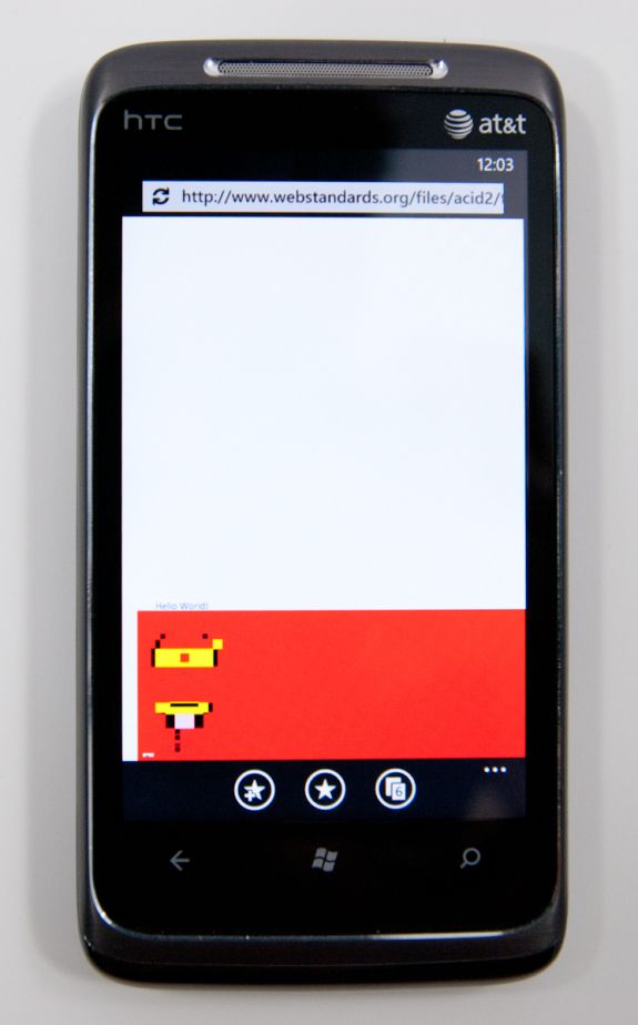
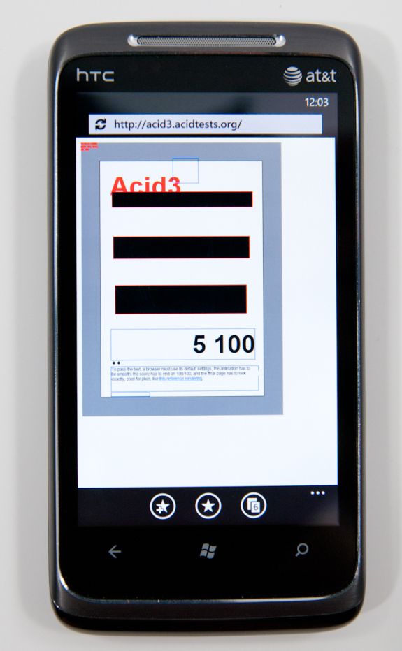
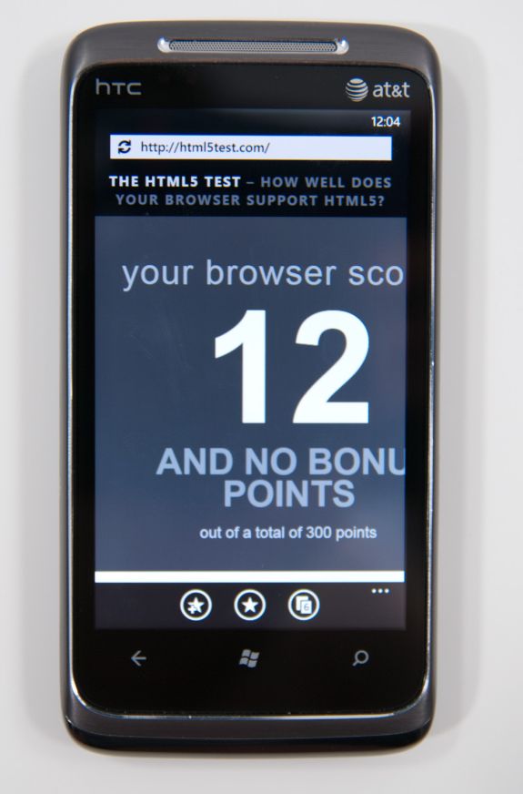
WP7’s browser just doesn’t do very well at Acid 2, Acid 3, or the HTML5 test. The results are pretty self explanatory:
What’s shocking however is that, so far, it hasn’t really mattered. I’ve spent a week using WP7’s browser, testing every page I can think of that I visit on a daily basis, and have yet to encounter anything that doesn’t render properly or crashes the browser. Never once have I been want for more in fact, outside of the font rendering qualms we noted prior.
Obviously, better HTML5 support is the future, but it’s pretty shocking just how usable the browser feels otherwise while still scoring so poorly on these tests.
Unfortunately, JavaScript performance isn’t WP7 IE’s high point either, nor is BrowserMark, both of which it scores pretty abysmally in.
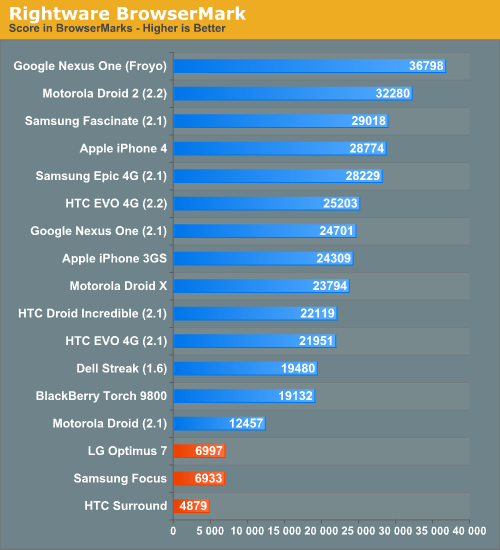
This is one area where Android holds a huge lead, and where Microsoft still needs a faster JavaScript engine. Same for actual page loading times, which are just longer than everyone else’s no matter how you spin it:
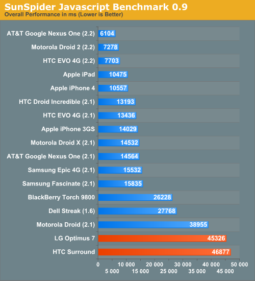
What’s surprising is that in spite of all this, the WP7 browser feels fast. It’s amazing just how much extremely fast UI can change one’s perception entirely. Slower page loading times aren’t as big of a deal anyways, since you can leave the browser and go do something else entirely while the page keeps loading. It’s obvious that WP7 makes a WebOS-like tradeoff here, sacrificing snappiness in some places for the ability to go do other things while pages are loading.
There’s no flash support in WP7’s browser right now, but it’s already on Adobe’s radar for the near future. A faster JavaScript engine and faster loading times would definitely be nice, but the browser as it is at launch feels extremely fluid in its current version.
Microsoft has done a lot with Trident and IE8 code in WP7’s browser - they claim that it lies somewhere between IE7 and IE8 in reality, but it’s hard to not argue that still more must be done. WebKit definitely remains the reigning champ in the mobile browser space, now powering essentially every smartphone platform: iOS, Android, BlackBerry 6, WebOS, Symbian, and MeeGo all use it. The irony of the situation of course is that IE9 made its earliest debut at MIX10 the same time WP7 did, and thus the improvement path is obvious. WP7 needs to eventually get IE9 code onboard and deliver much improved HTML5 compliance and JavaScript performance.
My final parting remark about IE on WP7 is that Anand and I both found ourselves occasionally confused by the back button. It sounds simple, right? You can be browsing along, and as long as you don’t leave the browser, back does what you’d expect it to do - take you back. However, if you hit home and leave the browser, then come back in and hit back, you’ll just get taken outside again. The result is that you essentially lose your back history whenever you leave the browser. Not a killer deal, but there should at least be session preservation so that back always works like a browser’s back button should, not like WP7 contextual navigation does.
Bing Search and Maps
Bing is tightly integrated into WP7. One needs to look no further than the inclusion of a dedicated (mandatory) button for search just to tell how serious Microsoft is about pushing Bing into the mobile search space with WP7.
I talked earlier about how entering a string into the URL bar in Internet Explorer takes you out of the browser, into search, and then back depending on whether you choose a web result or not. In almost every context (save the marketplace, here search searches the market), pressing the physical search button launches this unified search application.
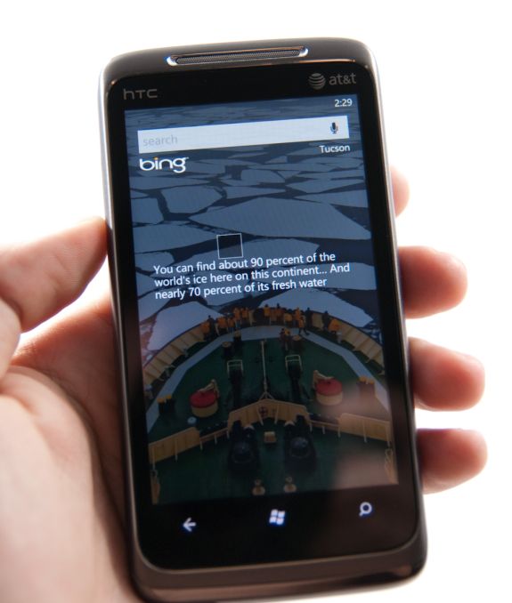
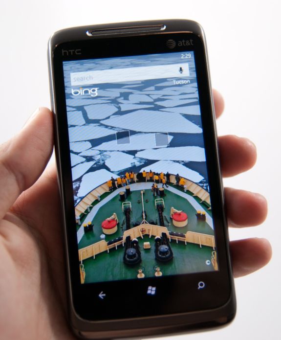
Bing search and maps honestly hasn’t changed much since I saw it at MIX10, and it really didn’t need to as far as basic maps and search go. Hit the button, and you get a Bing homepage like screen with the daily wallpaper and factoid boxes.
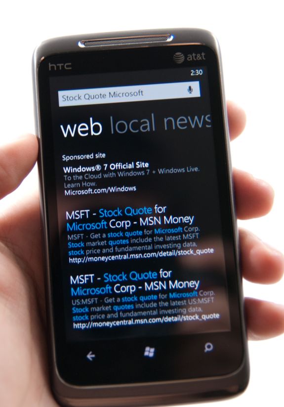
Search terms still pop up differing levels of semantic data - type a company and “stock quote,” and it’ll probably bring that down. Type “pizza in” and a city name, and you’ll get location results. It’s nice to see some intelligence here with searching. You can pivot between web, local, and news. Hit a link on web, and you wind up in the browser. Hit one in local, and you’ll probably wind up in maps. Whether or not you like Bing, the execution here is pretty above average.
What’s lacking is the ability to search local stores like the SMS library or email accounts. It’s sort of ambiguous anymore on every platform what search really does. WebOS has type anywhere, iOS has a mobile spotlight type approach, and Android does a pretty good job searching everything tied to your google account and web.
For whatever reason, WP7 only seems to want to search web facing content most of the time. Hop into messaging, hit search, and you get taken to Bing. Hop into mail, search, and you’ll search email you’ve downloaded - not what’s up on your exchange or IMAP server. Hop into people, hit search, and you’ll search your contacts, but can also search your exchange contacts. The result is that finding stuff is relegated to specific areas rather than one unified place. Whether or not this is right is more of a philosophical argument, it just happens to work that way here.
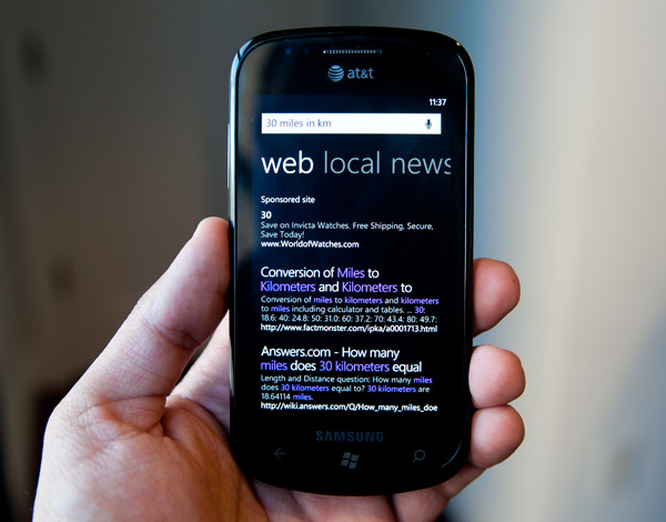
Another huge omission is the ability to search for things like shipper tracking numbers or unit conversions in Bing. The Bing website allows you to type in a FedEx tracking number or a unit conversion (e.g. 40 pounds in kg), but the search app on Windows Phone won’t give you those results. Given the data already exists on Microsoft’s end, it’s something I’d expect to see down the road.
Microsoft does still have to worry about the bottom line and thus you’ll sometimes see a sponsored search result (similar to what you’d get on a web browser) above your actual results. Microsoft says that the sponsored results will always be limited to one at most.
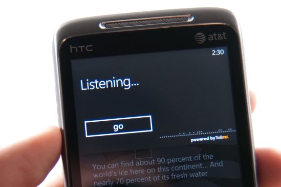
There’s also voice search support from within Bing and the entire platform. You can tap the microphone icon in Bing, or hold down the Windows button for a few seconds anywhere from WP7. It truthfully works very well for calling contacts, searching simple things, but sadly can’t nail down ‘Anandtech.com’ - that results in ‘Manhunt Xbox Com.’
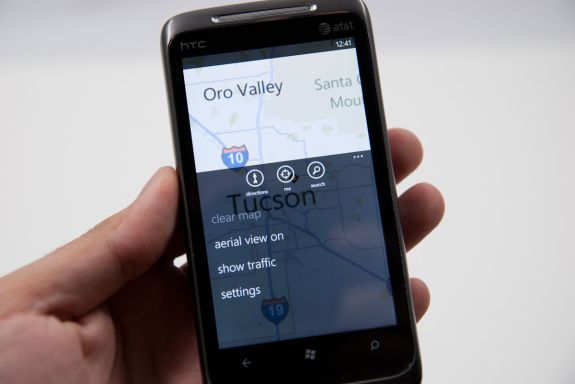
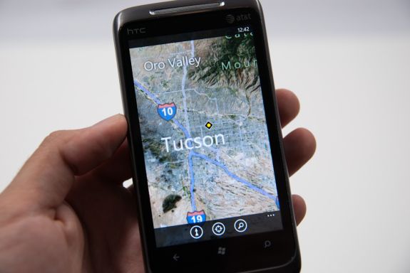
Finally there’s Bing maps. I had a bad experience with Bing maps on Android. It felt slow and clunky, and initially lacked multitouch support entirely. Thankfully Bing maps on WP7 and home turf is completely diffrerent. It’s fluid, packs multitouch support, and loads quickly.
I think WP7 takes a strong nod from iOS here, going the minimalist route with basic directions, locate me, and search support. Expand the options menu, and you can toggle aerial views and traffic, or clear everything from settings.
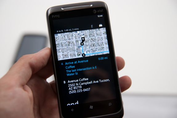
Directions works well and is a bit unique. There’s support for walking and driving navigation directions, sadly no public transport. There’s a top window that shows the map as you progress and scroll through the directions in the list box below. Finally at the destination you get Bing’s street view perspective of the destination.
Searching from Bing maps for a location does what you’d expect - flags drop down onto the map. Tapping on these brings up details such as phone, website, and hours if Bing has them. Reviews and nearby and related listings also populate the adjacent pivots.
This is as opportune a time as any to note that the location services on WP7 have continually brought down very speedy location fixes. It’s fast and definitely leverages a location services database like Skyhook or respective databases Apple and Google use. I’m not entirely certain what WP7 is using, or whether Microsoft is rolling its own, but so far I’ve yet to be not be located just as well as I otherwise would be on Android or iOS even inside buildings with no possible way of getting GPS.
The Keyboard
The virtual keyboard is software replaceable under Android. If you don’t like what comes on your phone just download another one. Microsoft took the Apple approach and doesn’t allow swapping of keyboards. Instead, Microsoft put together what it feels is the perfect virtual keyboard. While I won’t call it perfect, it is a nice blend of Apple’s simplicity and the text replacement bar you get with some Android keyboards.
Each keypress has an ultramodern typewriter sound to it. Hold down the shift key and you’ll hear an extra tap indicating that caps lock is now active.
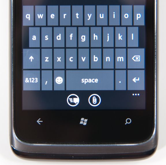
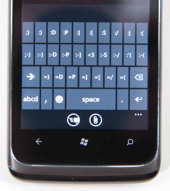
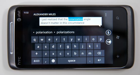
There are three keyboard configurations by default if you’re typing in a text field. The default one is very similar to the iOS keyboard with a few android-like additions. You get a comma and period keys as well as the emoticon button. Tapping the latter gives you two pages of emoticons for your expressive needs.
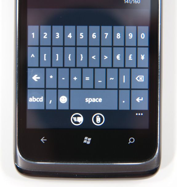
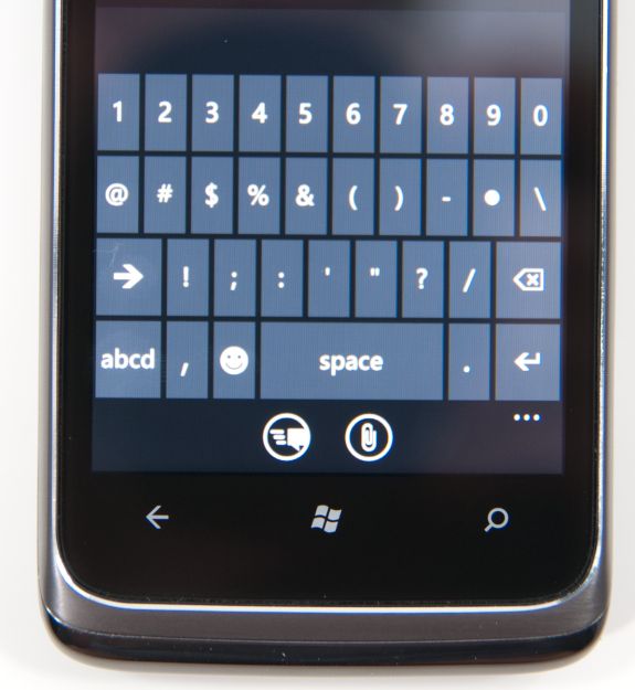
Hit the &123 key and you’ll get numbers and symbols. Hit the right arrow and you’ll see the second page. The numbers remain intact across both symbol keyboards making typing complex passwords a bit easier.
Microsoft doesn’t inject as much key spacing into the keyboard as Apple does, which can throw off iOS users. The learning curve isn’t steep though. The keyboard will autocorrect simple errors. Corrections happen based on length of word typed and location of keys pressed. For more ambiguous errors it’ll present you with a list of options in a bar above the keyboard. You can tap to select a replacement or scroll left/right to find one that may not be among the top suggestions.
If a word incorrectly shows up as misspelled, tap once to highlight and hit the + key in the suggestion bar to add it to the dictionary.
There’s typically a separate confirm/send button below the keyboard for anything that’s a non-recoverable action (e.g. sending an SMS). This is so you don’t accidentally hit enter and send something when you thought you were putting a space in between some lines.
Of course the whole point of a virtual keyboard is that it should change based on the application. Windows Phone 7 is no exception. If you’re typing in a URL box you get a dedicated .com key for example. Typing in an email field gives you dedicated @ and .com key. The calculator app has its own custom keyboard layouts (one for portrait and one for landscape).
To position a cursor in iOS you tap and hold until you get a magnifying lens that helps you fine position your cursor. Android relies on arrow keys or a trackball (optical/physical). Windows Phone once again borrows from Apple. You tap and hold but instead of getting a magnifying lens, a theme-colored cursor appears above your finger. Simply drag your finger down and out of the way to position the cursor exactly where you want it. It feels awkward at first, but it makes a lot of sense once you get used to it.
Overall the keyboard is great. If you’re used to iOS, there’s a bit of an adjustment period but you’ll pick it up right away. If you’re coming from Android (except for Swype) I believe you’ll find it a pleasant balance between iOS and Android keyboards. And if you’ve never used a virtual keyboard before, you couldn’t have a better starting point.
Messaging
It’s easy to forget sometimes that first and foremost smartphones must perform the duties of an ordinary cell phone. That includes support SMS, MMS, and voice calls.
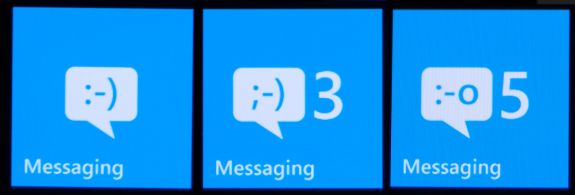
WP7’s messaging application is threaded and minimalist. On the outside, the tile shows the number of unread messages, and an emoticon that changes from a :-) to ;-) to :-o as your unread messages pile up. It’s a subtle change but funny nonetheless.
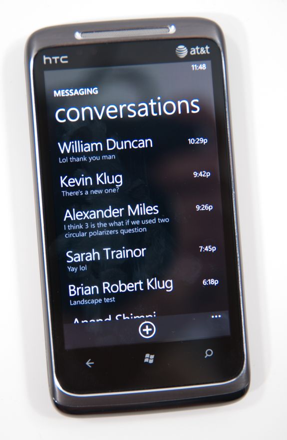
Fire up the application, and you’ll get an overview of all the conversations you’ve got going on. This is pretty standard, and it’s all Metro themed. Threads with new messages will appear in the accent color (blue by default). Long press on a conversation to delete the whole thread. Pretty standard.
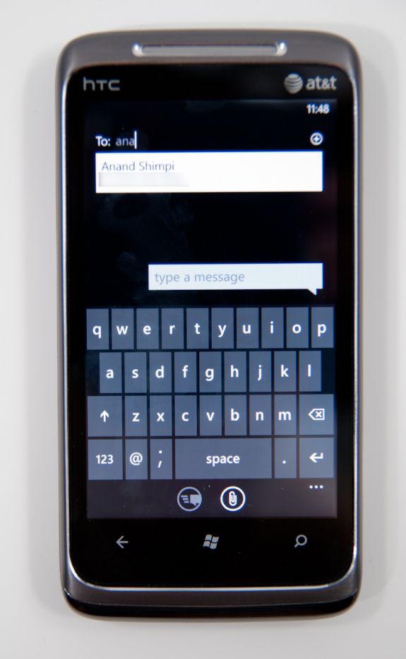
Tap the plus symbol to compose a new message, and you’ll get the compose screen. There’s multiple recipient support, and you can start typing a name and find a contact just like every other platform. There’s initially no character count, but as you pass about 140 characters, the character count appears and starts counting. As you pass 160, the interface will also tell you how many messages your SMS will be split into. It’s a nice touch that WP7 keeps this information out of the way until it comes time to need it - the result is a very clean and simple UI.
The conversation view itself is honestly quite beautiful, as are the transitions in and out of it. Just like other platforms, your messages are on the right, theirs on the left. Each message is timestamped and you can long press individual messages to delete or forward them. Forward almost mitigates lack of copy and paste, but not quite. From what I’ve seen so far, the conversation thread contains all of the messages you’ve exchanged in the dialog - I’m not sure if there’s some eventual overflow. If there is, I have yet to hit it.
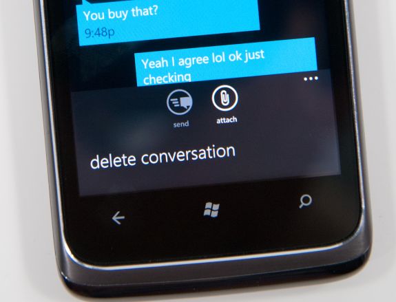
Buttons at the bottom are send and attach photos (more on this in a second), and expanding the menu options lets you delete the conversation from inside it as well. There’s landscape support as well, but if you have the keyboard up, you can only effectively see two lines of a text message.
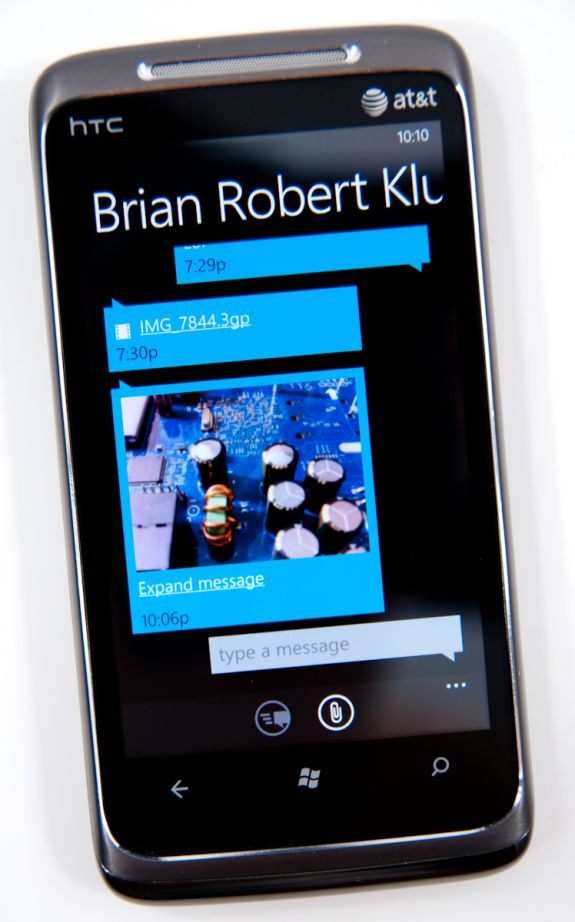
MMSes with photos thankfully show up with a thumbnail preview. Receive an MMS with more than one photo, and you’ll get a link to expand the whole thing and show everything inside. Unfortunately, videos get no such preview, just a file name and a film icon.
While WP7 supports receiving photos and videos over MMS, it only appears to support sending photos. Support for sending videos captured on the device is strangely absent. I tried recording videos in every resolution allowed and sending them, none of which would appear for attachment from the messaging application. WP7 lacking support for sending videos is a rather strange (and glaring) hole, one I hope will get filled quickly.
Back on the conversations page, tapping settings brings you to the messaging settings options page, which is pretty sparse. On the HTC Surround and Samsung Focus, there’s an option to change the SMSC number, which is a rather curious thing to expose at all - in general this shouldn’t be changed unless messaging isn’t working.
I’ve expressed my frustration with Android’s sometimes extraordinarily sluggish SMS database and messaging application in the past, which slows down after a few days of heavy texting. It’s something I’ve heard other users complain about, so I know I’m not alone, and even changing clients doesn’t help since they end up using the same SMS subsystem. Let’s not forget, however, that Windows Mobile was at times even more sluggish - I remember routinely out typing the compose field and experiencing dramatic lag on an HTC Touch Pro, Mogul, and even Apache.
For a lot of users, having SMS stay snappy and responsive is very important. Even more important is being able to get in and get out of the messaging application quickly so you can get back to what you were doing before. Thankfully, WP7’s messaging subsystem seems to be quite snappy. Thus far, I haven’t experienced any slowdowns of any kind like I’m used to seeing on other platforms despite regular use. Honestly, having messaging stay snappy is so important of a thing to test that I now routinely throw hundreds of SMSes at devices from different phones to see how they stand up.
I fired a little under 200 SMSes at the HTC Surround in the span of just a few minutes and didn’t experience any dramatic slowdown. There’s a tiny bit of chop scrolling through the list the first time, but subsequent viewing is completely smooth. I did this again later and tried to place a call while SMSes were coming in and managed to crash the phone subsystem so that subsequent incoming and outgoing calls were silence, but a reboot fixed it, and I've seen that on numerous other smartphones.
One of the things WP7 executes extremely well are message notifications. If you’re not in the conversation thread when a message comes in, a notification strip pops up with the number or name of the sender, and a small preview of the message. Tap on that, and you’re brought into the conversation where you can read and reply to it. What’s nice is that you can tap back after and get back to what was going on.
One of the most useful workflows for the back button is when you’re browsing a webpage, and an SMS comes in:
You can tap the notification, jump into the messaging application, reply, then hit back and pop right back out into the browser.
The combination of a smooth interface and an excellent virtual keyboard make messaging on WP7 a very fast experience.
No AIM Application
One thing Palm did very well was use its messaging app for virtually all communication outside of email. SMSs, IMs and Gtalk all took place over the same messaging app and the conversations were stored by contact, not by service.
This is one area where everyone else has fallen short, Microsoft included. Windows Phone 7 ships with no native support for AIM or any other messaging services, including Live Messenger.
Email and Exchange
Email is one of those things every smartphone has to nail. It’s an absolutely critical part of mobile productivity that there literally is no margin for error, as even small changes can make an experience either completely usable or totally awful depending on the platform. Gmail on Android is so compelling that I know many a person that use it solely because of how nicely integrated it is.
Starting off the email tile shows shows a number that doesn’t correspond to the number of total unread emails in your account, but rather how many have arrived since last you glanced at it. I actually really like this idea. It’s a simple way to notify you that new stuff has arrived since last you checked out the mail application, without overwhelming with some evil gargantuan number of unread messages. Messages read on the desktop or elsewhere still decrement the counter like you’d expect.
Jumping into the mail application itself is a bit of a shocker the first time. While the rest of the WP7 is primarily white text atop black background (unless you changed it in theme settings), the mail application is entirely black text on white background, and there’s no obvious way to change it. Not a huge deal, but it’s a bit strange that mail exists on its own outside those theme settings.
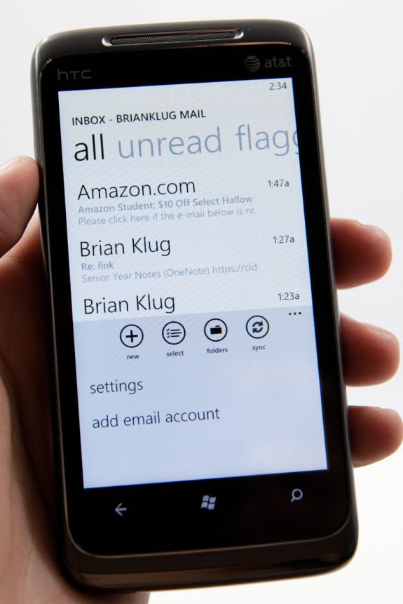
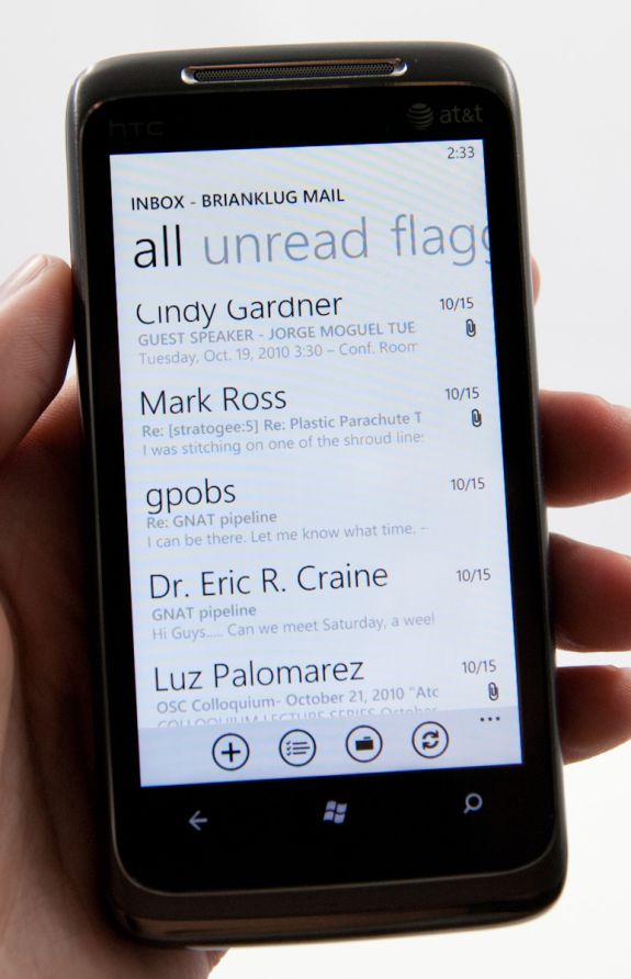
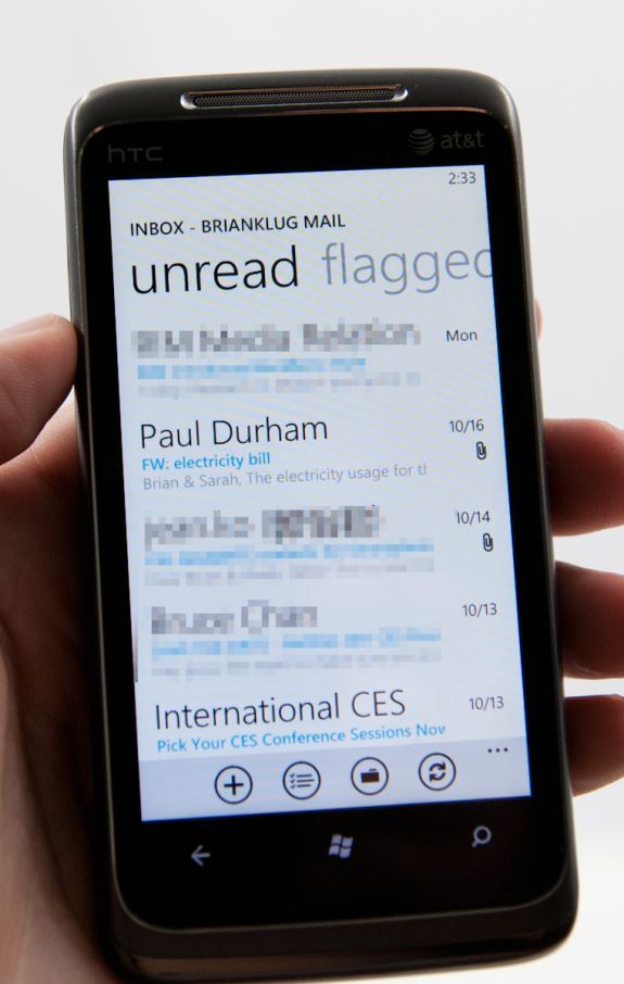
The default view is simply of all your messages in a timeline. The sender’s name is huge, followed by subject and then a one line preview of the message.
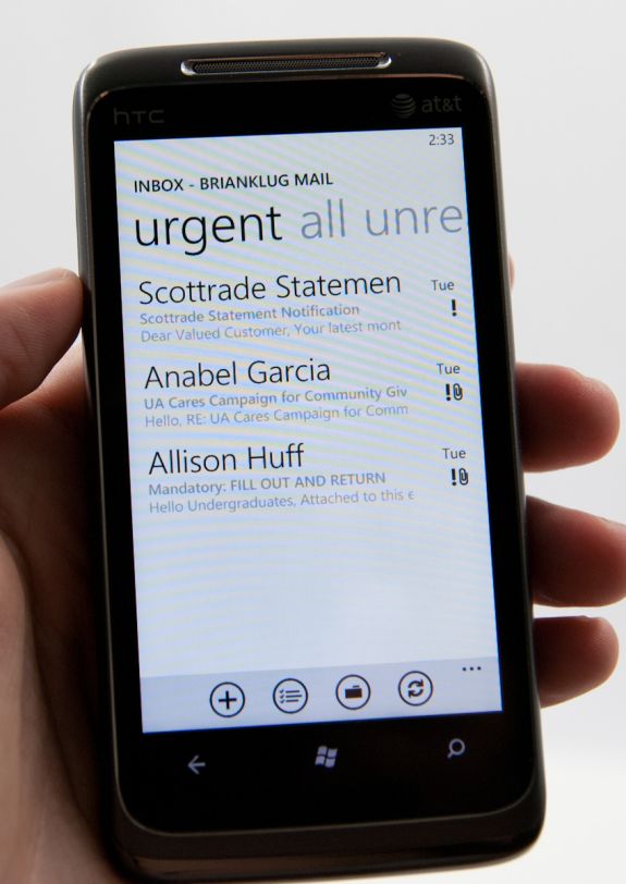
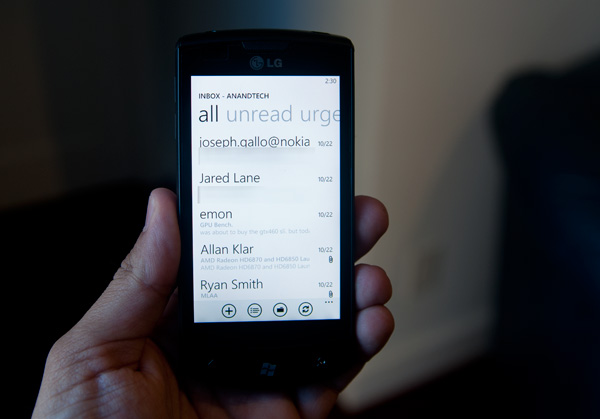
Pivoting right brings you to a view with unread messages only, followed by flagged and urgent. Unread view is very useful - I’m honestly shocked other platforms haven’t implemented something similar. Flagged and urgent aren’t as useful, just because starred doesn’t translate to flagged (at least on Google Sync exchange for me), and urgent messages are usually anything but.
Buttons at the bottom compose new email, enable multiple selection, bring up the folders view, or sync respectively. Tapping on the ellipsis for more options lets you get to more settings or add another email account.
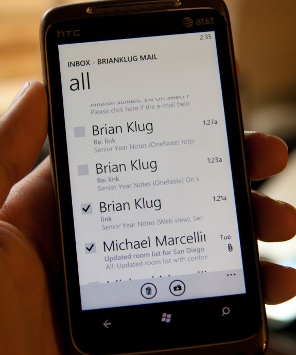
Multiple selection on WP7 actually doesn’t require using the button, which makes me wonder - why bother including one? To do it, just tap at the far left of any message, and a small box will glow, letting you know you’re about to enable multiple selections.
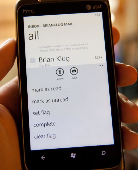
Then you can check lots of things and delete, move, mark read or unread, or flag.
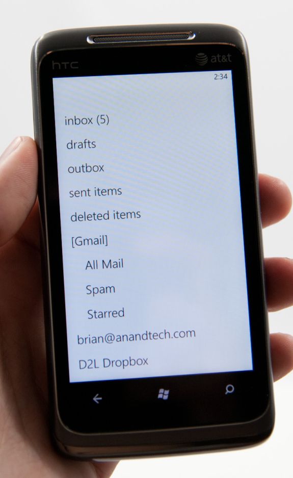
There’s also obviously landscape support for everything in the email application. Go back to the normal view, hit folders, and you can view things stored locally on the phone like drafts, or view all the folders on the exchange or IMAP account:
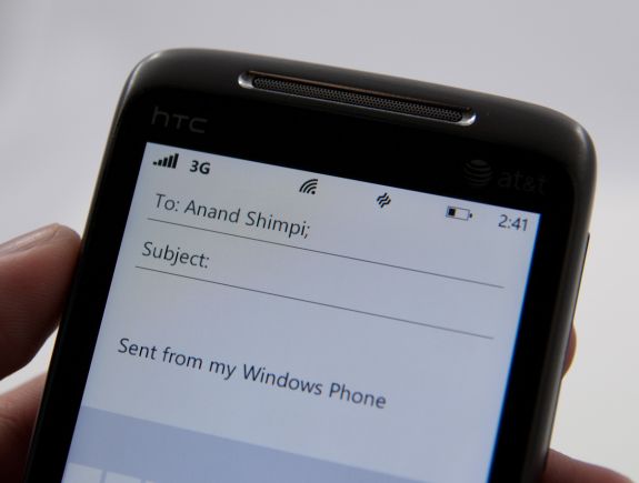
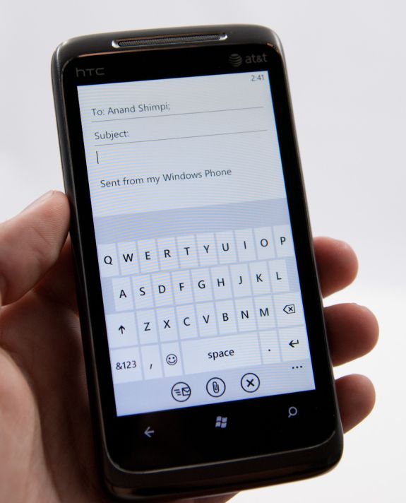
The email compose screen is spartan, but the same can be said for iOS and Android. Start typing a contact’s name or email address, and you’ll get suggestions. Interestingly enough, WP7 does elect to append a default signature to every email - “sent from my Windows Phone.”
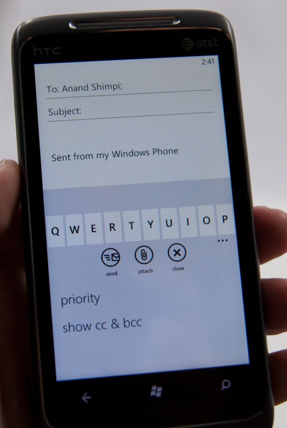
You can expand options and set priority (if you like marking everything urgent), and get to BCC and CC fields. There’s also obviously an attach option which right now just lets you attach photos one at a time. Photos get reduced in size to 1630 × 1222, and are compressed to around 350 kilobytes. There aren’t any options to send full size images, unfortunately.
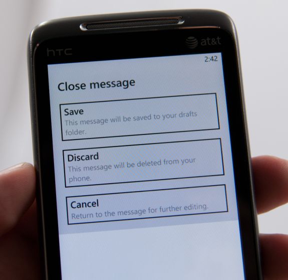
If you close or hit back, you’ll get a save, discard, or cancel dialog. Drafts go into local drafts which you can get to from folders, but not up to a folder of your choice.
All the text composed in the mail application gets typeset in Calibri, whether you like it or not. There’s no formatting options from the email compose screen. Other than that, email is just what you’d expect it to be.
One thing that’s interesting which Anand and I both noticed regarding WP7 mail is that changes like deletion aren’t immediately propagated out. Neither him on IMAP nor me on Exchange saw messages delete immediately. If you want to see those actions reflected on a desktop client, you have to force a sync immediately after making the change. This is somewhat unusual, since everyone else forces those updates to happen immediately instead of later on.
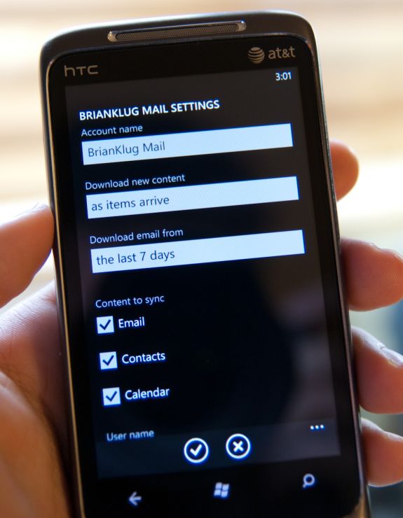
There’s setup support for a variety of common email services, including Windows Live, Outlook (Exchange), Yahoo! Mail, Google, and any POP or IMAP box. Under Exchange you can sync contacts, calendars, and email. Google does the same, and you can specify mandatory SSL. Inside the account options options for grabbing everything or just the past 3 days, 7 days, 2 weeks, or month. Download new content has settings for manually syncing on a schedule or as items arrive (pushed).
The only field I’m uncertain about is logging, which defaults to advanced but has a field marked ‘off (recommended).’ I’m not sure where these logs are going or what they’re used for, but this field is here.
Putting the Phone in Windows
Though Windows Phone 7 doesn’t have a dedicated phone button, there is emphasis placed on calling as evidenced by the Phone tile being top left on the start screen. The tile - like others - displays a number corresponding to the number of missed calls or voicemails. The carrier string is relegated to the bottom left of the tile - the same size and style as other text.
Phone’s tile does change as you miss calls and get voicemails:
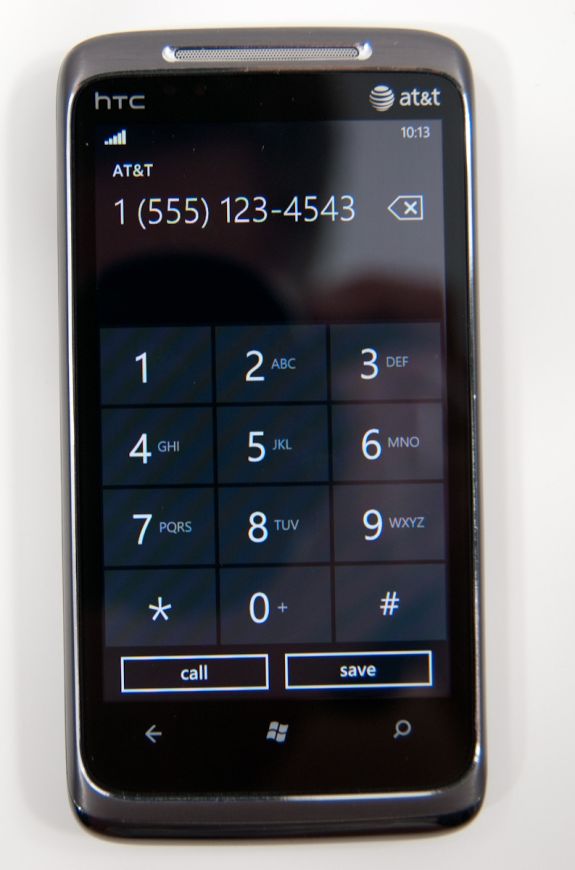
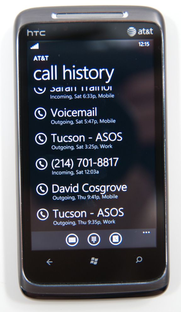
The dialer itself is very spartan. The application opens up to the call history pane by default. Opening the dialer pad requires tapping on the keypad icon at the bottom. To the left and right are links to voicemail (there’s no visual voicemail support, this just dials your voicemail number), and people tile respectively. Expanding the option pane brings you into phone settings or lets you delete all the call history.
The call history list itself is again very basic. Tapping on the phone symbol to the left of entries immediately dials the last called number, and tapping on the item itself just brings up the contact entry in the people tile. What’s missing here is the ability to see individual call duration, or break down your contact history with a specific number. The only information you get is when the call started, whether it was incoming or outgoing, and whether the number was associated with work, home, e.t.c.
The keypad interface itself is probably one of the most simple I’ve seen before - dialing a number doesn’t get you smart dialing abilities or contact lookup. You’re just entering numbers. It’s clear (rightfully so) that Microsoft expects most calls to happen from contact entries or the call history. You can also pin contacts to the start screen.
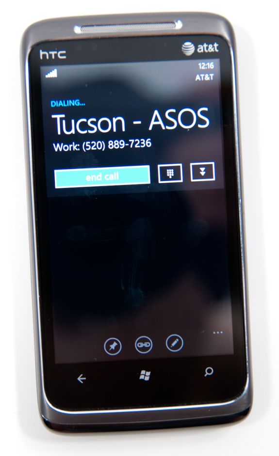
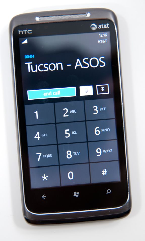
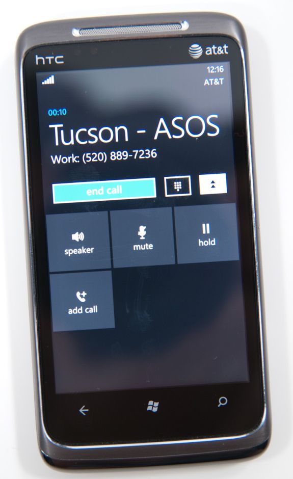
Where WP7’s core phone functionality differs from others is how it transports the dialer UI basically anywhere. Fire up a call, and you’ll get an overlay with the call duration, name, and number. At right are buttons to bring out the keypad, and expand a shade with options for call management.
Hit the windows button, however, and everything rolls up into an accented notification strip just like we see for incoming messages. The text alternates between tap to expand, and the current contact’s name and call duration. What’s even more interesting is the way the notifications bar shows you the signal bars when you’ve got a call in progress - most of the time everything is hidden unless you tap on the top of the screen, then status indicators elegantly drop down.
Tapping on this brings down the dialer overlay again - the best part is that the window underneath goes transparent. It’s slick in practice and nicely animated with Metro 3D transitions.
What’s nice is that again the dialer UI is basically transported anywhere on the phone - it isn’t just relegated to a standalone application but instead is inherently a part of the phone from any perspective.
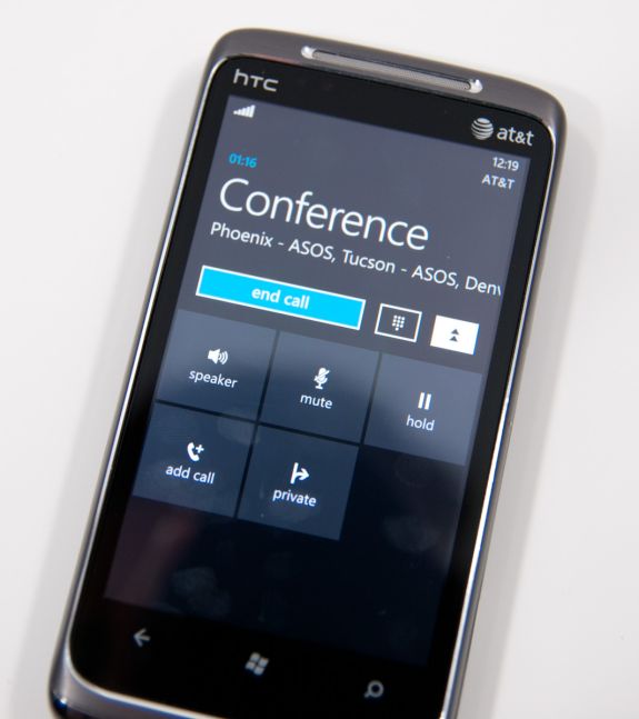
There’s conference support as well if your carrier and plan support it. I tossed a ton of ASOS numbers into a conference. Tapping on the conference title brings up a new window with a more readable itemized list of each line that’s going. If you’re just juggling many calls without doing a conference, the status notification at top changes to “tap to swap.” It’s obvious that someone really thought about getting this right.
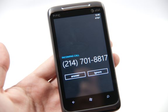
Finally, incoming calls are handled with a full screen overlay with answer and ignore buttons. If the incoming caller has a contact photo, the entire background is that photo.
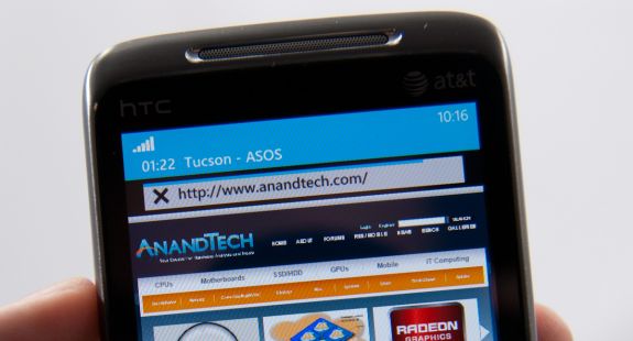
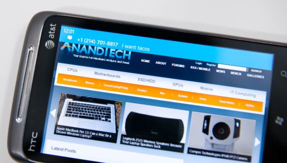
While WP7 has done a good job making the notifications bar blend in and rotate appropriately in landscape, I did catch one edge case that seems strange. In the browser, I pointed out that you can get messaging notifications in landscape, dive in, reply, and emerge back where you were with the back button. Look where that notification comes up:
Now look at where the call in progress strip is in the browser when in landscape:
I think this is just a minor inconsistency that was overlooked, otherwise I’ve only found two more occurrence of WP7 mixing landscape view with portrait elements. More on those two in a second.
Camera
One of the chief ways for device manufacturers to differentiate handsets from one another is camera performance. Though Microsoft has set hardware requirements that each WP7 device have at least a 5 MP camera with flash, as we’ve shown consistently in our camera bench shots, smartphone pure pixel count isn’t everything. Optical system design and detector sensitivity play a hugely important role
Though OEMs write drivers and can include extras in the camera settings menus, the top level of the camera experience is the same across every WP7 device. By default, the camera tile isn’t on the start screen, rather hidden away in the applications list. At first, I was very puzzled by this decision - getting to the camera fast is important, so much so that I almost always put it right on the first home screen on iOS and Android alike. How Microsoft wants you to get to the camera is through the dedicated camera button, which is a hardware requirement.
Hold down the camera button when the device is on - or for five seconds when the device is off - and you’ll instantly fire up the camera application. Camera launch is relatively speedy on the HTC Surround at 2.2 seconds. If you have a screen lock set, this trick still works, but you’re stuck in a walled garden in the camera application and can’t view other photos or get to the home screen. There’s a tiny lock in the bottom left. Even if you get messages or calls in this view, you can’t tap on them and get around the screen lock. I tested a variety of things I thought would get me cleverly out of the walled garden - none of them worked.
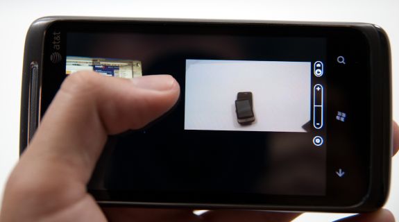
The camera UI largely follows the Metro UI style guidelines, but feels a bit different. There's a dedicated settings button, still and video switch, and digital zoom controls. Tapping digital zoom in and out steps you through seven discrete zoom levels - there's no overlay about how far you're zooming though.
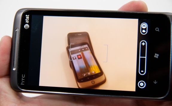
The preview itself doesn’t have tap to focus or expose support. Instead, autofocus and exposure runs when the shutter button is pressed to the first detent. A focus bracket pops up letting you know the routine is done as shown above. That’s a bit lacking, but not experience-killing. Thankfully, you can mash the button down before autofocus runs and immediately capture a shot. Capture on the HTC Surround is very quick, and subsequent captures remain steadily fast. I shot just under 80 photos in quick succession without any pause or slowdown at all - very impressive.
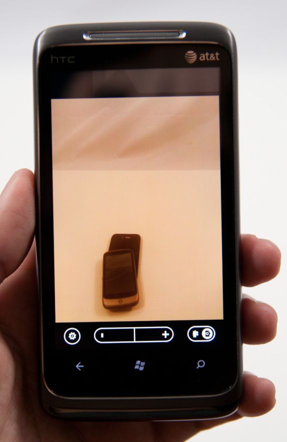
Landscape is the preferred orientation here for photo capture, however only one orientation of landscape. There’s also portrait image capture support, but it’s curiously counter-intuitive. Microsoft made a huge deal at MIX10 about how all of the icons rotate appropriately when transitioning from portrait to landscape, and for the most part that’s a well-enforced part of the WP7 UI.
However, the icons in the camera application are static - they don’t rotate when you rotate 90 degrees from landscape to portait, so it’s not immediately obvious that you’ll get the right EXIF orientation data embedded in the JPEG header. Look at the photo above. It took some experimentation for me to figure out that yes - indeed every rotation is possible and encodes properly (upside down included), but without iconographic feedback, it’s confusing. I digress.
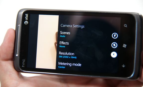
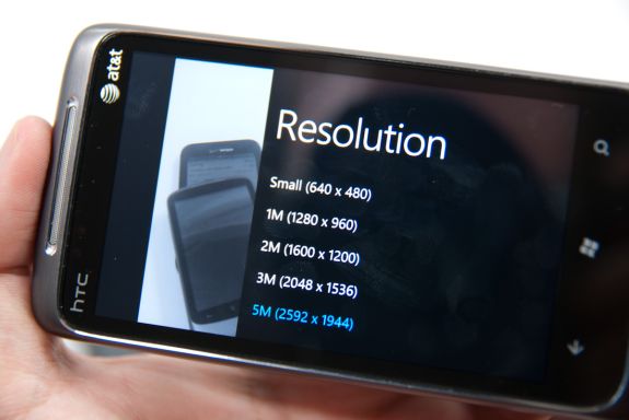
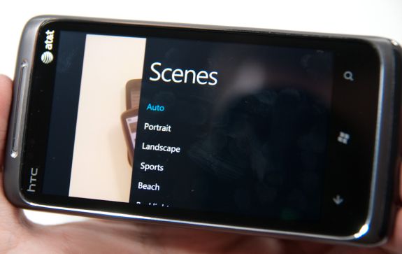
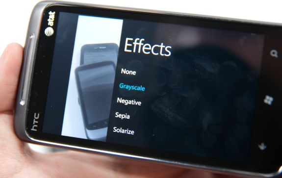
Tapping the settings gear on the preview brings up the camera settings. While Anand played with the Samsung Cetus, er... Fetus, I mean Focus, I used the HTC Surround. This is one area where there’s some differentiation between devices, which I’ll expand on in a second.
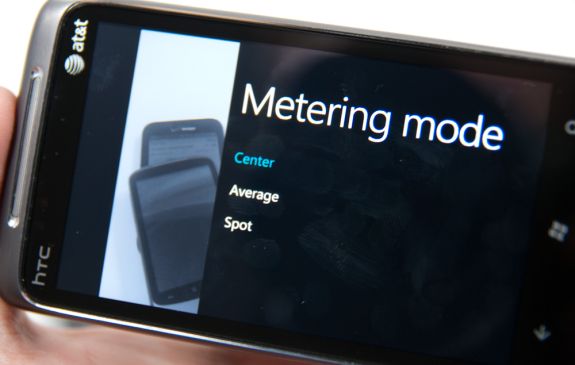
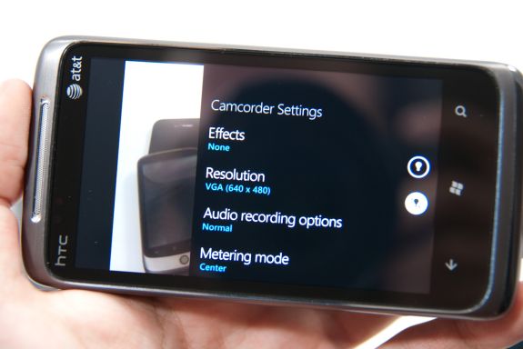
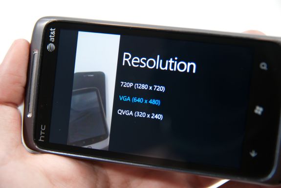
Inside settings, you get a nice overlay (with the live preview still underneath) with 8 scene settings (auto, portrait, landscape, sports, beach, backlight, candlelight, and macro), 5 effects (greyscale, negative, sepia, and solarize), 5 different resolutions (VGA, 1M, 2M, 3M, and 5M 2592x1944), 3 metering modes (center, average, and spot), and the usual flicker adjustment (auto, 50 Hz, 60 Hz).
At the right on that pane are flash settings for auto, on, and off. Navigating through these settings panes makes heavy use of the back button. There’s also a reset to defaults button at the bottom.
Interestingly enough, there are more settings that are photo and camera capture specific, but to get to them you’ll have to go into settings from the tile, scrub to applications, and find pictures + camera. It’s here that you can configure automatic geotagging which is on by default, uploading to SkyDrive if you have Live (more on that later), and whether to keep location data embedded in photos you upload from the device. It’s a bit odd to find these settings outside of the application itself, when most of the other settings menus can be accessed from respective apps in addition to from this applications settings list.
Auto SkyDrive image uploading is rather intriguing. If you have already have a Live account signed in on the device, the first time you fire up the camera application and try to look at an image preview, you’ll be prompted whether you want to auto upload photos to the cloud. You can share those with friends, everyone, or keep them to yourself. I opted to just keep my photos to myself for starters. If you turn this on, photos you capture on the device will immediately start getting dumped into a folder called “SkyDrive camera roll” on your Live account that the device creates with the appropriate permissions.
The images themselves upload regardless of whether the current connection is WiFi or 3G. It happens nearly instantaneously. The photos are relatively small, at just 717 x 538 and compressed to around 100 KB, but they’re decent web quality images fit for destinations like Facebook. It’d be great to have some control and optionally upload higher resolution images, but no doubt you’d run out of SkyDrive space quickly. It’s nice to see some of the KIN-like cloud components come to play with WP7, but the nice thing about KIN was that full resolution images rather than much smaller images were backed up to the cloud.
Toggling video capture mode from the live preview screen happens just by tapping the switcher. Nothing visibly changes, but video capture is ready. If you fire up settings, there’s a lot of familiar territory, but the options now are effects, resolution, metering mode, and flicker adjustment. At the far right is an option to use the LED as an illuminator as well. On the HTC Surround, there’s another option - audio recording options, which inside reveals options for Normal, Noise reduction, and Stereo audio recording. What puzzles me is that the default video recording resolution is VGA - getting 720P requires going into settings and selecting it. The catch is that every single time you want to record HD video you have to change to 720P manually in settings. That gets tiresome really fast.
Swipe left from the capture screen and you’ll get to a horizontal preview strip of photos and videos captured on the device. What’s impressive here is that as you swipe to the side, the capture preview remains live and surprisingly high framerate. Pinch to zoom out, and the preview, complete with UI, gets small. It’s a silly thing to be amused with, but it’s really telling of just how GPU accelerated the entire UI on WP7 is that this is feasible, much less completely fluid.
As usual, there’s an ellipsis you can tap to bring up more options. For videos, the only current option is deletion. As it stands right now, you can’t share or disseminate videos taken on the device unless you sync with a desktop. For photos, however, you get a host of options including sharing via MMS, email, facebook, and SkyDrive. Unfortunately, photos uploaded to SkyDrive here are the same resolution as they are if they’re uploaded automatically.
HD 720P videos recorded on the HTC Surround (and I’m assuming the same applies to the other WP7 devices) are shot in 24 FPS MPEG-4 video with AAC audio. I recorded 34 seconds of 720P video 34.8 MB in size, for an average bitrate of around 8 megabits/s. Video quality is decent, but what I noticed across two HTC Surrounds was that the camera runs the autofocus routine very frequently during the video, resulting in a pretty apparent zoom in, zoom out effect. If you’ve used an autofocus smartphone camera, you know exactly what I’m talking about.
I found very little difference between how audio sounded recorded with each of the three audio recording settings. In fact, I found audio recording performance to be a bit poor and distorted regardless of what setting I chose. Audio is encoded at 48 kbps and always 2 channel, with or without stereo selected explicitly under settings.
I took the HTC around to our usual bench locations and snapped photos, and in addition took controlled photos in the lightbox. One of the interesting things I noted is that WP7 sadly doesn’t turn on the LED when running the autofocus routine in the dark. The result is that sometimes you’ll get sharp images, sometimes completely blurry images. I shot through 8 or so before settling on the reasonably focused photo in the gallery with lights off. It’d be nice to see WP7 update and fire up the flash while the focus routine is going.
Performance on the HTC Surround honestly isn’t impressive. To be totally honest, it reminds me of the Nexus One all around. Both have plastic layers from the case between the top of the optical system and the phone exterior, where it’s easy to leave fingerprints and add to glare dramatically. Even the design and package of the camera assembly looks the same underneath. I wouldn’t be surprised if they’re very similar.
Image quality isn’t really stellar - the Surround takes decent photos when well lit, but has HTC’s trademark oversharpening. It’s clear that HTC is also being pretty liberal with its noise reduction algorithm, as we lose nearly all the spatial detail in the focusing ring on the Exakta camera. Compare and contrast that to the other 5 MP cameras in there, even from the Torch. It’ll be interesting to see how the other WP7 devices fare in our box and tests.
The LED flash on the Surround isn’t bad, I’d say it has more even illumination than the Nexus One, Torch, and Pre Plus. There’s a definite blue tint to the photo however. I’m particularly interested in trying out the HTC HD7’s xeon flash down the road.
Pictures Hub
While you can view photos in a somewhat ad-hoc manner from within the camera application, there’s a much better photo viewer tucked into the aptly named pictures hub. Unfortunately however, WP7 makes the same mistake that Apple does, tossing videos inside under the domain of pictures as well. Oh well.
Fire it up and you’ll get three options - all, date, and favorites. You can pivot right and see some random thumbnails of favorite photos and recently captured media, and pivot one more to see photos from facebook under what’s new. Tap all, and you’ll get transported into a gallery listing which includes your camera roll on the device, as well as all your associated facebook galleries.
Inside the camera roll gallery, you get just what you’d expect - a grid of photos. Unfortunately, this doesn’t work in landscape. It’s portrait only here.
Viewing photos is a landscape or portrait experience, and thankfully the grid view and photo viewer are both incredibly speedy. Hit the ellipsis to expand options, and you get the same options I mentioned earlier for sharing to SkyDrive, Facebook, marking as favorite, or deletion. Videos however only show up in landscape, and again can only offer deletion from the device. Getting those movies off-phone requires a desktop sync.
The interface is definitely pretty though:
As Anand mentioned, all your facebook albums are treated like they’re stored locally. What’s really well done here is that all the photos come down with comments and captions completely intact.
Photos works well, but it’s still missing some obvious functionality the competition has. There’s no ability to select multiple photos in the grid view and send all those to the cloud, delete, or email them off. After shooting a ton of photos in quick succession to make sure the camera app didn’t slow down, I was then forced to delete individually - bleh. The other missing thing is slideshow functionality which is occasionally handy but not critically important. Honestly, both of these are things that are easily fixed with a software update.
The Best Smartphone for Music Lovers
To call it a Zune Phone would be a disservice. The Zune was a capable PMP that didn’t gain mainstream acceptance. Windows Phone 7 isn’t destined for the same obscurity. But the Zune icon is present on what Microsoft calls the Music + Videos Hub and it is more functional than the iPod app in iOS and Android’s media player.
The first screen in the Music + Videos hub is the zune panel. Here you have access to your music, videos, podcasts, FM tuner and the Zune Marketplace.
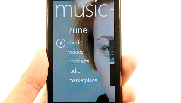
Tapping on music will take you to your music. There are tabs for artists, albums, songs, playlists and genres. There’s a “now playing” playlist that you can add to in real time. Tap and hold over any album or song to add to the playlist. To view the now playing playlist just swipe over to the history tab and tap the current song.
The player interface is pretty slick. Swipe to flip through songs and you get back, pause and forward buttons for playback controls. It took me a while to find the shuffle playback option, which is revealed if you tap the album art in playback view.
Below the song you’re currently playing you get a list of the next three songs in the playlist.
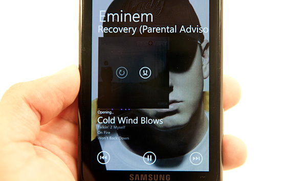
So far I’ve described pretty basic features of any smartphone media player. Here’s where the Zune integration rocks. Viewing any artist or album you get a list of what you own on the device, scroll down and you’ll see a label for In Marketplace and a downarrow widget. Tap the widget and you’ll get a list of artists or albums in the Zune Marketplace.
From here, directly in the media player application, you can preview and buy songs over WiFi or the cellular network. If you have a Zune Pass, you can also play anything you find here right away without incurring any charge.
Zune Pass is the major sellingpoint of Microsoft’s Zune PMP. For $14.99 per month you get unlimited streaming of all songs in the Zune Marketplace. You also get 10 download credits per month to use on songs you want to actually own (DRM-free).
The Zune Pass integration in Windows Phone 7 is just awesome. You can play any song you’d like that’s in the marketplace, even if you’re on the road. You can also spend your 10 credits per month while connected to the cellular network.
The Zune Pass streaming works like an expensive Pandora, except you get to pick and choose the songs you want to listen to. Remember an album that you really like but don’t have synced to your phone? Just search for it in the marketplace and start streaming it immediately.
You can mix streaming songs from the marketplace along with songs you have synced to your phone in your “now playing” playlist.
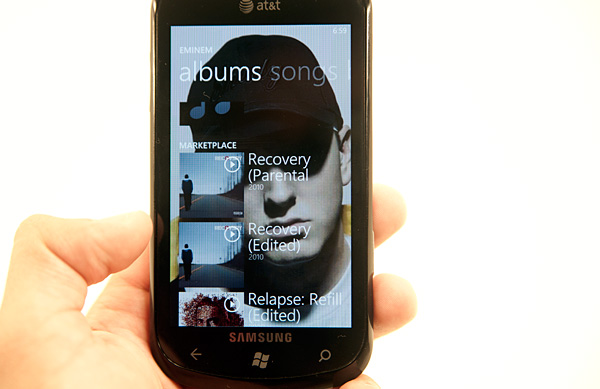
The whole interface is extremely fast and like the rest of Windows Phone 7, it’s very dynamic. Backgrounds in the Music app are dynamically populated by art pulled from the Zune Marketplace. You’ll get a picture of the artist you’re currently listening to as a background. Dithering can be an issue unfortunately.
Playback can continue while you’re in other apps. To access playback controls just hit the volume up/down buttons regardless of what app you’re in.
Navigating around the music app takes some getting used to, particularly if you’re expecting it to be like an iPod or fairly stripped down media player. Once you get the hang of it, there’s nothing like it. The back button always takes you to where you want to go, the UI is super fast and the mixture of your own content with the Zune Pass streaming content is just awesome for lovers of (legal) music. Dare I say the only thing that’s missing is some sort of social network integration for you to share your music interests with others on the device itself?
The Zune experience on Windows Phone is significantly better than what you get from both Android and the iPhone. If you buy a lot of music on iTunes, Zune Pass is probably a better deal. You get 10 song downloads per month plus unlimited streaming for $14.99 per month. You can also stream on your PC and Xbox 360 in addition to your Windows Phone.
Video Playback
The video playback integration isn’t quite as impressive as the Zune audio experience on Windows Phone solely because there’s no Zune Pass equivalent for video. That’s of course the holy grail that we’re waiting for everyone with their toes in video to solve, but there aren’t any takers as of yet.
Windows Phone 7 supports mp4, m4v and wmv video formats (m4a, wma for audio). You’ll notice that the list overlaps with what Apple specifies for the iPhone. That’s right, without transcoding you can playback all non-DRM video content that’s in an iPhone-friendly format.
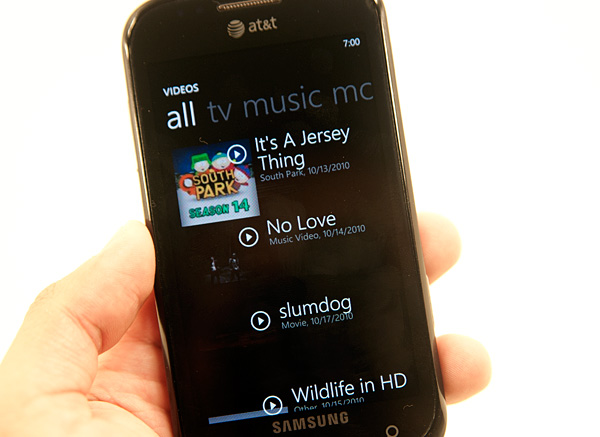
Your videos are grouped into personal, TV, music, movies and a category for all of them. As is the case with most tabs inside Windows Phone 7, these ones make a lot of sense. Any tagged content you download from the Zune Marketplace or sync goes into the TV, music and movies categories, and anything you record with the phone goes under personal.
All purchases/rentals in the Zune Video Marketplace happen in Microsoft Points. You have to first buy Microsoft points, then you get to spend them on content. Hooray.
When purchasing a TV show or movie you are presented with the option to view it on your PC or Windows Phone. The Zune application will deliver the appropriate version of the content accordingly. Once you’ve made your decision though, there doesn’t appear to be a way to go back.
Video playback on Windows Phone is very simple. The video player app has three controls: rewind, pause/play and fast forward. You can’t move your finger around the timeline bar to scrub through the video. Tapping the the forward/back buttons skips around in 30 second increments, while holding them down rewinds/fast forwards.

There’s no support for zooming ultra wide content to fit the screen, everything must be viewed in the original aspect ratio. I don’t have a problem with this, but my dad might. I prefer content in its original aspect ratio, while my dad is one of those people who wants the screen full of useful pixels - not black bars.
Like most anything in the OS, you can pin videos to the Start screen by tapping and holding on any video then selecting pin to start.
The app is very fast (notice a trend?) and does a good job of organizing your content. The biggest issue with the video player app is you can’t purchase content within it. You have to sync all videos from your PC. And allow me to reiterate: a Zune Pass for video content would be a dream come true.
Microsoft Office for Windows Phone 7
For the most part, Microsoft has always had excellent Office support on its mobile products. It’s been that way since Windows Mobile, and WP7 does a similarly good job keeping basic functionality intact. It isn’t exactly the entire office suite, but enough that you can open, edit and send things along that show up as email attachments.
Word gets you almost the same support as it did on Windows Mobile last I remember it. There’s even formatting support for bold, italics, highlight colors and a few font colors, though no actual fonts can be changed. Text is reflowed regardless of whether you want it to be or not so it can fit, which poses a bit of a challenge. There’s a search and outline view that somewhat mitigate the nightmare of navigating huge documents on a tiny screen. Of huge usefulness is comment and markup support if you’re working with .docx files.
I threw some large excel sheets at WP7 excel which it handled with ease. There are a few oddities about how mobile Excel handles plots, and obviously formatting isn’t perfect, but it does probably the best job I’ve seen on a mobile device. One weird thing is that multitouch zoom on a large number of cells in Excel doesn’t really seem to work properly - it increases text size, but not the cells. The result (at least in my test documents) is that text size increases in the cells, and gets harder to read.
PowerPoint mobile has full edit and notes view support. I honestly don’t remember PowerPoint being this usable on Windows Mobile, nor so compatible. You can’t create a presentation from scratch like you can an Excel or Word document, but editing support and markup is there.
What really got me excited about mobile office, however, wasn’t Word or Excel or PowerPoint. It was OneNote. I’ve been using OneNote religiously my entire time in college. Four years of inking on first a Samsung Q1 Ultra-V, then a Latitude XT, and I’ve amassed a huge quantity of notes. I’ve long proclaimed that OneNote is arguably the best kept and most underrated piece of the entire Office suite, and hoped that WP7 would finally bring the desktop experience to mobile. Being able to view those notes on the go without having to pull out the desktop would be life changing.
Even better, OneNote syncs with SkyDrive so you can always have notes backed up and synced across platforms. It makes sense, and I love the direction that Microsoft is headed here. So, imagine my disappointment when I copied a section of one of my current notebooks up to SkyDrive (I can’t copy my entire notebook up there because there’s a 50 MB limit), get it loaded on the phone, open it up, and see this:
All of my inking is changed to broken file logos.
I guess I can understand what purpose Microsoft wanted OneNote to serve on WP7 - the role of the notes application on iOS, but with a bit more support. There’s audio recording support, images, and list enumeration support (which is excellent, seriously), but what’s lacking is all of the OneNote backwards compatibility with the desktop. The end result is a definite disparity in what you can do on the desktop OneNote 2010 version (which plugs into Live/SkyDrive), and what will actually show up on mobile.
That kind of seamless desktop and mobile interaction would literally be enough to fundamentally change the way I take notes. For now though, it just can’t quite happen. It’s so close though!
Xbox Live
The hub that probably saves the most space in the UI is the Xbox Live/Games hub. All of your games go here regardless of whether they are Xbox Live titles or regular Windows Phone games.
There are two categories of games on Windows Phone 7: Xbox Live titles and standard games. The latter are similar to games developed for iOS or Android, anyone can develop for them you just need to spring for the $99 account to get them published. These games can be developed in either Silverlight or using the XNA framework and can leverage the GPU.
Xbox Live titles are supposed to be more polished and come with a stricter set of requirements. All XBL titles must support a try before you buy demo mode (it’s optional for regular games), they all support achievements and they can support turn based multiplayer (real time is out of the cards for now, we need better mobile bandwidth for that).
The regular games on Windows Phone aren’t all that impressive, they’re not terrible either. But we’re missing titles like Angry Birds (heh) and Plants vs. Zombies. I suspect over time we’ll see these in the marketplace, the phones just need to start shipping first.
With the original Xbox Microsoft had Halo, and what it’s desperately missing from Windows Phone 7 is a Halo equivalent. Not necessarily a first person shooter, but a game that’s so enjoyable that it alone is justification to buy into the platform.
The Xbox Live titles aren’t half bad, but so far they aren’t an order of magnitude better than what you get on an iPhone. They are pricey too. The titles range from $0.99 all the way up to $6.99, and in the long run I expect these prices to follow an upward trend. Games will get deeper, art/development budgets go up and the end user will foot a higher bill. I think the ultimate goal for smartphone gaming is for it to replace handhelds like the PSP or Nintendo DS. I would expect AAA smartphone game prices to be in the same range as games for those devices eventually. Without the need for the traditional publishing model the final price may be a bit lower, but that remains to be seen. It may take a few years but that’s where things are headed.
If your Live id is tied to your Xbox Live Gamertag then you’ll immediately get your avatar and gamer score imported into the Xbox Live hub. Any gamer score accrued in playing on your phone gets added to your total.
![]()
Through the free Xbox Live Extras app you can edit your avatar as well as interact with your XBL friends. This app is one of the slowest on the phone however, switching between tabs is choppy and it’s the only app that seems to consistently have problems.
Within the extras app you can view all of your achievements (both in XBL phone games and in 360 titles). You can also view your XBL friends list to see who’s online and even send them messages.
I see the messaging/friends list management as the killer feature for WP7’s Xbox Live integration. Typing messages via an Xbox 360 controller is a pain and the chatpad accessory is a silly thing to buy when you’ve got a fully functional smartphone. If you do a lot of communicating on Xbox Live, Windows Phone 7 has the potential to make things easier. The main problem is the performance of the Extras app, it’s just unacceptable. It’s laggy and crashes a lot - perhaps a rushed attempt to meet the European launch tomorrow, but it needs to be fixed asap.
The XBL Extras app is currently in a state of disarray
Apps
WP7 includes some preloaded productivity applications whose inclusion are just expected on any given modern platform. Things like a basic alarm, calendar, and calculator. It’s easy (and dangerous) to overlook just how critical things like these are. Alarm requires some background infrastructure to work that other applications don’t have yet, and calendar honestly makes or breaks a platform if you’re constantly running around trying to catch meetings or events. Thankfully the options on WP7 are pretty decent.
Alarm is basic and draws obvious inspiration from Apple. There’s a switch at the far right, and the time/date of the alarm at left. It even changes to things like ‘weekdays’ or ‘weekends’ like iOS did way back when everyone was easily amused. The alarm notification is basic as well, you get snooze or dismiss buttons that are surprisingly hard to hit early in the morning, but it works.
The time switcher is actually pretty novel. Tap on one of the fields, and you scroll up and down through all the possible entries. It clearly derives inspiration from iOS’s ring switcher for most things, but instead 2D and given the Metro style.
There’s a calculator too, as expected.
It’s simple in portrait mode, but becomes a basic scientific calculator in landscape:
WP7 (nor any smartphone) is close to replacing my Ti-89, but it’s there if you need it. There’s a second row with input history above the large results text, and it supports slightly more complicated syntax (with parenthesis) than other first party calculator apps I’ve seen. It would’ve been nice to see WP7 build a unit converter or some unit conversion into the calculator since Bing lacks it, but that’s for the future.
Finally we’ve got calendar, which has very obvious unique Metro styling. First up, the tile always shows your next upcoming calendar event, same as the lock screen. You get the name, location, and time all in the tile. There’s also the current date in the bottom right.
Portrait and landscape view initially give you a timeline view of the day with some color coding. Swiping left and right changes the view to an agenda with a simple list of what’s going on. Getting to the next day is a vertical swype away.
The three buttons at the bottom bring you to the today view, add an event, or month view. There’s no option to see a weekly timeline, which is a bit frustrating but not killer. The landscape view of the month makes it readily apparent that rendered inside each day in minuscule but still slightly readable text are that respective day’s events. Though it isn’t readable, you can still tell that something is going on based on how much text there is inside.
The current issue with WP7’s calendar is that there’s no obvious way right now to get google calendars working inside the calendar app. Anand had problems with ordinary google calendars, I had no luck with a Google Apps Premiere account using Exchange. To be clear, the main exchange calendar on my account appears just fine (that’s what you see in screenshots), but I can’t see other calendars I’ve been granted access to outside my domain. On other devices, you can view other calendars in a selection list somewhere or get to them through m.google.com/sync. This must be coming soon.
You can tap the options panel and calendars, but the only options are Windows Live and my exchange calendar:
Overall, WP7 delivers the right amount of out of box functionality that we’ve grown accustomed to from smartphones of every sort. No doubt they’ll flesh out with time, but they’re ample for right now and get the job done.
Settings
WP7 has a strong emphasis on keeping everything simple and largely abstracted away, and settings is no exception. It’s nicely Metro themed, and provides a unique combination of options and glanceability. Categories appear up top in larger white font, but what’s unique here is that the major setting appears down below. Under Wi-Fi for example, you get the name of the AP you’re currently connected to, under airplane mode ‘turned off.’
It makes it very simple to glance and change settings accordingly without diving deep into each category. I’ve gone through and taken photos of almost every setting and menu item inside, and for the large part there’s enough control so that nobody will be disappointed.
One of the few things I think users would really like is better cellular data control. I’m not talking about enabling or disabling data or roaming, but rather the ability to selectively enable 2G only data, 3G data, or both. Users that have security concerns about 2G GSM only want to transact data over 3G, and others that want to save on battery life only want to use 2G. Unfortunately, there’s no way to set a preference for either on WP7.
In other areas, I’d hazard an opinion that WP7 might expose too much. It’s cool that you can configure APNs directly and the SMSC number for messaging pretty quickly, but the majority of users don’t know what these are and don’t care, so why confuse? It just feels like some areas have tons of options, while others are overly minimalist.
There are two pivots in settings, one for applications, one for system. Under applications, most of the WP7 applications that are core parts of the OS have their settings duplicated here. Photos and camera is the one exceptions, with settings for sky drive and GPS tagging only existing here.
I’ve put together a gallery above with all of the settings menus, which you can check out if you want to see just what all you can change.
WP7 vs. iOS4: Multitasking, Copy & Paste, Suspend
If you’re looking for app switching in the manner supported by iOS 4.0, Windows Phone will disappoint. There’s no Apple-like multitasking supported by the OS at launch. Windows Phone 7 doesn’t totally regress in this regard. This is where the back button comes in.
The back button in Android literally takes you back screens until you land at your home screen, at which point it stops functioning. In Windows Phone, the back button is more like the back button in a web browser - it takes you back, in order, through every app/window you’ve visited.
Let’s say you’re typing a text message and you want to double check something you received in an email. There’s no conventional multitasking support so while you’re in the messaging app you’ll hit the Start button, and tap the email tile to find the message you were looking for. Now to get back to your text message, in a conventional smartphone OS without multitasking you’d hit the home/start button, and launch the messaging app again. That’s how it used to work in iOS. In Windows Phone however, hitting the back button will take you out of the email app and back to the last app you were in. In this case, that would be the messaging app.
There are rules for how the back button works. First, never use it after midnight. The history removes almost all references back to the Start screen with the exception of the most recent one. For example, if this is the path you took:
Messaging -> Start -> Email -> Start -> IE -> Start -> Zune
Continuously hitting the back button would take you to those screens in this order:
Zune -> Start -> IE -> Email -> Messaging
You always get the most recent Start screen in your history in case you, literally want to go back to the screen you were just at. Everything else however assumes that you’ll just hit the Start button if you want to go home and you’ll just traverse through apps you’ve visited.
The history doesn’t grow by using the back button. For example, if you launch the messaging app, hit back and then launch your email, hitting the back button will only get you back to the Start screen.
It sounds like a complex series of rules but honestly it just works for the most part. The back button really shines when you launch an app from within another app. Then there’s no going back to the Start screen, you just switch between the app you’re currently at and the one you were at prior to it. It’s like a one-tap task switcher.
The back button doesn’t completely negate the need for iOS style multitasking, but it gets you around 90% of the way there. Copy & paste is the other glaring omission, but Microsoft has already committed to deliver clipboard functionality in early 2011. We’ve privately seen a demo of the feature working, Microsoft is still ironing out the best way to make it happen within the Metro UI.
Windows Phone does support suspend/resume of apps. When you switch away from an app and later return back to it, the app will pick up where you left off - similar to what iOS4 enabled. All that’s really missing is the ability for 3rd party developers to have portions of their code run in the background and some sort of task switching mechanism.
Expandable Storage via microSD
Microsoft supports expandable storage on Windows Phone 7 devices. If an OEM chooses to do so, it can implement a microSD card slot for additional storage. This is similar to what Google allows with Android, however the similarity ends here.
Windows Phone creates a JBOD span across your internal NAND and any NAND on microSD. It’s all treated as one contiguous address space, like a large hard drive or SSD. The benefit is you don’t have to manage where you put your apps, music, movies or photos. The downside is you can’t just remove/replace the microSD card in your phone.
The OS is obviously stored in a known location, however data is written linearly across both internal and microSD NAND. Your phone will still boot if you remove or swap out the microSD card, but you’ll be greeted with an error.
If you remove the card and attempt to read off of it on your Mac/PC you’ll quickly realize that you can’t. By removing the card you effectively break the file system. Microsoft provides you with a couple of other options to get data to/from the phone (which I’ll get to later) so you don’t have to rely on swapping microSDs.
You aren’t stuck with that original microSD card however. If you do a factory restore with a new microSD card installed the OS will format across it and you’ll be good to go. Obviously you’ll have to re-download all of your apps and sync all of your files but it does work.
Syncing over USB and WiFi
Anand talked earlier about Zune integration on the device, I’m going to expand a bit by talking about the Zune’s desktop sync integration on Windows. One of WP7’s most touted features is WiFi sync to desktop. If you’ve got the bandwidth and the wireless network, this really makes sense. The phone doesn’t sit in a dock next to the computer like early PDAs did, they sit (for me at least) on a nightstand or wherever there’s a free charger in arm’s reach. Syncing with the desktop then becomes just a routine thing that happens nightly without having to actually go plug the device in.
To setup WiFi sync, you need to first connect the WP7 device to your computer at least once. While it’s connected, inside phone settings is an option to setup wireless sync. The phone has to be connected to the same wireless network your computer is on.
The wizard is simple and just asks whether the network you’re joined to is the appropriate one. It’ll do a simple check which I assume is provisioning the phone to only try and sync over this network, and then tell you it’s ready to go:
Wireless sync takes place after 10 minutes of uninterrupted charging when you’re on the right wireless network. I say uninterrupted because the first time I set this up, I waited with the device plugged in and used the phone - sync didn’t happen. It has to be idle on your desk for 10 minutes, and then sync will happen automatically.
There’s also no way to manually trigger a wireless a sync from the phone or Zune interface. It just happens on this 10 minute schedule, and by appearances checks for changes every 10 minutes or so as well while plugged in. While the device is syncing, there's little indication that a sync is in progress unless you try and fire up the Zune hub or take a photo. Unplugging the device during wireless sync seems to halt the sync elegantly.
What’s best about this process is that all same data that gets synced over USB makes it over wireless. Photos, videos, music - it all happens. There aren’t arbitrary restrictions about file size, and it’s decently speedy.
By default, Zune takes copies of all your photos and videos and backs them up inside the pictures folder on the desktop. The folder is given the same name as your phone, and the entire camera roll gets stuffed inside. Remember, this is the only way to get videos off a WP7 device.
Music gets dragged from the collection pane into the phone, and syncs the next time the device connects.
I’m pretty impressed with how well wireless sync works on WP7, and it’s awesome to see this not requiring a hack or lots of effort to get working. It’s also decently speedy - I was on HTC Surround connected at 65 Mbps with an 802.11n network, and saw throughput of about 24 Mbps peak when syncing.
Updates
At Microsoft’s reviewer’s workshop for Windows Phone 7 the subject of software updates caused a bit of unrest among the press in attendance. To understand how Microsoft handles update delivery let’s look at how Apple and Google do it first.
When Apple updates iOS it first puts the software update through its own validation tests. These tests include regression testing to make sure that previously fixed bugs are not re-broken by the new update. The tests also include basic functionality as well as usage model tests to try and simulate real world use. AT&T also gets to test these updates, after all it is AT&T’s network. The final update is placed on Apple’s servers and delivered to you by Apple. Updates have to be installed over USB.
Google is very different. Android releases go through the same testing and validation process within Google, however given the wide variety of hardware on the market the testing isn’t done on every device. Google’s partners are provided with final code which they have to bring in and implement their customizations on top of (e.g. HTC Sense) before they’re released to customers. The OEMs and carriers have the final say on what Android versions come to their devices and when. This creates a bit of frustration as not all Android devices will get equal treatment when it comes to updates. It’s the downside to doing extensive UI customization, when Google delivers an update the OEMs have a lot of work to do in order to implement the update. Android updates can be installed by copying the update package directly to the device or downloaded over the cellular/WiFi network.
Microsoft’s update approach closely mimics Apple’s. Microsoft has its own validation that all updates must go through before release. Microsoft has even mirrored AT&T’s testing labs on its campus so that whenever an update rolls out, Microsoft already knows how it will fare on AT&T’s tests. The update code is then handed off to AT&T with a test report showing how the update did in Microsoft’s internal testing. AT&T then takes the update, does its own validation (which should mirror what Microsoft has already done) and finally pushes it out to end users.
Microsoft physically hosts the update, however it is the carrier’s call whether or not to release it to customers. Given the ban on UI customizations and the unified hardware support, there should be no technical reason for a carrier to prevent an update from going out. The fact that Microsoft will deliver, with every update, a list of how the carrier’s own validation tests will run should guarantee that any failure to push out said update would be negligence on the carrier’s part. Microsoft went on to say that while it’s possible for a carrier to prevent a Windows Phone update from going out, it doesn’t believe it’s a likely scenario. While Microsoft didn’t say it explicitly, the implication is that Windows Phone won’t have the update issues that have plagued certain Android customers.
Microsoft did state that it wouldn’t offer a direct download of updates. Similar to updating iOS, you can only update Windows Phones over USB. Updates over WiFi and the cellular network aren’t supported.
The Windows Phone 7 Connector for OS X
Every huge company goes through the same motions when a smaller competitor starts making waves. Initially it’s always denial. The competitor doesn’t exist, they have no marketshare, why bother supporting them, etc... Then it’s mild recognition. The competitor exists but who cares, they make stupid products, our next version will assuage all fears. The next stage is depression, and the final stage (if the company survives) is outright competition. Microsoft is at that stage today.
Microsoft recognizes that a sizable portion of the market runs OS X, and it doesn’t want to leave them out of the fun. At launch Microsoft will deliver a beta version of OS X sync software called the Windows Phone 7 Connector.
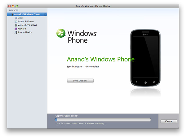
The connector application doesn’t mimic the functionality of the Zune Sync software for the PC. You don’t get any access to the Zune Marketplace, you can’t download apps, there’s no WiFi syncing support and (today) there’s no system update support. What the Connector is designed to do is get your non-DRM iTunes and iPhoto content from your Mac to your Windows Phone. Nothing more, nothing less.
I was supplied with an alpha of the Connector and despite fairly regular crashes (thankfully not while syncing), I’m happy to say it works. You get a very Apple-like interface. Just check the movies, music and photos you want and hit sync and you’re good to go.
The options are minimal. You can’t tell the Connector software to fill all available storage space on the phone with extra music or photos. You have to be very deliberate with what you want to put on the device.
The Connector will insert photos taken on the phone into iPhoto, unfortunately it puts them into albums (roughly one per day it seems) all named after your phone. In my case after a couple of syncs I had a lot of Anand’s Windows Phone albums in iPhoto.
Music downloaded from the Zune Marketplace will also attempt to sync, but it’ll fail miserably. For some reason the Connector tries to put downloaded music in iPhoto, which will of course throw an error:
There’s no way around it and unfortunately that means any music you buy in the Zune Marketplace can’t be put on your Mac. Thankfully it seems like a quick fix and we’ve alerted Microsoft to the problem.
There’s also no support for contact or calendar syncing, that’s done through the cloud. You can sync your address book in OS X with Google Contacts and keep your phone synced that way, but you can’t do it over the USB cable.
You can view all of the content on your device but you can’t manage any of it (short of erasing it all). You can’t add/remove email accounts or do any of the things you can do with an iPhone in iTunes. Microsoft’s Windows Phone 7 Connector software is good enough to get the job done, but it’s far from a full fledged OS X client.
The first major update to Windows Phone 7 will come sometime early next year. It’ll bring copy & paste support along with other things. Microsoft plans to have OS update support enabled in the Connector by the time that update rolls around. Assuming all goes according to plan, you should be able to have a pretty decent experience as a Mac user with a Windows Phone. You won’t get the full monty, but you’ll have enough to get by.
Microsoft needs to, as quickly as it can, bring all of the features of the Zune Sync client on the PC to OS X. WiFi syncing, marketplace access - everything. The fact that Microsoft is even providing this option is enough to convince me that it’s serious about being successful here. Windows Phone isn’t just here to offer an alternative, it’s here to take away market share from Apple. To make that happen, Microsoft needs to at least offer feature parity with its sync software for OS X users.
Battery Life
With everyone sharing the same base hardware and software there are only two items that will ultimately impact battery life between vendors: screen type and battery size. The pecking order is pretty easy to follow. Smaller LCDs will be the best on battery, larger Super AMOLED screens will be the worst. The battery scale is even easier to define: bigger is better, but heavier.
We’ve been testing three Windows Phones: HTC’s Surround, Samsung’s Focus and the LG Optimus 7. The HTC and LG use standard LCD displays, while the Focus uses the same type of Super AMOLED screen we saw in the Fascinate and Epic 4G.
The LG uses a 5.55Whr battery compared to 4.55Whr on the HTC Surround. As a result LG gets the best battery life out of the three with the Focus coming in last due to its Super AMOLED display.
Microsoft mandates three discrete display brightness settings on all phones: low, medium and high, coupled with an automatic brightness mode. The three phones delivered very different levels of brightnes at each setting:
| Brightness Comparison (White Point) | |||||
| Phone | Low | Medium | High | ||
| HTC Surround | 10.4 nits | 183.1 nits | 405.7 nits | ||
| LG Optimus 7 | 130.4 nits | 259.1 nits | 381.2 nits | ||
| Samsung Focus | 61.9 nits | 143.1 nits | 234.3 nits | ||
| Brightness Comparison (Black Point) | |||||
| Phone | Low | Medium | High | ||
| HTC Surround | 0.03 nits | 0.39 nits | 0.88 nits | ||
| LG Optimus 7 | 0.28 nits | 0.56 nits | 0.82 nits | ||
| Samsung Focus | 0 | 0 | 0 | ||
Overall battery life of these Windows Phones ranges from average to above average in the case of the LG Optimus 7. The use of Qualcomm’s 65nm SoC definitely doesn’t help battery life, but Microsoft appears to have done a reasonable job with power management.
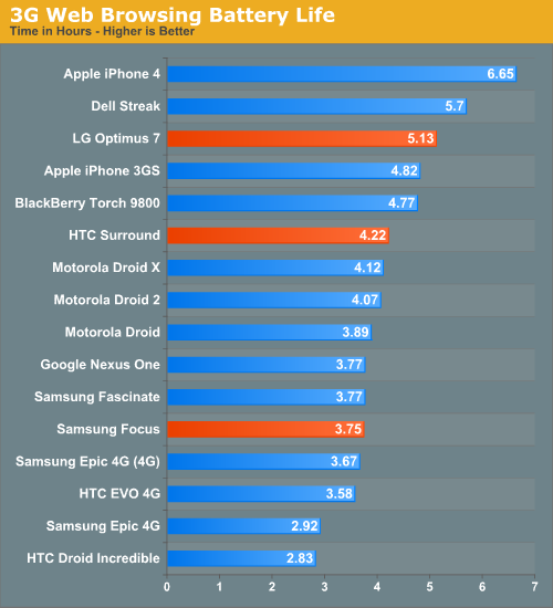
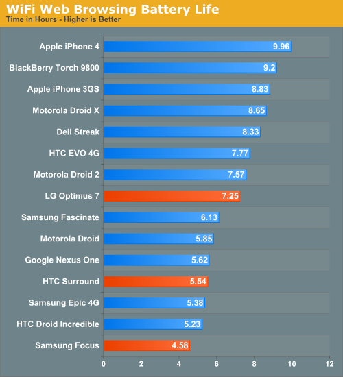
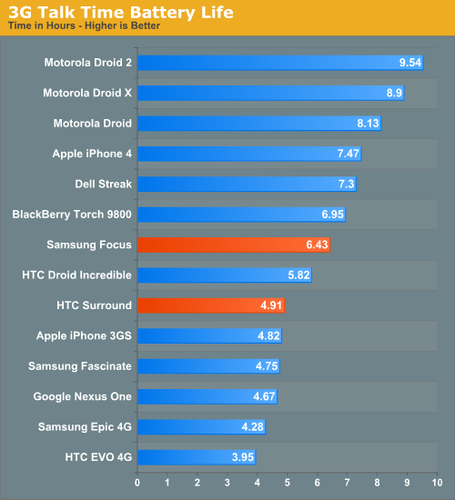
The first Windows Phones won’t be in the same realm of battery life as the iPhone 4, but it’s a reasonable starting point. Given a normal/light workload you can easily make one of these things last a full day on a single charge, but heavier users will probably find themselves charging once in the early evening. As with most aspects of the platform, we need to see significant improvement in the next 6 months for Microsoft to be taken seriously. Luckily for Microsoft, where it is today isn’t a bad place to be.
The First Phones: LG Optimus 7
We will have full reviews of all of these devices in the coming days, but we didn’t want to leave you with nothing on the hardware at launch so here are some brief thoughts on the three Windows Phones we’ve been playing with.
The LG Optimus 7 isn’t actually destined for US sale, it’ll be available tomorrow in Europe and Asia. The phone sports a 3.8” 480 x 800 TN LCD and unfortunately that’s both its biggest asset and its biggest weakness. The LCD sips power compared to the Super AMOLED in the Samsung Focus, but LG also sacrificed quality. Viewing angles and black levels just aren’t very good. The orange theme looks yellow on the phone when viewed at an angle.
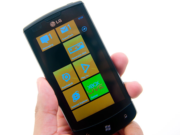
The display is bright but it lacks the integrated design that you get from the iPhone 4 or Samsung’s Focus. There’s a perceivable gap between the touch screen and the LCD beneath it.
The display is the biggest problem, the rest is smooth sailing. The form factor is great, albeit a little thick. LG opted for quality materials including a brushed aluminum battery cover. The device is heavy compared to other WP7 phones but it’s a luxurious sort of heavy, not a brick-like heavy.
The Optimus 7 comes with 16GB of NAND on board with an empty microSD slot for future expansion. Remember the rules though, you need to perform a factory restore on the phone with the microSD installed to use it.
LG preloads the device with three apps: Play to, Panorama shot and ScanSearch.
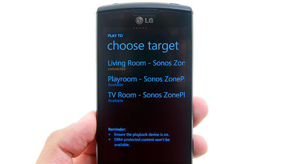
The Play to app is the most interesting as it supports streaming of all of your non-HDCP content to DLNA devices.
The Panoramic photo stitching app is super easy to use and works well in practice. My only complaint is the live view frame rate leaves a lot to be desired.
ScanSearch is a location based augmented reality app for Windows Phone 7. Eventually it'll be able to identify products but today all it can do is point out nearby locations of points of interests using your GPS and WiFi.
Battery life is the best out of the three phones we tested here today. We got over 7 hours in our WiFi browsing test and just over 5 hours on 3G. We’re still running talk time tests.
The First Phones: Samsung Focus
The Focus is a launch device on AT&T. It’s a Windows Phone Galaxy S. The Samsung Focus is incredibly thin and very easy to pocket. It’s very lightweight thanks to its all plastic construction. The Focus doesn’t feel like it’ll fall apart, but it doesn’t inspire the same confidence as the LG Optimus 7.
The screen is the best looking out of the three we’ve got here today. The 4-inch Super AMOLED display delivers vibrant colors (a perfect match for WP7’s color based themes) and perfect black levels. Overall brightness leaves much to be desired. We only measured 234 nits at its brightest setting. Medium is more than bright enough for indoor or use at night (thanks to the excellent contrast ratio), but outdoors during the day you need to leave the device on high.
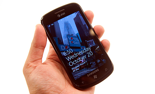
Battery life is absolutely abysmal, thanks to that Super AMOLED display. We measured 4.6 hours on WiFi, 3.75 hours on 3G but a respectable 6.4 hours of talk time (the display is shut off for our talk tests). This translates into a single charge lasting well under a full day’s worth of heavy use, or just under a day of moderate use.
Personally I prefer the 3.8-inch form factor of the LG to the 4.0-inch Focus. Unlike Android, Windows Phone 7 seems better suited for smaller displays thanks to its very simple UI and the fact that everything you need to tap on is already ginormous.
If you want more of a balance between size, screen and battery life you’ll want to look at the final phone in our trio: the HTC Surround.
While Anand played with AT&T’s other launch device - the Samsung Focus - and later on the LG Optimus 7, I got to play with the HTC Surround. HTC's entry into the fray stands out on AT&T. Ok, that was a terrible pun.
It's an interesting form factor, let's just say that. The Surround is put together like a landscape slider, except instead of a keyboard, you get a speaker that runs the entire length of the device. The speaker only slides out a mere 1.25 cm. As a result, the slider mechanism itself feels very sturdy, and there's very little space between the display and main base, not enough to slide a fingernail into. There's no spring mechanism on this slider, it’s just friction and two clicks that hold it in place.
In case it isn't readily apparent yet, the HTC Surround's primary differentiator is audio playback. There's a small button at the top of the device which cycles through SRS surround emulation and some Dolby audio enhancements. The speaker is actually impressively loud when you’re playing back music, as long as you remember to slide the thing open.
The speaker grille feels like brushed aluminum, and looks reasonably classy. On the back, when the speaker is slid out, you get a pop up kickstand. It's different from the EVO's kickstand - this one is narrower and rests differently. Where the EVO's is like a leg, the Surround's is like a small base that slides out. It’s just as sturdy honestly and does a great job propping the device up.
The Surround makes a tradeoff - on one hand, you get the increased thickness of a slider, but none of the keyboard goodness. Honestly, I haven’t found myself want for a keyboard on WP7 yet, especially considering lack of landscape homepage support. There’s definitely a market out there for devices that have good audio and emphasis on music playback. If that describes you, the Surround is perfect. It’s loud, pumps out undeniably the best sound quality from that big speaker of any smartphone I’ve ever used, and even has a kickstand so you can prop it up anywhere. Of course, the Surround also doubles as a loud alarm clock too.
Battery life is middle of the road for the WP7 devices we’ve tested thus far, but much better than the other AT&T launch device. Oh, and the HTC Surround charges very quickly as well. As we noted before, we’re going to have longer more comprehensive reviews of these devices up when they’re ready.
Final Words
There's a lot of good to say about Windows Phone 7. Far more than I expected going into this review, to be honest.
The Facebook integration is the best I’ve seen on a smartphone. The Zune integration is similarly perfect. If you’re used to spending a good amount of money on iTunes every month you’ll have a better overall experience with Zune Pass on a Windows Phone. Exchange support, Office and the Email app are great too, it all just works. And unlike previous Microsoft OS launches, there’s no caveat necessary. Windows Phone 7 is both functional and attractive.
The UI is a thing of beauty. Microsoft got the style, customization and performance one hundred percent right on this thing. It makes iOS feel old and utilitarian. It’s funny to think that Microsoft was the one to out-simplify Apple in the UI department.
Microsoft made great use of GPU acceleration throughout the OS. Scrolling, panning, zooming, everything is ridiculously smooth. The OS is so polished in this regard that almost none of the third party apps I tried seemed to clear the bar Microsoft has set. It’s going to take a while for developers to do the right thing on this platform.
It’s not only third party developers at fault. Microsoft itself clearly has a lot to work on. The Xbox Live Extras app is inexcusably slow. And then there’s IE mobile.
With JavaScript performance much lower than iOS and Android, IE mobile is measurable slower at loading web pages. The browser doesn’t actually feel much slower because of how smooth actually navigating around web pages is, but the web page loading performance must be improved. On top of that, web page legibility when zoomed out suffers due to a lack of font smoothing on very small fonts.
The application history and associated back button work well enough to make getting around WP7 pretty easy. Proper linking of addresses, phone numbers and web pages is nice and plays well with the back button. Ultimately adding copy & paste (coming in early 2011) will help but I’m not sure Microsoft can get around not having an actual way to switch between apps rather than just going back all the time.
From a hardware standpoint I have to say that I believe Microsoft got the formula right. Windows Phone 7 is launching a lot like a gaming console that Microsoft allows other companies to manufacture. Microsoft dictates the hardware, and it’s up to the handset manufacturers to implement it as stylishly as possible. If the manufacturers want to provide additional features, they can do so through their own apps that can come preloaded on the device.
Some handset makers are undoubtedly upset that they won’t be able to use UI as a differentiation vector, but I believe this is a better option for general consumers. You get a consistent experience across all Windows Phones and you force the handset guys to deliver better hardware, rather than attempt to compete out of their realm of expertise with software.
Buying a Windows Phone is going to be a lot like buying a PC. Except this time around the pre-installed software will be a lot easier to get rid of and hopefully a lot less intrusive.
Of course, this approach only works if the OS is good enough from the get go, and in this case, it is.
I’ve always liked Microsoft as an underdog. It isn’t afraid to spend money to deliver a good user experience and the company has the talent to do some amazing things. It’s only when Microsoft becomes a monopoly that things go wrong. But in the fight to reach that point, we get great products and healthy competition.
With Windows Phone Microsoft is in underdog mode. The OS isn’t perfect but aside from the lack of apps, it’s competitive today. While I’m traveling I need the apps you can only get with a mature platform like Android or iOS (e.g. Yelp, BART app, etc...), but while home I don’t use those apps as much. Instead my smartphone behaves more like an SMS, phone, email, camera and web browsing device, and it’s in those areas that Windows Phone is easily just as good as the competition.
The app story and lack of conventional task switching are the two biggest issues facing Windows Phone 7 today. Both of which look to be very fixable problems. If you don’t own a modern smartphone, you probably won’t view either as an issue today and you can bide your time until Microsoft introduces them. If you’re migrating from an Android device or iPhone, depending on your app usage, Windows Phone may be too young for you.
If you’re looking for a feature replacement to an Android phone or Windows Mobile device, WP7 will disappoint. Windows Phone is more like the iPhone than it is anything else. If you don’t like the iPhone (for reasons other than an inherent dislike for Apple), you probably won’t like Windows Phone. If your sole reason is disdain for Apple, then pick up a Windows Phone.
What I’m most excited about isn’t the fact that we’ll have another good competitor in the smartphone space, but rather the hope this gives me for Microsoft’s future products. Windows 7 was a nice OS, but it was nothing earth shattering and clearly did nothing to fend off Apple’s erosion of PC market share. Windows Phone 7 is a beacon of hope for Microsoft. If Windows Phone 8 and Windows 8 are designed with similar focus and clarity of thought as WP7 was, we may be looking at the beginning of Microsoft’s return.

