Motorola Announces the New Moto X: Initial Impressions and Hands On
by Joshua Ho on September 5, 2014 2:00 AM EST- Posted in
- Smartphones
- Motorola
- Mobile
- Moto X
Introduction
Motorola has been through a lot, to say the least. It was only a few years ago that Motorola had become an OEM struggling to stay afloat, as it was effectively an ODM for network operators in the US. We saw phone after phone pushed out with no real cohesive strategy. After its acquisition by Google, we saw a major shift. Motoblur was removed, and we saw a move AOSP UI to facilitate faster updates and smoother experience. The only real changes were Motorola’s custom apps and features, which still followed Android’s design principles. However, the Moto X seemed to lack in certain areas. The Snapdragon S4 Pro just couldn’t keep up with the Snapdragon 800 in performance and also used more power. The Clear Pixel camera was definitely interesting from an academic perspective, but at launch it was rather disappointing. Combined with Moto Maker exclusivity to AT&T and general exclusivity to the US, the Moto X was a great idea held back by timing and distribution. Today, Motorola hopes to make things right with the new Moto X. They’re also launching a new Moto G, the Moto 360, and Moto Hint.
The New Moto X
This brings us to the new Moto X. While Motorola is being acquired by Lenovo, it’s clear that the Motorola I saw today is still very much the same Motorola from the Google era. The new Moto X continues all of the differentiating features that we saw with the previous Moto X, and makes it better. Before we get into all of this though, we’ll go over the basics first. I’ve included these basic specs in the spec sheet to make things quick, as there’s a great deal of ground to cover for a first impressions piece.
| Motorola Moto X (Gen 1) | Motorola Moto X (Gen 2) | |
| SoC | 1.7 GHz Snapdragon S4 Pro | 2.5 GHz Snapdragon 801 |
| RAM/NAND | 2 GB, 16/32/64GB NAND | 2GB, 16/32GB NAND |
| Display | 4.7” 720p Super AMOLED | 5.2” 1080p Super AMOLED |
| Network | 2G / 3G / 4G LTE (Qualcomm MDM9x15 IP block UE Category 3 LTE) | 2G / 3G / 4G LTE (Qualcomm MDM9x25 IP block UE Category 4 LTE) |
| Dimensions | 129 x 65.3 x 5.7-10.4mm, 139 grams | 140.8 x 72.4 x 3.8-9.9 mm, 144 grams |
| Camera | 10MP Rear Facing, 1/2.6" CMOS size (OV10820), 2.1MP FFC | 13MP Rear Facing, 1/3.06" CMOS size (Sony IMX135) F/2.25, 2.1MP FFC |
| Battery | 2200 mAh, 3.8V, 8.36 Whr | 2300 mAh, 3.8V, 8.74 Whr |
| OS | Android 4.4.4 | Android 4.4.4 |
| Connectivity | 802.11a/b/g/n/ac + BT 4.0, USB2.0, GPS/GNSS, MHL, DLNA, NFC | 802.11a/b/g/n/ac + BT 4.1, USB2.0, GPS/GNSS, MHL, DLNA, NFC |
| SIM Size | NanoSIM | NanoSIM |
As one can see, the new Moto X has a 5.2” 1080p SAMOLED display. In discussions with Motorola a new emitter material for the display was explicitly mentioned. This and the size/resolution of the display suggest that we’re looking at the same display generation as the Galaxy S5. However, in practice it isn't, after taking a quick look at the maximum luminance of the display. While the SoC isn’t Snapdragon 805, the use of a lower 1080p resolution means that it will be competitive with 1440p Snapdragon 805 devices. We also see a move from the 10.5MP Clear Pixel sensor to a standard 13MP Sony sensor. The relatively small battery is a bit concerning but there are a great deal of mitigations done by Motorola to try and keep this from being an issue.

Those make up the basics, and while I’m definitely going to get into more detail about those in a bit, one of the most immediate, major improvements are the new materials. Much like the Note 4, we see a metal ring that runs around the side of the phone, but unlike the Note 4 the rest of the phone curves outwards to reach its max thickness. The result is a phone similar in that the feel is much thinner than the maximum thickness suggests. The sheer thinness of the phone also helps with one-handed use. While not as compact as the first Moto X, the shape definitely makes the phone easier to use than the Samsung Galaxy S5 with one hand. The thin bezels and generally small profile makes the new Moto X closer to the LG G2 in usability with one hand, which is definitely great considering that this phone has dual front-facing speakers with an amp to go with it. The metal ring also serves as the antenna, and Motorola has done a surprising amount of work to make this happen which I’ll get to in a moment. Around this ring, on top we see the SIM tray and headphone jack. On the right side, there’s the power button and volume rocker. Both are clicky with no real slack, and the power button has a ridged pattern to it to distinguish it from the volume rocker. On the left side there’s nothing but the metal band, and on the bottom we see the microUSB port.
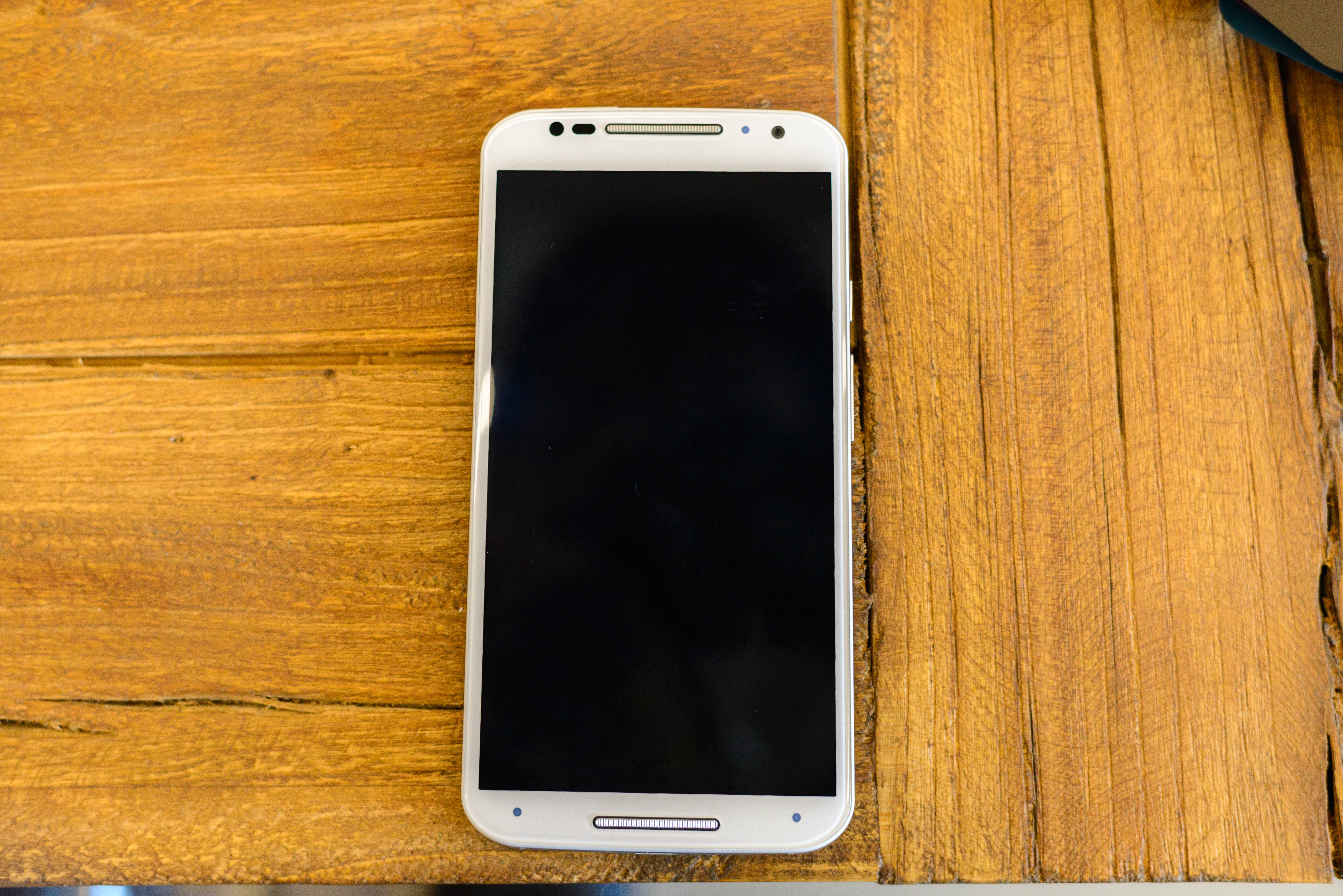
The front of the phone is dominated by the display, and there are a surprising number of elements to look at. There are two speaker grilles, which are made of aluminum and have the same ridged texture as the power button, which can have their color customized on Moto Maker. We see three light dots, two round circles, and a rounded rectangle. These make up the IR transmitters, a front facing camera, IR receiver, and the light sensor/proximity sensor. While the appearance of the IR transmitters, camera, and IR receiver make it appear that this phone has a 3D perspective feature like the Amazon Fire Phone, this is actually used to enable an improved Moto Display, air gestures, and Attentive Display. There’s also the same “magic” fused glass-plastic top layer that means there’s no lip to feel when swiping off the edge of the display, which definitely feels great.
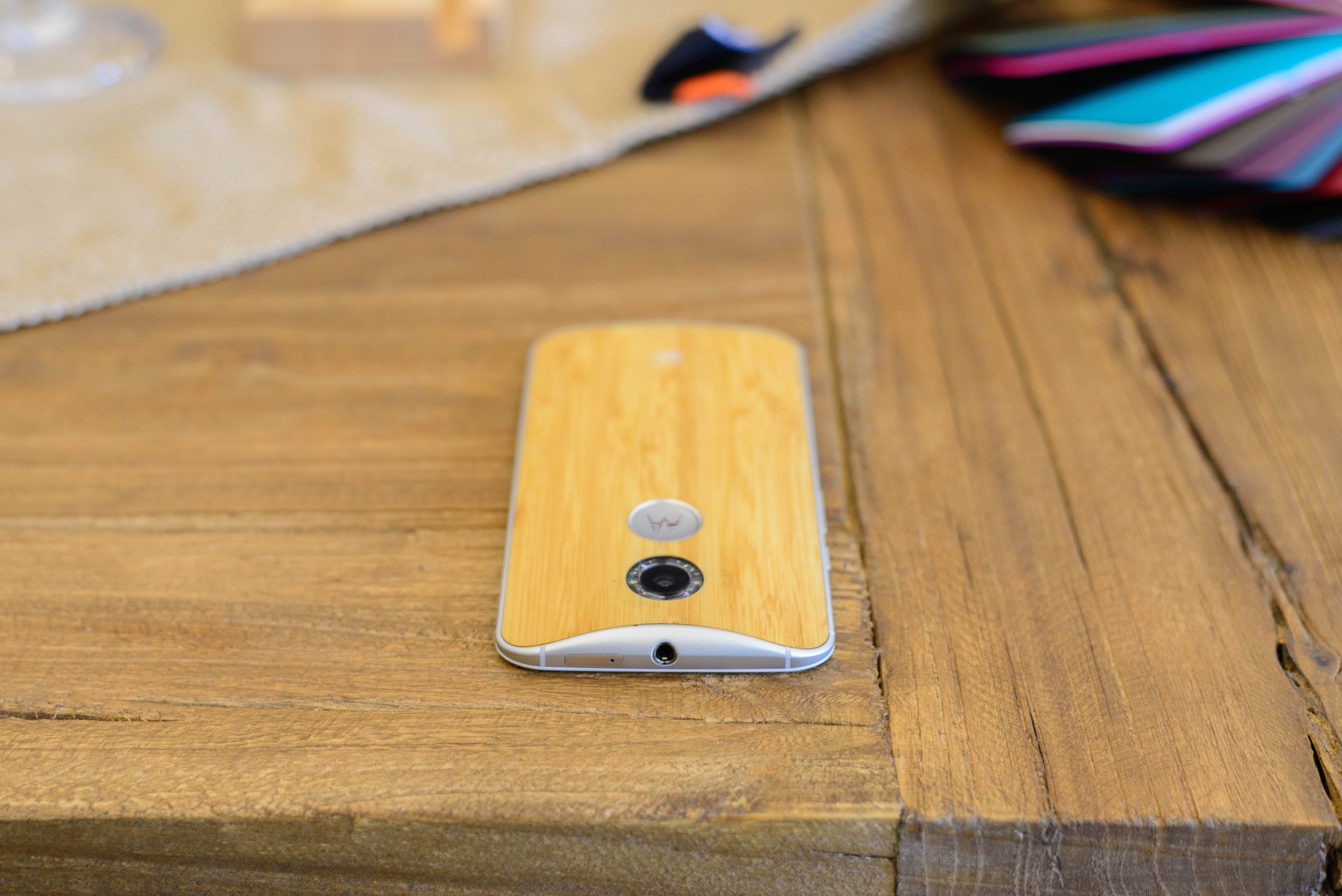
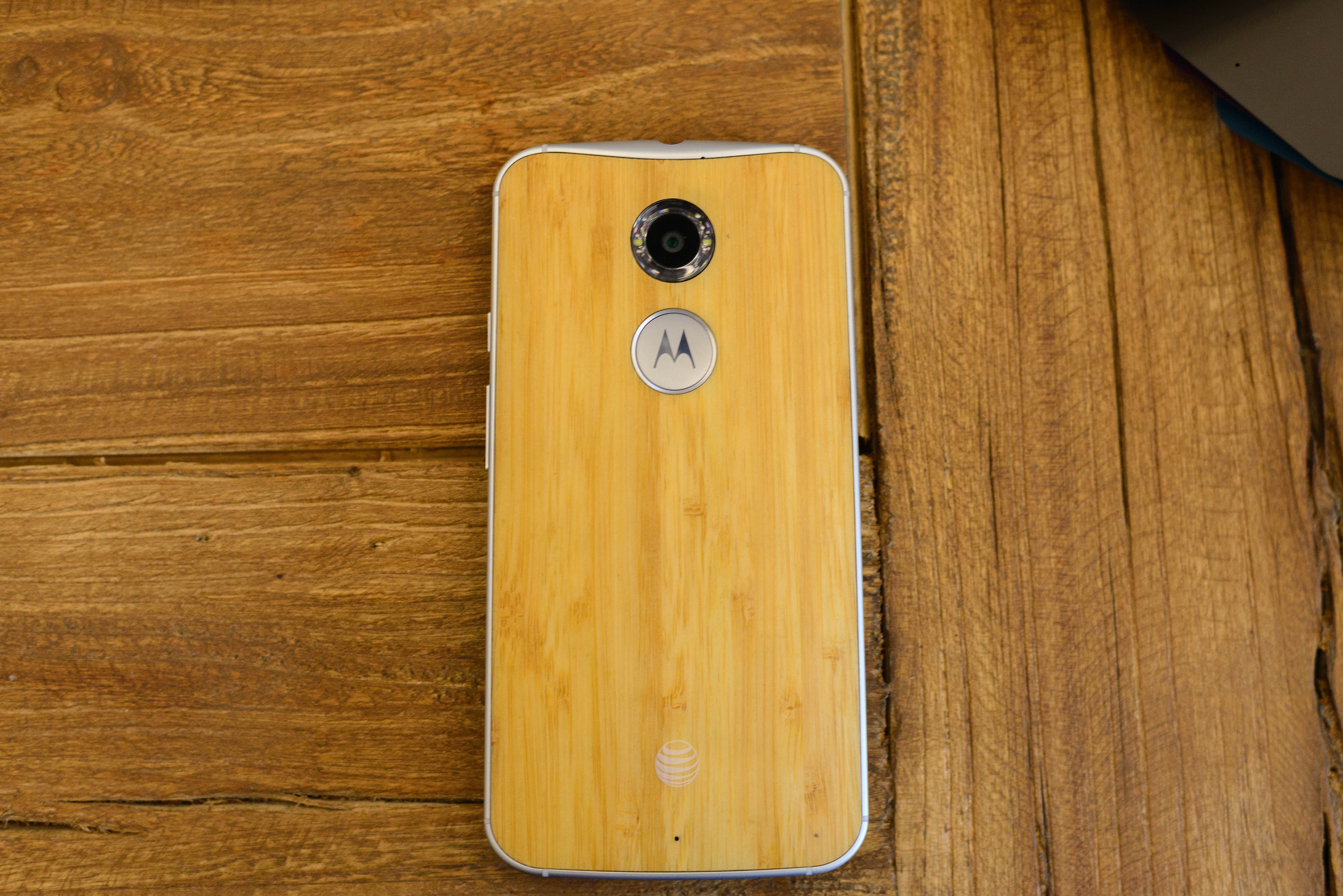
The back of the phone contains the customizable back cover, which can now be leather, wood, or various types of plastic. There are two visible mics on the top and back of the phone. However, the real design elements here are the dimple and camera. The new dimple seems to be larger than before, and also has a metal accent surrounding it, which makes it seem a bit button-like even though it isn’t a button. The rear camera is a bit unremarkable but the ring diffuser and two LED flashes makes for a distinctive look. In my hands-on time I found the leather to feel and smell authentic, although a few years of intensive use may make the latter a terrible idea. Motorola emphasized that the Horween leather was tanned in Chicago and that the colors were custom for Motorola.
Overall, the industrial design and material design is a solid continuation of what we’ve seen of the Moto X. Motorola stated that this combined metal ring and plastic/wood/leather back made it possible to have both the premium feel of metal and the warmer feel of the customizable back. Of course, now that the basic hardware impressions are done it’s time to move on to the feature highlights of the new Moto X.


108 Comments
View All Comments
erikiksaz - Friday, September 5, 2014 - link
Now this is why I love anandtech. Sum up all the specs in a chart (instead of of a 5 min video parroting back all the specs), and educate me on all the aspects of the phone that other websites simply do not cover.Thanks for the great preview.
Any more details on the color reproduction, sound quality/loudness of the speakers?
JoshHo - Friday, September 5, 2014 - link
The speakers are definitely quite good in quality, but I need to try some subjective comparisons and collect some data to really get a better idea of how sound quality is on the speaker.imaheadcase - Friday, September 5, 2014 - link
The one thing i don't like on my moto x is the speakers, you can't sit it on a flat surface because they are on back and muffles sound. kind of annoying when you want to watch videos on lunch break.imaheadcase - Friday, September 5, 2014 - link
Oic it HAS a front speaker? excellent news!craighamilton - Saturday, December 6, 2014 - link
The Moto X is not very popular if you look at consumer based reviews (such ashttp://www.topreport.org/phones/ which is my favorite).
JoJ - Monday, September 8, 2014 - link
Hi Josh, I'm new to your phone reviews, though not to this site, thank you for many years of providing great reference everyone, especially also the commenters here..Is it possible to test phones' speaker abilities by just putting them in a not so huge anechoic chamber? DIY, but I know you'd do a decent job, and providing some straight uncompressed recordings?
Several sites offer quite detailed measurements, but I'm not expert at understanding these, and differences all seem to fall within possible error margins. I'm simply thinking that a really good relative comparison would be to just soundproof a closet and run some tracks, preferably also from high resolution lossless files, at a range of volumes and microphone distances. Some real dynamic range classical, "noise war" pop, some operatic recitative is great for pinpointing hard to hear enunciation, maybe patch a phone in on speaker, to a conference call. Just enough so review readers could take, say, a half hour listen. Since so many have great headphones now, and many of those are studio monitor quality in flatness of response, I think this would work well.
As a kid, I very nearly took my studies to pursue a interest in sound engineering, but that's a very long time ago, however I remember many psychoacoustics reviews linking attention and perception of quality to both sound and video quality, basically perceived visual acuity would improve with greater audio fidelity, and similar correlations.
We spend a lot of time, now, with our phones. So much I have deliberately forgone use of anything but a very basic candy bar Nokia, just coming to six months now, exclusive use of a simple not even series 40 model, literally the flash ram is wearing out, it's so cheap. This is my last week or so!
My point is, that even with phablet phones, viewing a video, is something you often share, and so hearing comparison at a meter between phones would persuade me over anything other than a real deficiency in the screen. Poor audio has been the thing that I find causes my companions or colleagues to have difficulty understanding, not video, provided the video is smooth.
So having a idea of what these phones can sound like, for conferencing or music, at a meter or so, just as a comparison, forget graphs and numbers, would be really cool.
Please forgive me, if I have missed out on the parts of your test regime, which might give me a idea, but I'd be persuaded by any well managed real life sample, over test reports. To a certain extent, it feels like the eighties again, or before then, really, when getting any decent sound was a result, and the word "audiophile" was invented to excuse the measurebating.
I hope I'm not suggesting the all too obvious, instead just calling out a wish, but I was thinking the other day, about television reviews. About only one surprised me, to see something distinctly better, through YouTube's 1080 setting, and that as of a limited production Panasonic plasma, their last ever plasma. That seemed to shine through the obviously degrading signal chain. I am sure that great audio performance would shine through as well.
Are speakers generally deprecated? I mean, do most users .. no, most review readers, pay less attention to speaker ability, because they presume they'll be using their (very good) own headphones? If I was writing reviews, and selling adverts or anything to do with it, I'd be on the case to find out some numbers and opinions.
Thanks again & best from me,
~ joj
fokka - Friday, September 5, 2014 - link
i wanted to say the same thing, but you beat me to it.i hate having to read paragraphs of text, just to be able to tell what specs some device has. it's even worse when comparing different devices.
here we always get a nice chart, often comparing the reviewed piece of tech with its predecessor or competing products. this way i have a good overview in a matter of seconds.
thank you.
JoJ - Monday, September 8, 2014 - link
I agree with that, for sure!But I'm hijacking this early bit of the thread to as something dumb, that's kinda similar in terms of frustration with websites, or rather browsers: what happened to having text wrapped when you scale it on a phone or any other device for that matter? Opera Mini and Mobile used to do that, just fine. Okay, it did mess with layout a bit, but never so badly. Now I see no word wrap at all, and even in this Surface Pro 2, I don't have width enough when zoomed to appease older eyes, still keeping the page from overflowing... I simply do not want to horizontal scroll! Has anyone any ideas? I have tried lots of browsers, for sure, but no luck. Story of touch compatibility on a Surface is another thing altogether: I delayed the last Patch Tuesday because of the BSOD issue, and there's a few IE11 updates there. But, if a lot of things do not dramatically improve with IE11, I am going to write a very lengthy demand for a refund. That bad. On a metered connection and it won't recognize I darn well closed those thirty windows, two freaking shutdowns ago... and that's just one issue of many, and I really do wan to love this device...
Anyone know what happened to text wrapping for mobile browsers?
Why is - to my mind at least- such a vital usability feature not highlighted in reviews?
I am windows centric, but could care less about which platform I use, when it comes to usability.
hahmed330 - Friday, September 5, 2014 - link
Yeah awesome and highly professional preview... Moto X looks really promising considering how much attention to detail they have put in each and every solution. Motorola shames Samsung when it comes to attention to detail.Peroxyde - Friday, September 5, 2014 - link
Because other specialized "mobile" sites do quicker review. They shoot the phone with a bullet and check after if the phone is still working.